Thursday, April 27, 2017
OUGD503 - Studio Brief 03 - Responsive - Evaluation
In many ways I have found the Responsive module one of the most challenging yet rewarding parts of the course to date as not only has it been my first taste at live briefs in the real world but I have had to work to tight deadlines, learn to self-initiate my working process and prioritise my time to ensure all projects were handed in on time. Being set briefs by large clients such as Penguin Books, The Royal Opera House and BEAR has required me to think at a more critical and professional level to produce commercial work that would be appropriate for production on a mass scale in the real world.
The first brief that I chose to undertake was the Children’s Category of the Penguin Book Cover design competition. Designing book jackets is something that I have always had an interest in and the Children’s category provided me with an excellent opportunity to combine that with my interest in illustration. This competitive brief required a range of design ideas which were slightly out of the box to ensure my design would stand out against the thousands of other entrants. Therefore I had to consider a range of different approaches varying from obvious to extremely ambiguous, keeping in mind the whole time what would be engaging to a younger target audience. The approach I went for was a bold and eye-catching design that would attract the attention of children but would only become apparent what it meant once you had read the book. Working around tight guidelines in terms of content and size acted as a template to apply my creative thinking to, and provided me with the challenge of communicating the information in as engaging a way as possible. This brief highlighted the importance of a strong concept, as without that it wouldn’t have been possible to create an appropriate eye-catching and unique design which would resonate with the target audience.
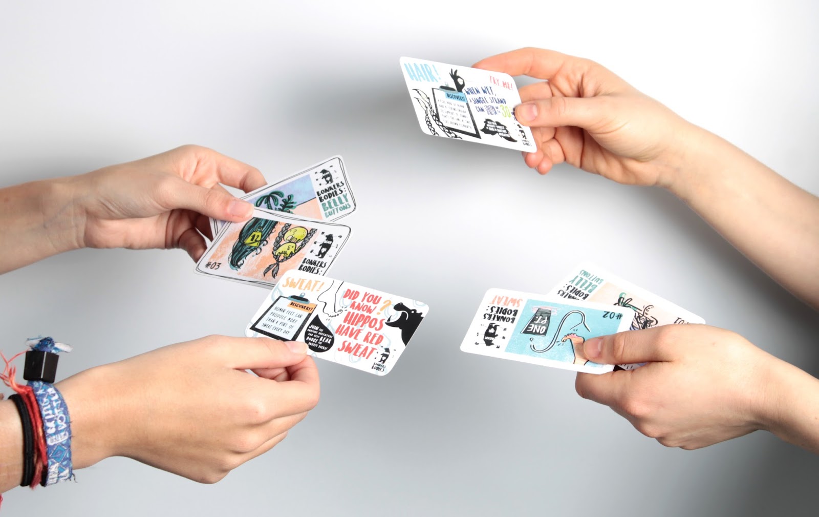
The second brief I undertook and the first of two major briefs was the YCN BEAR brief. Again I chose a brief that was both aimed at children and would allow me to further explore my interest in Illustration combined with Graphic Design. However, I soon discovered that the most challenging part of this project would be producing a range of illustrations that I was happy with. The most time-consuming part of the brief was drawing and redrawing the same illustrations in different styles, formats and layouts until I was happy with an outcome. Collaborating with an Illustrator would have definitely been a much more time effective approach to the project as I soon became bored and frustrated with my own style of illustration, despite receiving positive feedback. It was extremely rewarding however when I finally finished the illustrations and produced layouts that I was proud of. The brief also presented the additional challenge of making a ‘Collectible mechanic’ to go with the cards. This gave me the opportunity to explore my digital design skills further and create consistency between the printed cards and the digital app. An improvement I could have made to my submission would have been to display how the game worked visually by animating it in after effects and adding sounds however this was difficult to achieve within the time constraints. If I was working collaboratively this may have been possible and would have produced a more rounded outcome for my submission. Overall I was really happy with my outcome, especially the way the cards looked when I professionally photographed them, however, if I was ever going to work on such an illustrative brief again I would definitely find an illustrator to collaborate with.
That being said another smaller brief which I undertook for Studio Brief 01 was for the Papyrus colouring Book brief. Although illustrative in nature, this brief gave me the opportunity to explore a completely different style of illustration, merging drawing from life with the creation of patterns like ‘zentangle’. Although I was extremely happy with the outcome I produced, I hope to push myself further in future projects by perhaps exploring digital illustration and vector drawings.
The final brief I undertook for studio Brief 01 was my first experience of paid client work. I had 10 hours to produce a poster for a new science programme being set up by the Worker’s Education Association. I had to create a design which subverted people’s perception of science as the Poster was aimed at a target audience who would otherwise think science was ‘boring’ and ‘not for them’. This brief gave me my first experience in liaising with the client, making adjustments and completing the business side of design such as invoices and payments. This was a huge learning curve for me and although the client was absolutely lovely, the pressure of knowing I was being paid and it would actually be used in the real worlds was extremely nerve wracking, in case I let them down. Luckily the client absolutely loved it and the whole team was really happy with the final design. The flier had a really positive response and the programme saw a huge influx of new participants to the scheme as a result of it.
Studio Brief 02 provided a completely different way of working and discovering how to successfully collaborate with a partner. Although my group was small, deciding to work with only one other person allowed communication to be straightforward and easy and planning to meet up was never an issue as we could easily reschedule if one of us was busy. The only downside to working as part of such a small team was having the same amount of work with less people to do it, which was reflected in the finished outcomes. A bigger team with a wider skillset would have allowed for a more rounded project with more potential outcomes such as a video or an app etc. to go with the poster and banner series. However, I was proud of the work myself and Megan produced. Having an illustrator as a partner allowed me to step back and experiment more with the editorial elements such as layout and gave me a chance to explore a more typographic approach. Working as part of a team, you have the added pressure of not wanting to let someone else down, which meant the work got done faster as we had to deliver on the agreements we had set. The brief taught me that I enjoy working collaboratively as it enables you to bounce off of one another’s ideas and that there are equal benefits and negatives to working in both big and small collaborative teams.
The first brief that I chose to undertake was the Children’s Category of the Penguin Book Cover design competition. Designing book jackets is something that I have always had an interest in and the Children’s category provided me with an excellent opportunity to combine that with my interest in illustration. This competitive brief required a range of design ideas which were slightly out of the box to ensure my design would stand out against the thousands of other entrants. Therefore I had to consider a range of different approaches varying from obvious to extremely ambiguous, keeping in mind the whole time what would be engaging to a younger target audience. The approach I went for was a bold and eye-catching design that would attract the attention of children but would only become apparent what it meant once you had read the book. Working around tight guidelines in terms of content and size acted as a template to apply my creative thinking to, and provided me with the challenge of communicating the information in as engaging a way as possible. This brief highlighted the importance of a strong concept, as without that it wouldn’t have been possible to create an appropriate eye-catching and unique design which would resonate with the target audience.
The second brief I undertook and the first of two major briefs was the YCN BEAR brief. Again I chose a brief that was both aimed at children and would allow me to further explore my interest in Illustration combined with Graphic Design. However, I soon discovered that the most challenging part of this project would be producing a range of illustrations that I was happy with. The most time-consuming part of the brief was drawing and redrawing the same illustrations in different styles, formats and layouts until I was happy with an outcome. Collaborating with an Illustrator would have definitely been a much more time effective approach to the project as I soon became bored and frustrated with my own style of illustration, despite receiving positive feedback. It was extremely rewarding however when I finally finished the illustrations and produced layouts that I was proud of. The brief also presented the additional challenge of making a ‘Collectible mechanic’ to go with the cards. This gave me the opportunity to explore my digital design skills further and create consistency between the printed cards and the digital app. An improvement I could have made to my submission would have been to display how the game worked visually by animating it in after effects and adding sounds however this was difficult to achieve within the time constraints. If I was working collaboratively this may have been possible and would have produced a more rounded outcome for my submission. Overall I was really happy with my outcome, especially the way the cards looked when I professionally photographed them, however, if I was ever going to work on such an illustrative brief again I would definitely find an illustrator to collaborate with.
That being said another smaller brief which I undertook for Studio Brief 01 was for the Papyrus colouring Book brief. Although illustrative in nature, this brief gave me the opportunity to explore a completely different style of illustration, merging drawing from life with the creation of patterns like ‘zentangle’. Although I was extremely happy with the outcome I produced, I hope to push myself further in future projects by perhaps exploring digital illustration and vector drawings.
The final brief I undertook for studio Brief 01 was my first experience of paid client work. I had 10 hours to produce a poster for a new science programme being set up by the Worker’s Education Association. I had to create a design which subverted people’s perception of science as the Poster was aimed at a target audience who would otherwise think science was ‘boring’ and ‘not for them’. This brief gave me my first experience in liaising with the client, making adjustments and completing the business side of design such as invoices and payments. This was a huge learning curve for me and although the client was absolutely lovely, the pressure of knowing I was being paid and it would actually be used in the real worlds was extremely nerve wracking, in case I let them down. Luckily the client absolutely loved it and the whole team was really happy with the final design. The flier had a really positive response and the programme saw a huge influx of new participants to the scheme as a result of it.
Studio Brief 02 provided a completely different way of working and discovering how to successfully collaborate with a partner. Although my group was small, deciding to work with only one other person allowed communication to be straightforward and easy and planning to meet up was never an issue as we could easily reschedule if one of us was busy. The only downside to working as part of such a small team was having the same amount of work with less people to do it, which was reflected in the finished outcomes. A bigger team with a wider skillset would have allowed for a more rounded project with more potential outcomes such as a video or an app etc. to go with the poster and banner series. However, I was proud of the work myself and Megan produced. Having an illustrator as a partner allowed me to step back and experiment more with the editorial elements such as layout and gave me a chance to explore a more typographic approach. Working as part of a team, you have the added pressure of not wanting to let someone else down, which meant the work got done faster as we had to deliver on the agreements we had set. The brief taught me that I enjoy working collaboratively as it enables you to bounce off of one another’s ideas and that there are equal benefits and negatives to working in both big and small collaborative teams.
OUGD503 - Responsive - Collaborative - ROH - Evidence of Communication
Megan and I communicated throughout the project really well, sending each other research, arranging times and places to meet up each week, booking time slots and sending each other completed work. The benefits of working in such a small team meant we could easily reschedule meetings if one of us had something planned and that communication was kept fun, easy and succinct.


We met up at least once every week since the start of the colaboration and both took equal responsibility in booking things such as print slots to ensure deadlines were met on time, and finances for the project were split evenly between the two of us.

Evidence of time management and workshop bookings.

OUGD503 - Responsive - WEA Brief - Research and Final Outcome
In the Summer I had my first opportunity to produce a paid piece of Graphic Design work for the Workers Education Association, a programme that helps disadvantaged adults learn science. The brief was to design an eye-catching flier that would promote the programme but not look too childish.
'What the flyer needs to convey: – In September we are starting new WEA science courses. We are going to teach pre-GCSE Biology, Chemistry and Physics, initially in the North West and then Nationally. We teach adults, 19+ in deprived and disadvantaged areas. So we are targeting people who don’t believe that Science is for them. They think it’s boring, or too hard, or contain too much maths or that they will be tested. Whereas, we are planning easy fun experiment based courses with explosions, 2 hours a week (for each subject) for 22 weeks over the first two school terms.
We want to give people the confidence in science to assist their children with homework, to volunteer to assist with science in schools and to understand the science on the news and to go on and do GCSEs if they want. The flyer needs to attract attention without being childish. We need the RAS, RSC and WEA logos on it, and the charity and Matrix stuff that’s on the bottom of one of our poor attempt at flyers for another course which I’ve attached.
We are targeting people who think science isn't so much a swear word, but something that clever people do, and therefore totally beyond their grasp! Still pondering names. We may get Tim peak to endorse what we are doing through the Royal astronomical society, so it may become the Tim peak science school. I am going to phone the RAS tomorrow, and see if there is any news on the Tim thing.
If you are still interested in having a go at this for me, just get in touch, and hopefully we can put a design on our science courses which will be easily recognisable!' - Claire


This was the finished flyer:

My thinking behind the flyer was to incorporate some form of explosive image and a subtle but modern colour scheme - nothing too garish. I used predominantly black and white with a peachy orange accent colour that didn't clash too much with the logos which had to be incorporated at the bottom.
I wanted to get across the fun and experimental side of science with an image of something exploding or bubbling away in the background. It was hard to find anything appropriate as all the stock images of science experiments were very garish and clashing. The image I used was a stock image of exploding paint which I thought worked just as well as it reminded me of the chemical powders you often see in labs.

This was a huge learning curve for me and although the client was absolutely lovely, the pressure of knowing I was being paid and it would actually be used in the real worlds was extremely nerve wracking, incase I let them down. I also had to find a way to make the text editable after designing the flier in illustrator. Luckily the client absolutely loved it and the whole team was really happy with the final design.
This was an invaluable experience for me as it taught me major communication skills with the client and also taught me skills such as invoicing and how to sort out payments etc.
The flier got a really positive response and the programme saw a huge influx of new participants to the scheme as a result of it.
'What the flyer needs to convey: – In September we are starting new WEA science courses. We are going to teach pre-GCSE Biology, Chemistry and Physics, initially in the North West and then Nationally. We teach adults, 19+ in deprived and disadvantaged areas. So we are targeting people who don’t believe that Science is for them. They think it’s boring, or too hard, or contain too much maths or that they will be tested. Whereas, we are planning easy fun experiment based courses with explosions, 2 hours a week (for each subject) for 22 weeks over the first two school terms.
We want to give people the confidence in science to assist their children with homework, to volunteer to assist with science in schools and to understand the science on the news and to go on and do GCSEs if they want. The flyer needs to attract attention without being childish. We need the RAS, RSC and WEA logos on it, and the charity and Matrix stuff that’s on the bottom of one of our poor attempt at flyers for another course which I’ve attached.
We are targeting people who think science isn't so much a swear word, but something that clever people do, and therefore totally beyond their grasp! Still pondering names. We may get Tim peak to endorse what we are doing through the Royal astronomical society, so it may become the Tim peak science school. I am going to phone the RAS tomorrow, and see if there is any news on the Tim thing.
If you are still interested in having a go at this for me, just get in touch, and hopefully we can put a design on our science courses which will be easily recognisable!' - Claire
Research and Development
Before I started designing I first began by looking at posters and flyers that the WEA had previously used to advertise their programmes to analyse their tone of voice and visual approach.
I then looked into bold and eyecatching flyers of this nature which would appeal to both men and women aged between 19 - 40 years old. I also tried to look for science style themes in the flyers and see how they had been made to look trendy.
Geometric shapes, block colours, angular lines and strong images were at the forefront of many of these posters which inspired me to experiment with a similar approach myself.

I wanted to get across the fun and experimental side of science with an image of something exploding or bubbling away in the background. It was hard to find anything appropriate as all the stock images of science experiments were very garish and clashing. The image I used was a stock image of exploding paint which I thought worked just as well as it reminded me of the chemical powders you often see in labs.

This was a huge learning curve for me and although the client was absolutely lovely, the pressure of knowing I was being paid and it would actually be used in the real worlds was extremely nerve wracking, incase I let them down. I also had to find a way to make the text editable after designing the flier in illustrator. Luckily the client absolutely loved it and the whole team was really happy with the final design.
This was an invaluable experience for me as it taught me major communication skills with the client and also taught me skills such as invoicing and how to sort out payments etc.
The flier got a really positive response and the programme saw a huge influx of new participants to the scheme as a result of it.
Wednesday, April 26, 2017


Tuesday, April 25, 2017
Monday, April 24, 2017
OUGD503 - Responsive - YCN BEAR - Finished Designs
Once I had finished the cards and the app I professionally photographed them using the correct lighting equipment and mocked the design of the app up digitally.


Subscribe to:
Comments (Atom)