Thursday, December 29, 2016

OUGD504 - Design for Screen - Branding and Features

LOGO AND BRANDING

As I was designing a brand new site that featured every house from all the different letting agents on one site I had to come up with a complete new brand and company name. A few different names and ideas were considered including:

Hubble - A hub of all different letting agents where you could find your own little 'bubble'. 

Hubitat - A hub featuring all the different letting agents where you could find your own 'habitat'.

Den - Looking at different connotations to the name of a dwelling or where something lives. Den was short and snappy and could have good imagery to go alongside it like bears and nature however it didn't seem very relevant. 

This is where I decided what the website was actually featuring and what would be a relevant name. In essence the service acts to show all the houses available to students in Leeds all in one simple place or under one roof. This is where the name One Roof came from. It worked well because it was relevant, did exactly what it said on the tin and related perfectly with housing as of course all houses have one roof. It would be a place where you could find a roof for yourself. 

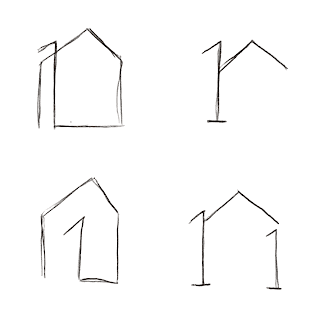
I sketched out a range of potential logos: 


These were a few of the most successful. That captured both the idea of a 1, R and a roof at the same time. 


After receiving feedback from a number of peers it was decided that the top left was the most appropriate as it looked like both a 1, a lower case r and the roof of a house.

I developed it digitally in illustrator altering the line widths and adding a gap into design to make the upper part look more like a roof with a chimney. This was the final design: 

GLOBAL MASTHEAD 

The global masthead is a navigational hub that directs users to all sections of the One Roof site. Users can access primary navigation, the main search page and the login page from here. 


The back button links to the previous page you were on. The One Roof Logo links to the last saved search page with your original filters still checked. If pressed again it takes the user back to the original search page with all filters cleared. The login button opens a pop up screen with the option to login to your own space 'my roof' or gives the option to sign up to 1 roof and create your own 'my roof' where you can save searches. 

Wednesday, December 28, 2016

OUGD504 - Design for Screen - Site Pages

PAGES

Landing Page

The landing page takes inspiration from sights such as sky scanner and train line, where users can't progress their search until the desired filters are selected and completed. 
Users can be as vague or specific as they please and then progress to the search results by clicking the search button. 

There is also a link to the login page where users can access their saved searches and reminders instantly if that's the reason they were coming to visit the site.


To enhance the User Experience and user interface of the page and make it more engaging I created a moving background featuring images of famous Leeds landmarks, students enjoying their new homes and examples of the properties featured on the site. 

The background was made using iMovie for Mac. I edited the video so the images would seamlessly blur into one another, making the look of the home page more engaging.

In the search bar itself there are several different examples of user interface including auto-complete, sliders check boxes.

Location: In the location box users are prompted to type the name of the location allowing for a range of endless possibilities. Autocomplete then suggests the rest of the name or address you may be typing in allowing for accurate results. I took inspiration from the way some platforms suggest the rest of your address when you're filling it in such as google maps this feature is called 'autocomplete'

No. Bedrooms: This feature is a drop down menu of the range of options available, saving space and allowing for accurate results. 

Price: The price uses a slider, allowing users to accurately and quickly select a specific price range they desire. As budget is a key feature when it comes to finding student housing, some students may be within an extremely specific budget of say £72 a week exactly. Vague price ranges would be no good in these circumstances as even a few pounds would be too expensive. This is why this feature allows students to select the exact amount they want putting them fully in control. 

Features: The feature is a checklist of all the most important features students might be looking for. There is a chance to refine the search even more in the 'edit search' menu on the next page.  

Search Results Page


The search results page features:
  • The global mast head
  • Option for Map View or Photo View
  • Number of results matching your search criteria
  • drop down menu with option to re-arrange search results in order of: Price Low to High, Price High to Low, Relevancy (highest % matching your search result) and star rating highest to Lowest. 
  • Images of the houses which you can flick through by hovering your mouse horizontally backwards and forwards over the image. This removes the need to open up a new tab to view the images, making browsing easier and more fun. 
  • Option to save the house to your my roof page, allows you to compare and save searches in one place. 
  • Average star rating from previous tenants. 
  • Price of each house with and without bills included. 
  • Number of times the property has been saved and number of viewings the property has had indicating popularity.
  • % matching your search criteria from the filters you selected.
  • Name of the property. 
To alter the search criteria at any time simply click on the side bar to the left of the screen with a magnifying glass icon and expander arrow. 


This opens up all of the filters from the previous page plus more options you can select such as move-in and move-out date and which letting agents you want to go with. Here is how all the filters would work if expanded:


Update: I decided to add other filters including star rating and re-arranged them into order of importance and what is most relevant / useful to students when they are looking for a house, with price first.


I also added the google rating next to each letting agency to give students an idea of who is reliable before committing to letting a property from them. 


To update filters and return to the results page click the tick on the right hand side of the screen and the pop up menu shrinks back into the side bar on the left of the page. 


Switching to map view alters the page to look like this. The benefits of this feature are that you can choose your house via location, enabling you to see it's proximity to places like university and town. The page allows you to quickly flick through the images of different houses and favourite the ones you like the look of for later. 


Individual House Page


Once a property has been selected to view from the search results page it will direct the user to this page.

First section of the page features: 
  • Images of the house at the top of the page as a priority with navigational arrows to click through the pictures. 
  • Button to add house to favourites on 'my roof' page
  • House Name / Number and Street Name
  • Average star rating and link to reviews from previous students (which is located further down the page)
  • Number of saves the property has had since becoming available.
  • Number of viewings the property has had since becoming available. 
  • % matching your search criteria
Second section of the page features: 
  • Price of house per week with and without bills 
  • Brief description of the house, keeping it short and snappy
  • Basic details of the house in list form
  • Added Features of the house with corresponding symbols for international students to understand more clearly. 


Third section of the page features: 
  • Map showing the location of the house
  • Average star rating from previous tenants
  • Statistics of the ratings in bar chart form
  • Example of a review from previous tennant
  • Option to view more reviews. 
Final Section of the page:
  • Link to 'book a viewing' which opens a pop up window where you can leave your details and write a note requesting a booking which emails the estate agent that the property belongs to. This conversation also shows up in the messages section of the 'my roof' page.


Below that you will find: 
  • Logo or image of the corresponding letting agency
  • Average star rating from google reviews
  • Link to the google reviews of the agency
  • Contact details including email address, phone number, street address and opening times


My Roof Page 

Once you click the Login link a pop up window appears giving you the option to sign in or create an account.


Once you log in it takes users to the 'My Roof' page. 


This page features: 
  • All your saved searches in one place, allowing users to easily compare the houses they like. 
  • Reminders of viewings you've booked and when payments such as signing fees and deposits are scheduled with letting agencies.
  • A list of your house mates where you can easily share and link properties with one another. Any house you favourite automatically goes into their saved searches as well, making sharing houses fun and easy and eliminating the need to screen shot and share or link via messaging services. 
  • Messages of your correspondence with different letting agencies so you can keep track of your viewings. 
  • A dream house section where you can save your chosen filters and search criteria allowing you to be notified when suitable houses matching your criteria become available. Notifications go into the chat area. Option to edit this criteria at any time.
  • An option to share and send your favourited searches to your housemates.  

OUGD504 - Design for Screen - Symbols and Icons


For the website is was important to have icons next to some of the information as international students would benefit from having universally known symbols next to the words to avoid any confusion about amenities provided. 

The symbols I used were from the noun project, an online collection of symbols from various contributors. If the website was being commissioned for real purpose I would have to purchase the royalties for each symbol or give full credit to the creator. 

For this purpose I edited all the symbols so the line widths were consistent to make the website as clear and aesthetically pleasing as possible. 

A burger button was also included in the design next to the 'Sort By' section to indicate a list of different options to sort the search results by. 

OUGD504 - Design for Screen - Typography

Avenir Next Condensed Regular 

Avenir Next Condensed is used as the default font for all large sections of body copy. It is also used for sections regarding contact information for letting agents. It is a san-serif font that creates an uncluttered and modern finish. Being condensed, it’s narrow bodywidth allows more information to fit into a tighter space. As I wanted to keep the design as uncluttered as possible, having a condensed typeface acts to maximise the white space and allow the images of the house and information on its features to take the centre stage. If then students still want to read more information on the house the typeface is still legible but not overbearing on the overall look of the design.

The lean proportions of the condensed typeface also makes it appear more stylish and sophisticated than its wider counterparts which is what I wanted the website to exude.

Avenir Next condensed is used on 61 of the top million sites on the web and is ranked #1,231.

( http://www.fontreach.com/ )


Din Alternate Bold

Din Alternate Bold is the primary typeface of the website used on its titles, sub headings, labels and stand out pieces of information. It is a striking and modern looking san serif typeface that fits in well with the overall aesthetic of the website. It too has a slimmer bodywidth making it appear more sleek and modern.

Din Alternate is used on 28 of the top million sites and is ranked #1,972.

(http://www.fontreach.com/)

Andale Mono 


Andale Mono is used sparingly on the website for sections such as ‘House Features’ and on the login page to create a subtle area of interest that attracts the users eye. This type could be seen as tacky and excessive if overused however when dotted around in small areas the font looks effective and engaging.

Andale Mono is used on 1221 of the top million sites and is ranked #173.

(http://www.fontreach.com/)


Regarding font size I used 12pt and above so the text was clearly legible at all scales. 

'16-pixel text on a screen is roughly the same size as text printed in a book or magazine; this is accounting for reading distance. Because we read books pretty close — often only a few inches away — they are typically set at about 10 points. If you were to read them at arm’s length, you’d want at least 12 points, which is about the same size as 16 pixels on most screens' 

https://www.smashingmagazine.com/2011/10/16-pixels-body-copy-anything-less-costly-mistake/

therefore for the important information on the page I used a point sixe of 16 pixels or above. 

OUGD504 - Design for Screen - Colour Palette

When deciding on a colour schemes for the design of the website I wanted to consider elements that would ensure the experience was calm, trustworthy and relaxed.
“Psychologically, research has shown that we all have the same innate, instinctive response to colour,” says colour consultant Andrea Mountford of Red Technologies. What nature begins, nurture develops.’
‘Green is for calm and peace...Blue is probably the most ‘trustworthy’ colour,says John Knight, director of the User-Lab research centre at Birmingham Institute of Art and Design.

Bray, P. (2005). The language of colour. Available: http://www.telegraph.co.uk/finance/2955490/The-language-of-colour.html. Last accessed 1st Jan 2017.

Taking inspiration from the iconic university architecture around Leeds such as the Parkinson building and Laidlaw library I decided to make the primary colour palette for the website a selection of muted Greys and Charcoals.
This decision also makes the site stand out against it’s competitors who all used a variety of gaudy bright clashing colours in an attempt to look young and fun. This attempt however only dated these websites and made them confusing, distracting users from the actual images of the houses or useful features on the websites.

Sticking to different shades and tones of one colour allowed helpful features like the ‘login’ link to stand out and made sure users always knew exactly where everything they needed could be found. It also provided consistency across the range of different pages. Typography is also easier to read when the contrast between the writing and the background is high.

The images of the houses on the website needed to be the main feature of each page as essentially this is the most important feature students are looking at, with prices and reviews coming second and third. Having neutral colours allowed for this and also gave the website a more calming and modern appearance.


Features like the Map were also edited using photoshop to match the chosen colour palette, seamlessly blending together all aspects of the page. 


OUGD504 - Design for Screen - Grid

The One Roof website has been designed for viewing from a desktop. This is because in both the online survey and group crit over 95% of all participants said that they preferred viewing student housing websites from a laptop or computer for various reasons including the fact that they could view larger images without having to zoom in etc. 

When designing for a website the first thing I had to consider was the optimum size of most desktops and what could be most accessible to the current user. The current top screen resolutions worldwide are as follow:


And for the UK show a similar trend: 


As there are hundreds of different variations for screen resolutions the design had to be created using a number of pixels that would work across a range of devices but not slow the website down. I opted for a maximum width of 1366px as most students have widescreen laptops rather than desktop computers at university (which adhere to this resolution).  

However if I was make the design to go live in the real world I would make the site responsive. Responsive design allows for one design which is displayed full width on any screen size. Adapting a websites’ view size is regulated with CSS and is based on the viewport of the device a visitor is using. The viewport is the visible part of a website, without scroll bars.

When creating the desktop design, the width of the art board was set to 1366px as this is the most common size of most desktops in the Uk and globally. 12 columns were then inserted as a guide with a width of 69px and a gutter and margin of 41px.


A 10px baseline grid is also used to help with vertical alignment of page components. Strictly adhering to the baseline isn’t necessary for all typography but it does help to create vertical rhythm on the page.


The three main criteria in optimising a page layout for a certain screen size are:
  • Web Page Initial visibility: Is all key information visible above the fold so users can see it without scrolling? This is a tradeoff between how many items are shown vs. how much detail is displayed for each item.
  • Web Page Readability: How easy is it to read the text in various columns, given their allocated width?
  • Web Page Aesthetics: How good does your page look when the elements are at the proper size and location for this screen size? Do all the elements line up correctly — that is, are captions immediately next to the photos, etc.?
All the information and research I used to inform my design of the one roof website was from:

http://www.hobo-web.co.uk/best-screen-size/

https://www.sitepoint.com/responsive-web-design-tips-and-notes/

and http://www.websitedimensions.com/

OUGD504 - Design for Screen - Site Maps

A site map (or sitemap) is a list of pages of a web site accessible to crawlers or users. It can be either a document in any form used as a planning tool for Web design, or a Web page that lists the pages on a website, typically organised in hierarchical fashion.

This is the site map for my website:


These were the initial plans for what each page would feature and follow on to: 


I decided to not include landlord of the month in my final design as ultimately when choosing houses students will be interested in a house based on what it has to offer according to it's features and how it looks, not from how good the landlord is. However Landlords are reviewed in the rating system and in the edit search section so students can have the option to only view houses with hihgly rated landlords. 


OUGD504 - Design for Screen - Wireframes

Creating wireframes is an essential part of the design process for building a website, acting as skeletal three-dimensional models on which you can add the detailed elements of the design.

Wireframes usually lack typographic style, colour, or graphics, since the main focus lies in functionality, behavior, and priority of content.

Wireframes are composed of lines, boxes and minimal notes and display the functional elements of a website or page, typically used for planning a site's structure and functionality.


Here are a range of wireframes featuring different concepts I had for the design of my website and it's functionality and user experience. 

Top sketch: Concept for landing page. The page is split in half with sides that expand and contract depending on the positioning of the users mouse. One side is for searching properties and the other is to log into your own personal account. 

Bottom sketch: Concept for 'my home'. Different windows take users to different features such as reminders, favourited houses and flatmates etc. 


Top sketch: Concept for search results page. Map thumbnail on the right had side of screen to show positioning of search results. 

Bottom sketch: Concept for individual house page. 


Top sketch: Concept for landing page. Taking inspiration from trainline, filters are the main option on the page allowing users to maximise their time when looking for houses, getting straight into the search. Users have the option to sign into their own space from this page if they so please.

Bottom sketch: Concept for 'Map View' on the search page with map on the right and images / house thumbnails on the left. 

Sketch: Another concept for landing page with option to view a potential feature called 'landlord of the month'. Showing the best landlords.


Sketch: Concept for individual houses page showcasing features of the house, map of location and reviews etc.


Sketch: Similar concept for landing page.


Sketch: Another concept for the 'my home' page in an alternate layout. 


Once I had done a range of sketches I narrowed them down into the ones I thought were the most user friendly, helpful and engaging.

Landing page:


Search Results Page (image view) :


Search Results Page (map view) :


Individual House Page :


Login Page:


'My Roof' Page:


Book a viewing window: 


Tuesday, December 27, 2016

OUGD504 - Design for Screen - Guidelines and Considerations

According to Transport for London's design guidelines these are the key principles that need to be taken into account when designing a digital experience or interface.

1. Anticipate users’ needs 
2. Make things easy 
3. Keep it clear & simple
4. Build trust 
5. Continually improve 
6. Think beyond functional 
7. Do more with less

1. Anticipate users’ needs. The service I am designing is for everyone looking for student housing. When designing my website I must start with my users - conducting research, using personas, and testing often. I must make accessibility a priority and not include anything they don’t really want or need. Instead, I should think about localised, personal solutions and only include features, functionality and content that’s genuinely helpful. 

2. Make things easy. Customers expect the services to be quick, efficient and easy to use. Work hard to make things effortless and obvious, and keep the visual language and patterns consistent – this familiarises people with the services on the website and takes the guesswork out of using them. 

3. Keep it clear & simple. Students need to be able to relax and trust in the services being offered as they are spending a lot of money on finding a student house. The digital services should reflect this. Use plain English, get to the point and remember that, even online, you're talking to people - real people who are more likely to view the website in a positive way if we are human, engaging and easy to understand. 

4. Build trust. Students need to get the most out of the service so giving them accurate and consistent information is key. The service also allows students to build a relationship with letting agents and landlords creating a respectful community where people can receive and expect honest reviews. 

 6. Continually improve. Start small, test early and keep refining. Be receptive to feedback and learn from what others are saying or doing. Iteration encourages innovation, reduces the risk of failure and helps build for future needs. 

7. Think beyond functional. Digital doesn’t have to mean dry or merely functional. Look for opportunities to make the service engaging, fun and friendly to use. 

8. Do more with less. Be lean and efficien. This doesn’t mean you shouldn’t think creatively, it just means you should use your creativity to help deliver value for money

With the Experience principles as a foundation, the interactive visual language of the new student housing website and digital service should been designed using these considerations: 

Simple and intuitive – clean, clear and usable 

Modern and exciting – a fresh design that inspires the user and acknowledges current trends

Accessible – must be compliant, lean and fast-loading

Consistent – a well thought out and intuitive visual language across all devices, with a clear brand identity

Personal – a welcoming, more customer-centric and human look, right through to the use of language and integration of social tools

CREATIVE DIRECTION: LOOK & FEEL

The interactive visual language has been designed to reflect the modern architecture in the evolving city of Leeds such as the Laidlaw library at Leeds University and the trinity centre in the heart of the city's main shopping area. 

The design is uncluttered and engaging with a bold, modern feel. The neutral colours of muted greys and earthy tones allows the user to pick out vital information and allows the images of the website to take centre stage. The design has been kept clean and flat with large target areas. In order to maintain this, the look has minimised design flourishes such as shadows, double borders, gradients and tiny calls to action. Although the site has been made to look modern and interactive it also has accessibility needs and allows users to effortlessly navigate around the site. The design uses space, muted colours and a heavy use of imagery to guide the user.