Tuesday, October 24, 2017

OUGD603 - Brief 01 - Art Platform - Name

Coming up with a name

Key words

Connecting
Finding 
Tracking 
Linking 
Artists
Designers 
Galleries 
Events 
Art
Design 
You 

Fomo?
Fate?
Fae? 
Ade? 
Dag? 
edg? 


To find a name I wrote a list of keywords for what the app represented then entered the first letter of each word into an online word generator. 

Keywords: Find, exhibitions, galleries, artists, designs, talks, nearby. 

Words starting with f were the most appropriate as the acronym had to start with 'find' to emphasize the purpose of the app. 

FAE = Find, art & events
FETA = find, exhibitions, talks, artists 
FANGED = Find artists nearby galleries 
FATE = Find artists, talks, exhibitions 
ADE = Artists, Designers, events
DAG = Deisgners, artists, galleries
EDG = Events, Designers, Galleries 

The name fate is simple, easy to remember and perfectly fits with the app's purpose. Allowing people to actually find artists, exhibitions, and talks they want to attend rather than leaving it to fate. 

Monday, October 23, 2017

OUGD603 - Brief 01 - Art Platform - App Features

The purpose of this app is to make finding art galleries, exhibitions and design conferences super easy by eliminating the need to use any other platforms and having everything in one easy place. 

Therefore the app needs to have a range of features. 

Search
  • Search Artists by name
  • Search Exhibitions
  • Search Galleries 
  • Search Locations
  • Search Workshops 
  • Search Talks/events
Filters
  • Date
  • Disciplines eg. architecture, sculpture, fashion
  • Location 
Saved

Favourited events, galleries, exhibitions, Talks

Events List

Shows all events on in your area, tailored to you eg. how far away, what dates, what disciplines etc. 

About you page

List of tickets to events you're attending
Friend Activity 

OUGD603 - Brief 01 - Art Platform - Inspiration

Evaluating the looks, user experience and design of existing apps and websites that are successful in searching events, buying tickets etc. will help determine the content for this app to make it as useful and relevant as possible. 

Dice App (Music and Events) 

'We handpick the best gigs in your city. Trust us to find you incredible shows, no catch.'- Good user experience
- Well laid out
- Clear and Simple layout
- Easy to search events and buy tickets 
- Easy to filter events to your interests, location, genre, artist, dates etc. 
- Good user experience

Dice app is a music and events version of the app I am proposing to create, making it easy to filter events, search them and tailor them to your needs. Helpful features include joining the waiting list for sold out events you want to go to in the hope of securing a ticket, and also makes selling on tickets for events you no longer want to attend, reducing the risk of ticket touting. 


Here is an article featuring a list of the best apps for finding activities to do. Useful features I determined from this article included: 

  • What's going on that day near me. 
  • Maps to visually see what's near you. 
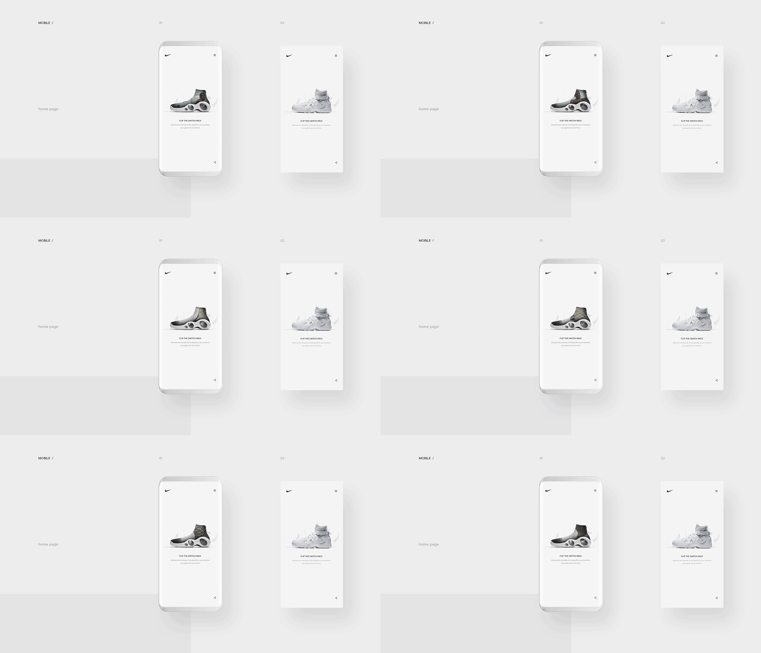
Concept - Nike App 
  • Minimal Colour Scheme
  • Stripped Back Information
  • Neutral Colour Palette
  • White space remind me of Gallery 


Event Brite


OUGD603 - Brief 01 - Art Platform - Initial Research

To start my research I asked my peers, friends, and family who are creatives or interested in the art scene, the platforms, websites and methods they use to find artists, galleries, and exhibitions which they are interested in. 

What platforms do you use to find this information? 
  • Eventbrite
  • Following Facebook groups 
  • Art Gallery Websites: Tate, V&A etc. 
  • Timeout website events page
  • Eye magazine events page (here)
  • See events other people are attending on facebook  
  • Googling: galleries in ______ (city)
  • Word of mouth
  • Websites such as Leedslist
  • Instagram - Friends
  • Various Art and Design Magazines
  • Design Blogs - It's nice that, booooom, creative review
The problems with these methods are that it is easy to miss events, as not everything is featured on these websites. You're only getting a small fraction of the and picture and when you do it is hard to save the event in your diary and difficult to find similar events again. 

Helpful features that you would want for an app/website

Push Notifications
  • New exhibitions in your city
  • If your favourite artist is in a city near you 
  • Design talks in your city
  • Disciplines you're interested in.
How you search 


Search everything in different ways:
  • by city
  • dates
  • artist/designers name
  • events
  • galleries
  • exhibitions 
  • Interests: photography, illustration, painting, sculpture etc. 
Algorithms 

Builds algorithms based on things you've attended of things you'd like, related artists, rate the event, etc. 

Calendar/Favourites

Save favourites and events that interest you to your own personal calendar so you never forget about an event, reminders of dates. 

User

Anyone with an interest in the art scene/design world which can range from students to OAPs. Needs to be accessible to all. 

OUGD603 - Brief 01 - Art Platform - Brief Outline

Design a platform aimed at young creatives that makes finding art and events when visiting new cities easier and more accessible. Make it aesthetically pleasing and easy to navigate, eliminating any unnecessary information. 


The Problem

Often when looking for something creative to do like visit an exhibition, attend a design talk, go to a gallery or attend a workshop, creatives and those interested in the arts are faced with the arduous task of trawling through various websites, design blogs and magazines to find something to do that they're interested in. However, this method still means a number of events slip under the radar, as without visiting the right sites it's impossible to see everything that's going on in a particular city or on a particular date at once.

This can be particularly frustrating as every city across the world is teaming with creative events and unless you're completely in the know, the chances of missing something you would be interested in are highly likely. All the information can be found online in some form, but often it is scattered around a number of different websites and wouldn't be found unless you knew what you were specifically looking for or happened across it or heard it via word of mouth/saw it on instagram. 

There are some apps that have attempted this such as Google's Art and Culture App. However, it contains a lot of cluttered information and doesn't use an aesthetic that would be appealing to designers. 

Brief

Create a stylish and user-friendly app/website/ platform which allows creatives to search and find every single art gallery, exhibition, and guest speaker within their chosen radius. Search by artist/designers name, location or dates to find every gallery/exhibition or talk from that person in one easy platform. This world-wide platform would make accessing art easier for everyone, encouraging both professional creatives and members of the public to embrace the art world and be inspired, ensuring no-one will ever miss an event they're interested in ever again. 

Deliverables

Collateral: Website, App, promotional materials eg. poster
Branding: Colour scheme, logo, typeface, name
Animation: How the app/website responds/moves

Inspiration 

Before undertaking this brief you should identify the following:
  • The client
  • The problem
  • The target audience
  • The overarching aim of the project (what are you trying to achieve)
The role of the communications: Deliver a world-class digital experience that engages the audience, how can you maximise the potential of digital devices?

Considerations: Must be global — Digital formats are viewed on a global scale, this must inform your approach and design decisions.

Use mixed media — A combination of image, audio and video should be used to communicate your message

Background / Considerations

In identifying and developing your outcome the production decisions should inform, direct and enhance your overall design treatment. You should consider the following:

Mandatory Requirements

Show a good understanding of design for screen through documented and ongoing design and development.

Your content should demonstrate an understanding of design for screen, which includes but is not restricted to layouts, usability, and design for your audience.

Your finished product should show an understanding of the role of a graphic designer in screen-based delivery, as well as demonstrating industry standard requirements.

Deliverables
  • Blog
  • Detailed wireframes/prototypes and mockups
  • Where possible working/animated/navigable prototypes
  • Design boards and blog posts, which articulate a thorough and informed approach to the brief. These must include; clearly written/interpreted brief, research, idea generation, development, and production.

Inspiration


Wednesday, September 27, 2017

OUGD603 - Level 6 Extended Practice - Mission Statement

I consider myself as a multidisciplinary designer as I have a passion for all areas of design from typography to illustration, however, following on from level 5 I realised the area of design I am most interested in was branding and visual identity. This will form the core of my practice throughout level 6 and my aim is to have a portfolio of work that reflects this by the end. 

This year I also want to improve my skill set, with the intention of creating a variety of outcomes using both digital and print media. My aim is to have a portfolio which showcases a variety of disciplines from UI and UX to typography and editorial design. All the while I want to be able to link these projects back to an overarching strong visual identity. To achieve this, I aim to teach myself how to use Adobe XD and Glyphs mini, a typography editing software and familiarise myself with other programmes I haven't yet used such as Adobe LightRoom. I also want to become more proficient at using the photography studios to take my own product shots, therefore plan to arrange a tutorial to go through the lighting and camera settings to achieve professional photographs. 

Looking back on my portfolio from Level 5 it is clear that I have developed a recognisable illustrative style, therefore this year my aim is to move away from hand-rendered illustration in order to develop my style more as a graphic designer using purely image, type, colour and layout.  I also want to enter D&AD as it's something I've never entered and this year will probably be my last chance to do so as a student. 

Finally, as I consider myself an ethical designer, to prepare myself for the industry I want to delve into issues surrounding gender disparity, equality and diversity as well as how graphic design can help the world on an environmental level. 

Wednesday, May 17, 2017

OUGD505 - Evaluation

This module has been the first opportunity where I have explicitly had to focus on the ethics behind design and production and how to make work which is 'designed for good.' Ethics is something that I had never really associated with graphic design however it has been beneficial to my practice learning about how design can influence our community in a positive way. 

Studio brief 01 allowed me to research into the history of Leeds as a city and discover an array of multicultural and exciting events that has shaped Leeds into the city it is today. As traditional print isn't one of my strongpoints I wanted to use this project as an opportunity to create a piece of design that was really fun, bold and humorous, something that I would enjoy working on and look forward to printing. 

I really tried to push myself in the idea generation process by coming up with at least 10 individual designs and ideas for the poster that could each work in their own right as a stand out and vibrant poster. I'm really glad I did this as my final idea of merging a pigeon with a flamingo inflatable only came at the very end of the idea generation process after combining a range of my initial sketches into one humorous and clever concept. This has taught me a valuable lesson in the importance of brainstorming and not just going with the first idea that pops into your mind. All my peers thought it was really clever but light hearted design which is what I was aiming for. 

Although I went for screen printing again in my traditional print this year rather than lino or mono printing I tried to push myself and learnt how to make an image half tone to create depth and shadows, which was a new skill for me. 

I definitely struggled with my time management for this module as it initially overlapped with COP and Responsive during its early stages, therefore I ended up putting a lot of my time and effort into those briefs, which resulted in me neglecting this one. Unfortunately my preferred way of completing work is to focus on one project at a time however I know this will not be a realistic approach when it comes to 3rd year and after I graduate so this is something I will have to try and improve on in the coming months. That being said, as the year has progressed I have found myself being able to undertake and ultimately produce work a lot faster than I could in 1st year without the quality being affected, which is something that I'd initially hoped to improve on at the start of the year. 

Once I got into it I particularly enjoyed studio brief 02 and the idea that you can find an issue whether that be political, social or ethical and resolve it through the use of design. If I had applied myself sooner I feel I could have come out with some more unusual and refined ideas and designs however I'm happy with what I produced and think the entire range of products looked really smart and cohesive when gathered together. If I had not been so pushed for time I would have liked to make an animated video showing the benefits of a lending library as part of an advertising campaign and would have animated my screen based designs to showcase the user experience.

 The lending library idea has a lot of potential to be made into a reality, therefore it's exciting that I had the chance to explore this concept while it was still relatively new. 

OUGd505 - Studio Brief 02 - Final outcome


The Problem

Communities are starting to become more and more detached from one another, losing the sense of knowing your neighbours and becoming less active within the community. With a rise in house pricing, more people and families are finding themselves with less space, and less funding for expensive objects such as DIY tools, camping gear, and other large miscellaneous objects, that are only used once or twice a year. In our wasteful society, the idea of sharing commodities would not only benefit people's wallets but the environment too and reinforce the benefits of belonging to a community, sharing and borrowing commodities.

The Brief

Encourage people to 'lend not spend'. Design the end to end branding for the Leeds branch of a Lending Library, a place where Leed's inhabitants can go to borrow objects for designated periods of time as and when they need them. The design needs to be accessible and engaging to all ages from students to OAPs.

Outcome


The outcomes I have created answer the brief as I have produced a range of collateral from library cards to leaflets to an advertising campaign. The designs are bold and vibrant without losing touch with the practical service behind them. The lending library provides a service where anyone with a membership card (only £7.50 a year for OAPs and students) can access commodities such as tools, camera equipment and cleaning products all year round as and when they need them. 

I also created a website and a mobile web page as I wanted the online catalogue to be accessible to anyone, anywhere, whether you're retired and sat on your computer at home or a busy student sat on the bus or running errands.  

Feedback

18 - 60 year-olds

The feedback has all been really positive with everyone asking why this wasn't already a thing. As the target audience was so broad it was important to create perfect balance between a young, modern and engaging design as well as informative and straightforward. The colour scheme I used kept the branding engaging as well as highly legible at all sizes, whether it was on a sticker or A3 poster. The flyers and leaflets quickly and succinctly explain what the lending library does and is for and the tone of voice is kept friendly and welcoming. 

Evaluation

I am happy with he final outcomes and think the finished designs all tie in really well together. Throughout the project I kept referring back to the module's title 'product, range and distribution to ensure that I wasn't going off track and had covered every appropriate solution to these 3 criteria. The methods of distribution I specified have maximised the amount of people the campaign would reach and I think it has really good potential to be made into an actual service and product. I know I would use it! 

OUGD505 - Studio Brief 02 - Photography of Collateral