Following on from my initial research I started to kickstart the design process by making rough sketches of any ideas that came into my head.
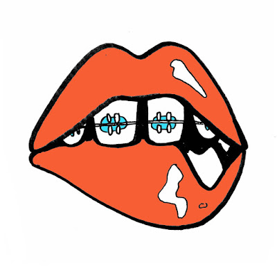
I started off with Jack Garratt's track, Worry, focussing first on the key lyrics within the song. I drew inspiration from 'Pick apart the pieces' thinking about imagery that could relate to these words such as broken pottery, jigsaw puzzles, flower petals and the game 'operation'. Some of the other lyrics I felt could be visually interesting were 'when my eyes are closed I start to feel you staring at me' 'sounds of women I'll never meet', hence the lips and eyes, as well as 'this moon of ours only shines a half to make me feel whole' and 'I felt your breath in every step I take when the wind blows'.
Then I looked at general imagery related to the word worry such as thunder clouds, the worry emoji, and biting nails.
Finally I was inspired by the way Jack Garratt performs his songs in such an impeccably timed and passionate way, playing a number of instruments all at the same time, hence the drawings with the mr Tickle arms, imitating a sense of urgency and confusion.
Gif compiled of my initial sketches and ideas:
My favourite ideas for the Secret 7" sleeve:
Top Left: Broken Pieces of pottery inspired by the lyric 'pieces you left'
Top Right: Tweezers picking out the broken heart in the game operation, inspired by the lyrics 'Pick apart the pieces you left'. Symbolises how his ex is playing with the singer's broken heart.
Bottom Left: Also inspired by the same lyrics, this image shows a pair of hands picking apart a tiny model of the singer's body. She is picking apart what she left (him) in the most literal sense of the meaning.
Bottom Right: This is inspired by the passionate and talented way Jack Garratt performs live.
Bra: Inspired by the lyrics 'pieces you left' I thought of possesions left behind like bras and hair clips.
Thunder Cloud: Imagery resonating with the word worry
Experimenting with my favourite idea in colour, I'm not 100% happy with this resolution for some reason, perhaps the colours or composition but my crit group thought it was extremely effective and that I should just submit it how it is right there and then:
This is the same idea created in a different composition with different illustrations and a new colour scheme. I'm not sure how effective I think it is:
The music video features a giant gorilla named trevor and a lot of raunchy imagery however I didn't want to focus too much on what the music video as that is the vision of another artist and I wanted my album cover to be original. I tried to focus more on the lyrics of the song and the way it made me feel than what I'd seen in the video or the psychedelic artwork that had already been produced for tame impala. When drawing my ideas I thought of stereotypical teenage parties, sneeking out, young love, innuendos and innocence as well as lyrics in the song such as 'go on superman, say your stupid line' and the title of the song itself, 'the less I know the better', which also ties in with the theme I was going for of 'leaving things to the imagination'. You could imagine the worse yet still be blissfully unaware of what's really going on.
Sketches of initial ideas:
4 favourite ideas:
Ideas with colour:
Mocked up as album covers:
I presented these ideas in a group crit and got a lot of positive feedback.
One of the comments was that I could use the set of thumbnail drawings I did as a design in their own right as it looks like a comic strip of events relating to the lyrics of the song.
These are 4 ideas that I had for album sleeves which I didn’t submit into the competition s I didn’t think they were as visually eye catching or ‘obvious’ as the others.
I also discovered that an almost identical version of the lips design had already been entered a few years earlier.


No comments:
Post a Comment