Today we had a helpful workshop on the use of colour swatches in analogue printing methods and why they are regularly used in the production of publications.
Colour swatches are used in design for a number of reasons. The first is to ensure a consistent colour palette across a range of publications and media, perhaps for if you were creating a number of different products for one brand, swatches help to maintain consistency of the brand and abide by copyright laws.
The second is to reduce printing costs. Using a limited yet consistent colour palette can reduce the costs of ink, as if you were spot printing, less types of ink would need to be used and in cases with less than 4 inks yoou wouldn't have to use CMYK which would greatly reduce costs.
Swatches also help you keep the exact pigment you want without having to make it time and time again, making the actual design process much quicker. They also allow you to change every example of that one colour used in the document, simultaneously at the same time. Meaning it's far quicker and easier to tweak elements of a document.
You can also save swatch palettes to be used at a later date without having to waste time going back and trying to recreate the same colour palette for a new document. Swatch palettes can also be used across a number of adobe programmes including illustrator, indesign and photoshop.
Making a swatch global allows you to create different pigments for a certain colour which will automatically adjust if you alter the colour in any way.
Finally through the swatch panel you can access the pantone colour system, allowing you to print consistent colours on a universally recognised scale, allowing you to correspond with clients from anywhere in the world.
Monday, October 10, 2016
OUGD504 - Studio Brief 01 - Stock
For my publication I started to consider which stock would be appropriate to use.
'Gloss is considered better suited to full-colour reproduction of images, but it's shine can interfere with the readability of the text. For this reason a matt stock offers a workable compromise when reproducing both image and text.' - Ambrose / Harris
4 different types of stock were experimented with in the making of my publication. After visiting Fred Aldous and realising that most of the stock they had was thicker than 120gsm it soon became apparent that this stock would not be suitable for the inside pages of my publication. It was also fairly expensive at £3 or more per A2 sheet. However they did have a lot of stock that I could potentially use for the cover.
Going back to the digital print room at uni I decided to do a couple of test prints with the satin, glossy, matte and recycled papers.
Satin - High quality paper with clean, crisp, bright finish. Unfortunately the drawback with this paper was that it doesn't print double sided meaning it would not be suitable for my publication. This type of stock would be suitable for photo books or one off wall prints.
Glossy - The glossy paper was 80gsm so quite flimsy and thin and seemed like it would appear cheap when used in a publication. You could also see the images from the other side of the paper coming through. If it had been a bit thicker it would have been more appropriate for this publication, however as I wanted it to have a more quality and aesthetically pleasing feel for my publication I decided against using this stock.
Matt - This was a lot more durable and gave a nicer finish. The images did not come through the paper onto the other side when printed back to back and they appeared glossy on the paper. The thicker stock also felt more high end and nicer to flick through. The bright white paper didn't discolour the images making them appear crisp and bright.
Recycled - This paper had a slight yellow tint to it which made my images go an off greeny colour. It was also very thin and creased easily. It did not give a good finish and looked like it would make the publication look cheap and tacky.
Following this research I decided to use the 120gsm matt white paper for my publication as it was the most suitable paper that the college produced for the design and did make the images look bright and engaging. If the book was going into an actual industry standard print run the design does lend itself well to this kind of paper so the stock would remain the same, if not slightly more satin.
Friday, October 7, 2016
OUGD504 - Studio Brief 01 - Peer Feedback Crit 7/10/16
Some of the feedback I received after the crit.
Q] Should I do the Graffiti book or the book on the devonshire quarter?
'Book on the devonshire quarter as it combines the two together and shows off the diversity of the streets in sheffield.'
I'm glad that my group agreed that I should focus on the devonshire quarter combined with the street art found there as my tutor also suggested that it keeps the concept of the book more interesting rather than another book on graffiti as it paves way for more ideas on how to make the book more unique and covetable.
Suggestion: 'Could print of your own stickers that can be used interactively by users in the book to put next to their favourite example of typography which can be found in the publication once they've visited the place. Attracts other people to buy the book / find out about it. Makes the book more fun. '
This was a really interesting suggestion that I think I will use in my publication as I wanted to look for a way that makes the book interactive and this is a really simple way to do so. The streets of the devonshire quarter are filled with lamposts and parking ticket machines covered in unique and interesting stickers, some of which are featured in the images of my book. It would be interesting to see the people purchasing this book contributing to the street art and typography found there by sticking the stickers from the book to the location themselves.
'Make an app which details where the locations of the book can be found, where you can check in etc.'
John suggested that if I was to take the project further I could design an app to go with the book that would make hunting down the typography interactive and more engaging.
'Make it cheap to produce.'
The book would be for students and younger creative people so the price would have to be quite cheap.
After the feedback I am much clearer on the proposal for my book and the route in which I want to take it down.
Thursday, October 6, 2016
OUGD504 - Studio Brief 01 - Publication Proposals
IDEA 1: Mark making trail
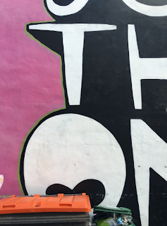
Sheffield is a vibrant and multicultural city with a whole host of different examples of talented Graffiti artists and young creatives.
The first concept for a publication was to explore the typography found within the streets of Sheffield focussing particularly on street art, graffiti, stickers on lampposts and other examples such as carvings in tree trunks etc. The mixture between urban Street art which is praised and encouraged and the contrasting graffiti that can be found alongside it would create an interesting mix of content which divides opinions on what can be considered as beautiful to some and ugly to others.
The book would be used as a field guide to seek the examples featured in it for yourself and would have a check list for the ones you found, and coordinates for the location of each picture.
The audience would be anyone interested in street art, young creatives and people from sheffield who love and work in the surrounding areas.
The book would have a soft but durable cover and be glue bound. The stock would be water resistant and sturdy to stand the wear and tear it would be put through when taken outside and used in a physical way.
As it is aimed at a younger target audience the cost would have to be kept relatively cheap as not to to deter sales and would be under £10 to buy. It would be stocked in independent gift shops in areas of sheffield like the Devonshire quarter and Ecclesall road where this kind of cliental can be usually found.
Production wise, I would look into materials such as spray paint to make the book and see if it could be incorporated into the printing methods at all.


IDEA 2 : The Devonshire Quarter
This book would explore the variety of typography that can be found in the vibrant urban village of the Devonshire Quarter in Sheffield, nominated for the Great Neighbourhood Award in 2015.
The book would be a cross between a field guide and a coffee table book, encouraging visitors and residents to look closer at this electric and culturally diverse part of the city.
It would include a mixture of street art, graffiti, independent shops, cafés, restaurants and pubs.
The demographic would be the young 'hipster' people and students from Sheffield, who you would typically find in the Devonshire Quarter.
The publication would have a soft but durable cover, so it would be splash resistant from coffee drinkers and would survive the elements when used as a field guide.
There would also be a nod towards it's history of old cutlery works through the use of patterns on the inside covers and also think about the more modern events that happen there annually such as the hugely popular tramlines festival.
The book would be sold in the independent shops in the area and retail for about £10.
It would be thoughtfully made and attractive to look through, which would further attract the same young, creative type of cliental.
Content wise I could have small subsections of whether the type featured was from the street, a cafe or a restaurant so I would have to look into vector imagery and symbols to make the publication more universal for perhaps foreign visitors, and also look at ratings and quotes on each establishment.
Or whether to just note down the coordinates on each location and just the name of the establishment.


Tuesday, October 4, 2016
OUGD504 - Studio Brief 01 - The Form of the Book Lecture and notes
After reading the Essay by Armand Mevis: 'Every Book Starts with a New Idea', I jotted down some key quotes that will influence the way in which I design and prepare my own publication for production.
'Mistakes are inherent to the job of making books'. - You must learn from trial and error, make sure you book multiple print slots and allow time for things to go wrong. Some successful elements happen by accident. Must experiment.
'All books start with a question...you have to find out what that question is' - The clearer the question the easier it will be to design a book with a solution, making it appeal more to a particular target audience. All books are published because there is an opportunity for them and a gap in the market. If you can word that as a question it will inform the target audience and purpose of the book.
'You need to be open, to know how to reinvent and to rethink what a book can be.' - Listen to the advice of your peers and take opinions on board. It will make the book much more appealing to a wider target audience. You have the content but you need to reconsider the concept and have multiple directions.
'understanding what the book is about it essential.' - Don't lose sight of the purpose of the book, it will make the content confusing and its purpose will be irrelevant.
'Sometimes there is too much design and not enough content and vise versa. You need to find the right balance.' - You don't want to overpower the book with overly complicated design.
'If you are able to link the content to your concept and the concept to a form, you have succeeded.'
Extra Points: Have confidence in your own design. Don't try to be someone you're not. Explore your own ideas.
Monday, October 3, 2016
OUGD504 - Type in context publication - Target Audience
While I was in the Devonshire Quarter I made a tally of the ages of people that I spotted in the area to gain an insight into the demographic that my book would be aimed at and appeal towards.
My research was conducted between 1pm and 1:30 pm on Saturday the 1st October 2016, a time and day when most people don't have work, university or school so would be free to visit the area.
The main age groups that I found to visit were students aged 16-25 year olds and young professionals aged between 25-30 yrs. However a range of ages was prevalent throughout the investigation.
This gave me a clear insight into who the target audience would be and who to have in mind when producing the book, making it young, bright, colourful, engaging and eye catching to the most common demographics.


Tally Chart

Bar Chart
OUGD504 - Studio Brief 01 - Review of Project - Change of Direction
Following the presentation to the class on Friday i realised I needed to give some more thought to the concept of my publication. I had a vague idea of what I wanted the content to include but hadn't really considered the audience of the book or where it would be sold / who it would appeal to.
I also didn't fully know what the purpose of the content would be, eg. a typography trail for students from one starting point to a finishing point, or a book on the history and culture of Sheffield, looking at it's typography along the way.
Both of these ideas seemed to have huge gaps in and neither concept was very solid.
For this reason I decided to go back to Sheffield and have another walk around looking at more typography to inspire me to consider furthering my ideas and illuminating a new concept.
This is where I realised a lot of the typography that I was interested in originated from a very concentrated area of Sheffield, The Devonshire Quarter. This area has a lot of historical importance to me as both me and past generations of my family have been born and raised in Sheffield for most of their lives on both my mum and dad's side.
My dad began his career at the old firestation on division Street which is now Bungalows and Bears and his grandfather was a marks maker for the cutlery industry in the early 20th Century, so I felt a strong connection to this particular area. It also has a very interesting history as back when Sheffield specialised in the production of steel, the Devonshire Quarter was a hub for making cutlery and other specialised steel products.
'Explore the streets around the Devonshire Quarter and you’ll come across the buildings of former cutlery and silver plate works – and, for a glimpse of how Sheffield looked during its industrial peak, take a walk down Milton Street. Here lie the listed Beehive Works and Taylor’s Eye Witness Works, the latter thought to be the city’s only remaining factory still manufacturing the original products that gave it purpose when it opened back in the 19th century.' https://www.creativetourist.com/sheffield/devonshire-quarter/
The Devonshire Quarter also boasts a long list of independent cafés and shops, which trade in everything from vintage clothing (such as at Vulgar and Freshmans) to curious-looking houseplants (Moonko).
For this reason the book lends itself to being a coffee shop book, however the small area division street covers would also allow it to be a handy street guide that people could take with them to find the typography for themselves.


Subscribe to:
Comments (Atom)