- A functional navigational wayfinding system for your selected environment, informed by thorough research and development.
- The identification and selection of an appropriate, consistent typeface. Consideration of appropriate type styles and sizes for specific uses.
- The development of appropriate pictograms for directions and identification of facilities.
- The identification and selection of a limited and appropriate colour swatch with associated PMS, CMYK and RGB values.
INITIAL IDEAS
By exploring a variety of ideas for a way-finding system in the Light I developed a few possible concepts that I thought had potential.

The first idea was to mark out the floor number and establishments on each particular floor with large 3D metal numbers. The numbers would stand at the top and bottom of the escalators and next to the entrances and have the names of the establishments on that floor engraved onto the side. The drawbacks to this design are that you can’t see where other shops and restaurants are in the building and legibility would be hindered from a distance.

A different idea was to have a starting point in the centre of the room and have a number of different trails running off from it in the direction of the different establishments.
These trails would either be painted onto the floor, vinyl stickers or light bulbs built into the floor.
The issues with this design were that the floor is made of marble and stone, therefor paint or vinyl sticker would clash wth the natural colour of the floor and lights would not show up very well in daylight hours. Another issue with this design is the the “pathways” could get crossed over and there are too many different establishments on each floor for the system to be easy to understand. Also, visitors would never use the same starting point each time and always enter from different doors. Following the pathways would also stop customers browsing in different shops.

Similar to the metal numbers idea, another concept was to make use of the brick walls in the Light by painting giant numbers onto the walls, again listing the various establishments on that floor. These would act as only part of the wayfinding system, and be more decorative than informative. However it would allow customers to quickly decifer what floor they were on and what establishements were on that floor.
The use of directional signs and markers in the Light would be hindered by the building's architecture with it's high ceilings and wide open plan spaces. Therefore a different strategy needed to be made to help guide users through the environment. Making changes to the existing wayfinding stystem so it was more legible, easier to understand and had a more consistent design, seemed like the most appropriate path to go down.
Designing a map that had the floorplan for all 4 floors on each map rather than just the currrent floor like the existing maps would increase the legibility of the current way finding system in the Light. Redrawing the floorplan using clean, straight, lines and a consistent use of line weights, colours and typefaces would also improve the effectiveness of the current system. To decipher which floor the visitor was stood on, the design would incorporate some form of highlighted section to allow that particular floor to stand out on the map. This could consist of exaggerating the details on that floor, making it glow, using a different colour or blocking the other floors out.

A slightly more off the wall idea was to create a ‘Lightbulb Tree’ which would point customers in the direction of their desired establishment.
The ‘branches’ on the tree would point in varied heights and directions of specific establishments in the shopping centre for visitors to get a rough idea which way to go. Issues with this design however included how to display place names on the lighbulb tree, how to make the tree legible and understandable from a distance and up close amongst a number of other design floors. Therefore I decided against following up this idea.
After looking through my initial designs and calculating their plausibility and usability, I decided to continue with 2 of the ideas:
- A series of floorplans illustrating the establishments on each floor
- The Painted wall numbers
PICTOGRAMS
Before making a start on the floor-plans a series of pictograms had to be designed. These included:
- Toilets: male / female / disabled
- Lifts
- Escalators
- Carpark
- Fire Exit

These are the initial sketches for the escalators [on the left] and the car park [right]. I wanted the designs to be more unusual than regular symbols as the Light is a more upmarket establishment, so a more refined and elegant set of pictograms is required.

Above are the sketches I made for the toilets and lifts.
By developing the initial sketches by making them into vectors using illustrator I could test the pictograms legibility at different scales aswell as making them look much more professional and ready to be applied to signage around the building.
The designs in vector form:

Lifts / Toilets / exits

Stairs / Escalators / Car Park

Above are the final pictograms.
FLOORPLANS
By tracing over the photographs I had taken of the preexisting floorpans in the Light using Illustrator I could begin creating a set of vector drawings for a new way finding system.
Instead of using hand rendered effects I kept the lines clean and minimalistic by using consistent line weights and strokes. Doing this created a more modern and refined design than the one currently in use at the Light.
This was the initial skeleton for the layout of all 4 floors: Courtyard Level, Arcade Level, Balcony Level and Upper Balcony.

Incorporating symbols into the design was also a crucial part of the floor-plans readability. I had to consider which symbols needed to appear on the floorplans and whether to include the names of the establishments within the diagram or to use numbers, or letters.
Using names or the company’s logotypes would make the design too cluttered so in order to keep the design minimal the floorplan would feature numbers for the establishments, similar to how the floorplans at the Trinity Cente work.

By studying the Light’s pre-existing floorplan I could see it was successful how landmarks such as the street names outside the doors could be used as reference points for visitors, therefore I decided to also include them in my map.
The floorplan element of the map consists mainly of numbers and pictograms such as the lifts, esclators and toilets as not to over complicate the design referring back to the main design principles for a successful navigational system.
- Do not make them think
- Create a comprehensive, clear and consistent visual communication system with concise messaging.
- Show only what is needed
- Show information what relevant is to the space, location and / or navigation path.
- Remove excessive information
- Remove unnecessary elements to create a clear visual environment ahead.
[http://designworkplan.com/wayfinding/introduction.htm]
The establishments were numbered in the top left corner of each rectangle to keep the design, consistent, legible and easy to read. Aswell as this Street names, directional arrows and directions to other levels in the building were added to the design.
The order in which the floorpans should appear was also a crucial element of the design regarding legibility At first I wasn’t sure whether it should be laid out in physical order or order of readability (from top left to bottom, with ground floor being at the top. )
After referring back to my primary and secondry research I found that the majority of floorplans designed in this way were laid out in their physical order with ground floor being at the bottom of the map.
This led me to shuffle the entire design around resulting in this:

A list system was then needed to work in conjunction with the floorplans explaining which establishments are on each floor allowing visitors to easily find their way around the building.

This is how I envisioned a map of my floorplans to look with a column of large numbers in a serif font indicating the floor levels so visitors could easily determine where they wanted to be. At the moment the Light does not use floor markers such as these to determine the different floors. Their system consists of Courtyard Level, Arcade Level, Balcony Level and Upper Balcony. To new customers this could be a potentially confusing system as they wouldn't know which level is positioned there purely from reading the names. To get around this a combination of the floor name and floor level would be used in the design.
A coded list of establishments that corresponded with the numbers on the actual floor plan itself would run down the middle column.
The floorplans would then run down the right hand column in order of physical appearance, ground being on the bottom and the third floor being at the top.

For the large floor numbers I wanted to find a sophisticated, yet slightly unusual serif typeface that would be easy to read from a distance, yet add an elemenent of style and elegance to the design.
After searching through various typefaces on DaFont Mike Diehl and Paul Volk’s 1991 font ‘Edition’ particularly stood out.
The elements about this font that struck me were it’s long tall capheight and ascenders, which resonated with the building’s architecture with high ceilings and tall glass windows and doors.
Its varied line weights, especially on the 2 also stood out to me. I felt the other typefaces I had looked at (the bottom 4) were all a bit too chunky and art deco and didn’t really give off the sleek, elegent tone I was trying to portray.
The serif element to the typeface was also crucial for the design as I have learnt in previous study tasks, adding a serif to a letter form allows it to become slightly more legible to the viewer, and when reading my floor plan from a distance I needed my typefaces to be as legible as possible.

Next I had to choose a typeface to use to display the floor level names eg. Arcade Level, as to not confuse pre-existing customers and regular visitors and to also display the names of the establishments.
I went back through my research to see what had worked effectively on other designs such as the floorplans for the Trinity Centre and Leeds Art Gallery, and found that sans serif fonts were regularly used for the smaller sections of text.
However referring back to previous research for other projects, when it came to smaller printed text a serif font had always been more fsvourable as the most legible.
Therefore, for my design I chose a typeface that encompased elements of both serif and sans serif typefaces. The font I went for was Andale Mono, a monospaced sans-serif typeface designed by Steve Matteson. The interesting thing about this typeface was that it has slight serifs on letters such as the g, i , j and l.
The typeface is also has some other unusual characteristics such as a dot inside the zero.

Experimenting with just upper case and a mixture of both upper and lower I found that a mixture worked better for legibility and was also used in the other way-finding systems I had studied.
COLOUR SWATCHES

I wanted to keep the colours for my wayfinding system in the light, earthy and timeless yet modern aswell so it wouldn't clash with the building’s architecture.
Currently the building uses a whole host of colours in their colour scheme consisting of pink, yellow, burgundy and light blue.

Not only does this look unrefined and clumsy but it also creates an inconsistent way finding system.
I wanted my colour palette to seamlessly blend in amongst the stone and brickwork of the building creating a timeless wayfinding system to be enjoyed by it’s visitors for years.
For this reason a neutral colour palette of charcoal grey and white was the most suitable for my design. Specifically the colour #46464
COMBINING DESIGN ELEMENTS
This is where I started experimenting with putting all the elements of my floorplan together, considering composition, scale and colours.
The order of establishments goes in clockwise order / starting at top left then going down around the floorplan. This is easier to understand than listing the establishments in alphabetical order on each floor as there are not that many buisnesses in the LIght so finding a specific establishment would not take too long.
Using a dark charcoal background with the writing and floorplans laying on top in white for increased legebility. Muted, earthy tones resonate with the materials used in the building’s architecture and allow the design to remain timeless despite passing trends and fashions.
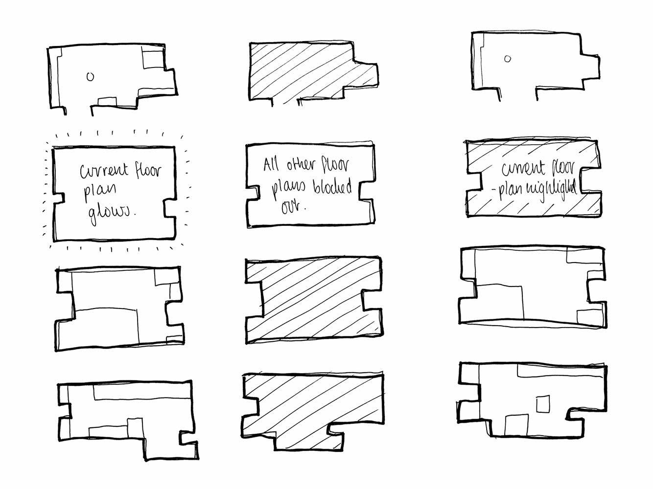
Experimenting with a number of different designs to help the visitor establish which current floor they were stood on, enabled me to choose the most appropriate outcome.
Using a dotted line between the names of the establishments and their corresponding number aided with legibility as it helped the eye travel across the layout easily and naturally without getting lost.
Here are a few experiments of floorpans using different techniques to highlight specific maps.

This design shows a backlight to highlight the current floorplan and floor number while the others remained just painted/engraved.

Here, a completely different approach of blocking out the details on the other floors and just leaving filled-in outlines looks quite effective aesthetically, however it is not practical and almost draws the viewer’s eye away from the current floorplan. You also can’t see where anything on the other floors are positioned, which may hinder the wayfinding experience.

This design softly highlights the current floorplan by using a lighter grey background behind the map.

For this floorplan adding a bright orange to the current floorplan introduced a touch of colour into the design and brings it to life. The issues with this design however is that the colours clashed slightly with the elegant yet earthy colour palette of the building's architecture and that of the rest of the design.

The most effective floorpan was the one that used a backlight to highlight the current floorpan as it is clean, elegant and minimalistic subtly highlighting which floor you are on, yet it is easy to read the information for the other floors if you want to.
Using Photoshop allowed me to test how the design would look in it’s environment using by creating a stand and positioning it over a photograph of the Light.
I applied it in two different formats to test how well it would work against a wall and as a stand-alone piece of signage.

At first I was concerned that parts of the sign such as the ground floor section would be too close to the floor and hard for visitors to read as it would mean them having to bend down to view the information.
Positioning the map on a plynth helped with this drawback.
The small projected ‘shelf’ also displays the current floorplan the visitor is stood on, further aiding legebility.

The signage would be positioned on the wall between 900 and 1800 mm above the ground for maximum legibility to the broadest target audience.
It is important to not have the signage too low in crowded areas such as walkways as signage may become obscured and customers may feel pressured to rush when stopping to look at the information as to not be in the way.
This is how the final pictograms look when combined with the colour scheme. The shapes successfully stand out against the dark background and would be easily legible from a distance, as the contrast between the symbols and signage would be high.

I then tested the legibility of the designs by photoshopping them into their chosen environments to see how they would look.

One possible application of my design could be the use vinyl stickers to apply my pictograms to their environment.
Vinyl stickers are an excellent alternative to paint and stencils for the following reasons:
• Require no paint, no paste and leave no residue. They are a lot cleaner and easier to apply.
• Affordable, they are instant to apply and wouldn't require a professional decorator.
• Easy and quick to remove without damaging the wall or paint.
• Available in a wide range of colours, sizes and shapes.
• Affordable, they are instant to apply and wouldn't require a professional decorator.
• Easy and quick to remove without damaging the wall or paint.
• Available in a wide range of colours, sizes and shapes.

This gives a sense of how the car park pictogram would look when applied to a glowing sign, demonstrating how effective it would be in different mediums.

Lift Pictogram applied to a brick wall, demonstrating how it would work as a stencil.

Fire exit symbol applied to glowing neon sign.
No comments:
Post a Comment