
Mexico City 1968 utilise an alternative approach of using symbols rather than figures to represent the sporting events. This approach limits some of the sports such as fencing as some sports are harder to display than other sports using purely objects. The difference in colours and line weight also creates some inconsistency amongst the symbols.

The Munich 1972 Olympics revolutionised the way symbols for way findings were designed. These were developed by Otl Aicher.
'The pictograms present schematic silhouettes in typical sports poses. A system of graphic and geometric rules standardise the design of the symbols. A checkered grid acts as the reference for their development and design. The lines of the pictograms are constructed based on angles of 45° or 90°. The silhouettes are produced with a limited number of body parts: the head, trunk and limbs. These are formed by a line of constant thickness.'
The style of these designs and the thought and development behind the grid system acted as a milestone in terms of pictogram design for both the olympics as well as in general. The way some sports are represented, such as modern pentathlon or sailing, influenced the sets of pictograms for later editions.

The style of these designs and the thought and development behind the grid system acted as a milestone in terms of pictogram design for both the olympics as well as in general. The way some sports are represented, such as modern pentathlon or sailing, influenced the sets of pictograms for later editions.

Barcelona 1992's pictograms are reminiscent of calligraphy and traditional Japanese writing, similar to kanji, where shapes of objects influenced the shape of the words and letters. In this design only the head legs arms and equipment is represented, allowing the eye to suggest where the trunk of the body would be. A lot more emphasis is given to the artistic style rather than the readability of the symbol.

Atlanta 1996's wayfinding is a lot more anatomically correct with almost complete figures shown with a lot of details with defined muscle and striking silhouettes. The drawings are a lot more reminiscent of traditional drawings rather than symbols, and they are extremely translatable and easy to understand. The figures were inspired by those found on Ancient Greek amphorae, drawing links with he heritage of the first olympic games.


Atlanta 1996's wayfinding is a lot more anatomically correct with almost complete figures shown with a lot of details with defined muscle and striking silhouettes. The drawings are a lot more reminiscent of traditional drawings rather than symbols, and they are extremely translatable and easy to understand. The figures were inspired by those found on Ancient Greek amphorae, drawing links with he heritage of the first olympic games.

The pictogram silhouettes for the 2000 Sydney Olympic games are cleverly made up of boomerangs, generally one for the legs and two small ones for the arms. The use of boomerangs, traditional hunting tools, pays homage to Australian Aboriginal culture. The pictogram style aims to be dynamic to recall the speed and agility of the athlete. The grainy quality the pictograms are also reminiscent of aboriginal art.
 The Athens 2004 pictograms were inspired by Ancient Greece. Their plain and uncluttered shapes and simple layouts make reference to Cycladic figurines. The silhouette of the athlete and the fine strokes which define the details recall the black-figure vases of Ancient Greece. Finally, the fragments of ancient vases served as inspiration for the irregular shape of the pictogram frames.


The London 2012 olympics combines abstact lines with a more accurate representation of the human form. The pictograms were created with two distinct formats: a “silhouette” version designed for standard use and a “dynamic” which was inspired by the London Underground map and incorporated lines which extend outward from the figures. The pictograms were designed for a variety of uses, including digital and 3D applications.
I decided to base my pictogram on the sport of beach volleyball as it is one of the newer sports at the Olympics being introduced in 1996.
Before I started my sketches i looked into the forms of people who played beach volleyball and the interesting movements which they made.

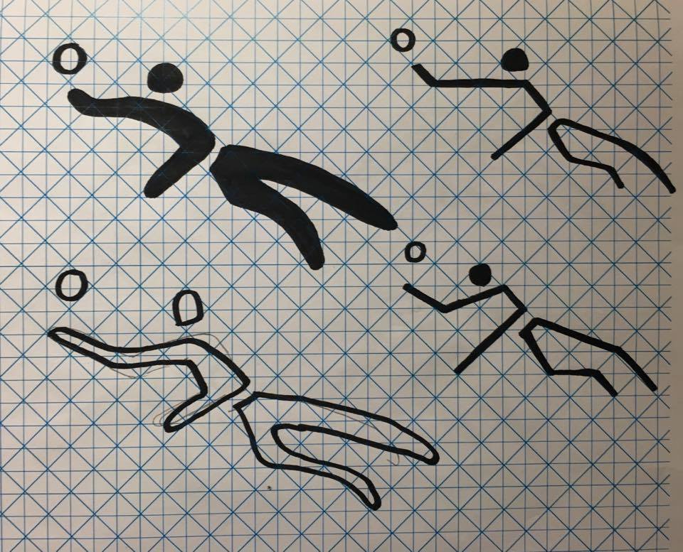
I then sketched out all the the volleyball symbols that had been used over the years for previous Olympic Games so I could compare and contrast the poses. The pictograms for volleyball have been varied and altered a lot over the years as there are a lot of striking poses you can illustrate that still capture the essence and movement of volleyball.

I sketched out a variety of poses that could illustrate the sport but found some more dynamic and energetic than others.

I then sketched my designs onto the grid designed by Otl Aicher for the Munich 1972 Olympic Games. For each form I drew a few different variations in different styles and line weights.


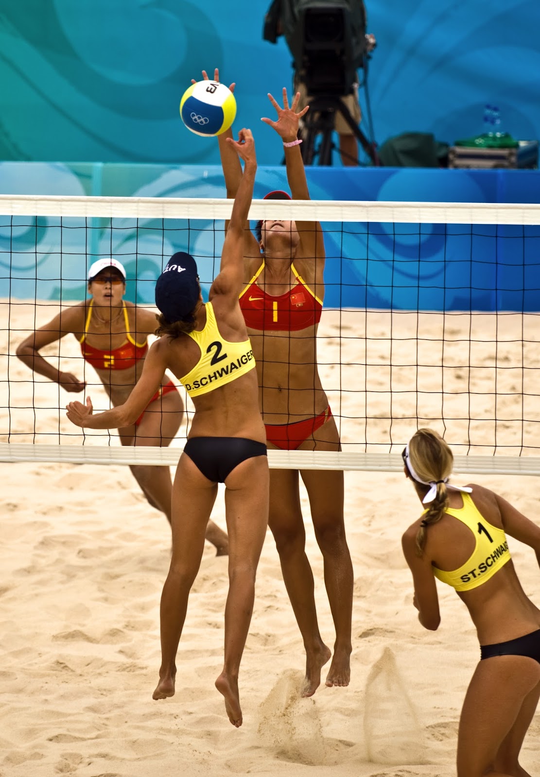
The first action pose I tried to recreate was inspired by this photograph below.

Using simplified shapes allowed the design to be easily translated across all other areas of sport.

I added detail to the ball to further signify the sport that this pictogram was representing.

I made the head slightly off centre of the dip in the next to further enhance the movement and added sand flying from the foot to show that it was beach volley ball. The design effectively communicates the sport as it illustrates the equipment used by adding detail to the ball and clearly defines the sand and movement as belonging to volleyball.

I then experimented with some of the other forms I had drawn to play around with shape and style in illustrator.


This is the symbol I decided to run with for my final design.

I played around with the colour and the composition for use within a shape, here with the edge of the ball leaving the outside of the shape.

However I decided it was clearer to understand from a distance if the whole ball was contained within the pictogram as ultimately it is legibility and how easily the pictogram translates that is important.

Warm colours like orange yellow and ochre reflect the colour of the sand on which beach volley ball is played.

The final design effectively communicates the sport of beach volleyball through its use of colour and form. The simplistic shapes used allow it to be legible from a longer distance and on smaller scales.

As an added experiment I tried incorporating some sand in the pictogram to enhance the design's interpretation as beach volleyball however it wouldn't be visible on a smaller scale or from further away so I don't know how effective this is to the overall design.

No comments:
Post a Comment