Friday, September 30, 2016

OUGD504 - Studio Brief 01 - 6 Week Plan

Week 1
  • Research Art Books - Document size, binding, stock, audience etc.
  • Retake Photos for book in Sheffield
  • Research into layout of different books considering posibilities for stock, binding etc.

Week 2 
  • Choose content for book
  • Look into various contents 
  • Consider book layout / size

Week 3
  • Research and finalise binding methods
  • Research and finalise Grid
  • Research and finalise Stock 
  • Research Print methods used in Industry 
  • Deside how much type you want in book
  • Embossing and foiling workshop

Week 4
  • Edit photos and arrange in book
  • Choose typography to go in book and write the content
  • Design cover for book

Week 5
  • Prepare docs to be printed 
  • Produce cover for book
  • Start trying to bind the book 

Week 6
  • Finalise and bind
  • Make design boards

Thursday, September 29, 2016

OUGD504 - Studio Brief 01- Post Presentation Review

After today's presentation to the class I came away with some helpful feedback to consider when developing my publication further.

Some of the ideas suggested were to make a publication aimed at design students and young creatives to help them find typography and interesting pieces of art and graffiti in a more concentrated area of the city as a short trail of typography. 

The images would have to focus on text and imagery solely related to sheffield's independent shops, cafés and bars to make the book unique to Sheffield. 

I thought this could be extended by making a type trail that was interactive somehow and could have a voucher at the end to attract people to the more independent shops found in this area of Sheffiled on West street, Calver Street and Division street. The publication would be funded by the establishments featured in the publication and given out for free to people wanting to participate in the trail. Once the trail was completed you would receive a free voucher for one of the featured shops. 

OR a slightly alternate difference would be to make it aimed purely at students, focussing on the processes and typography used and having it funded by the university. 

The theme of this book could then be continued in other cities following the same idea.

A second book idea was tocexplore the different cultures found in Sheffiled from it's history of the steelworks, to the football grounds, kehlam island, the city centre, the winter gardens and famous Parks in the city. As well as things like the fire stations and other local areas, considering themes like the full monty, however this could run the risk of being quite tour guidey. 

To keep it marketable I would use beautiful photography that would interest creatives and other people from all walks of life.

A follow up of this idea would be to create a full monty inspired photography trail, this would attract residents of sheffield as well as fans of the film. 

Another idea would be to look at purely the typography found in graffiti and tree carvings and etchings found in sheffield's streets, from actual artists to vandalism. 

Initial Book ideas:


Wednesday, September 28, 2016

OUGD504 - Studio Brief 01 - Art / Photography Book Research

To kick start my inspiration for the project and help find potential routes to take my publication down I began by researching and analysing different art books. Whilst looking at the books I noted down the following elements to see what had been used by previous designers for similar publications.

- Size of publication 
- Binding method used
- Stock
- Cover
- Image Placement
- Image Quality and editing / colour
- Text / the typefaces used / how much text compared to writing / where in the book / content
- Audience 

I started my search at the Blenheim Walk Library by asking to look at the photography books section in the glass cabinets. 

Book 1] 

DUST // Michele Cera

'Dedicated to the face of Albania, it is in fact the binder book of all the faces of Albania, portrayed along that dusty strip of land overlooking the Mediterranean Sea. Michele Cera deconstructs the ideology of linear narrative in order to produce in a single frame the catalogue of the human universe of Albanian people. 37 photos but a large literature on the issue of marginality, geophysical and anthropic in total camouflage.' 

http://www.landscapestories.net/bookreview/bookreview-01-michele-cera-dust?lang=en

Size20.2 x 1.2 x 24.6 cm

Binding Method - Case bound in perfect bound sections with headbands and footbands.

Stock - Thick gloss paper, white

Cover - Matt grey satin cardboard with embossed details and satin photograph

Image Placement - Polaroid style, white borders

Image  - All of the images were high quality with a muted pastel colour scheme flowing throughout.

Text - Title page and acknowledgements, Interview in the back, no text around photos

Type - Caps Lock san-serif typeface for title page, lowercase serif font  acknowledgements and sans serif interview page.

Audience - I believe the target audience for this book is an older age group of 30+ who are aware of the struggles and hardship of Albania following the war. The documentary style photographs further enhance this opinion, however it is also a book aimed at creatives. There is a strong pastel aesthetic running through the pictures in the book with it's matching colours and precise layout. The images contrast the harsh nitty gritty reality of life with the delicate and 'pretty' colour scheme. 


Book 2] 

Real Estate Opportunities - Eric Doeringer 2009

This self produced book is one of 1000 copies that follows Ed Ruscha’s 1970 book Real Estate Opportunities featuring photographs of vacant lots in and around Los Angeles. Doeringer's publication visits the same locations Ruscha had photographed and takes photographs from the same vantage point. In 2009, few of the lots remained vacant - they had been replaced by strip malls, Christian centres, restaurants, etc.Size - 17.8 x 14 cm , 48 pages

Binding Method - Perfect bound with glue

Stock - Matte, satin paper, white

Cover - Soft Cover, Glossy thick paperback, plain white with black serif typeface

Image Placement - Placed alongside text in polaroid form with white border throughout

Image - All black and white photography 

Text - Title page and acknowledgements, location of pictures written underneath photo

Type - Serif font used alongside pictures


Audience - Residents of Los Angeles and from the local area, the way to book is produced and bound would keep the production costs and therefore the retail cost cheap which in turn would make the book more appealing to young creatives and photographers.


Book 3] 

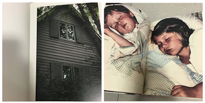
The Epilogue - Laia Abril

'This is the story of the Robinson family – and the aftermath suffered in losing their 26 year old daughter to bulimia. Working closely with the family Laia Abril reconstructs Cammy’s life telling her story through flashbacks – memories, testimonies, objects, letters, places and images. The Epilogue gives voice to the suffering of the family, the indirect victims of ‘eating disorders’, the unwilling eyewitnesses of a very painful degeneration. Laia Abril shows us the dilemmas and struggles confronted by many young girls; the problems families face in dealing with guilt and the grieving process; the frustration of close friends and the dark ghosts of this deadliest of illnesses; all blended together in the bittersweet act of remembering a loved one.'

http://www.laiaabril.com/project/the-epilogue/
Size - Hardback, 172 pages 24.8 cm x 19 cm

Binding Method - Hard back, case bound, perfect binding with headbands and footbands. 

Stock - Thick glossy white paper 

Cover - Grainy textured cover with embossed satin rectangle over photograph 

Image Placement - Mixture of image placement, full page spreads of images, double page spreads, images with lots of white space, text alongside image etc. 

Images - A mixture of found images and reconstructed imagery, all with a quite dark filter / edit applied, muted colours reflects the tone of the book. 

Text - Stories next to relevant pictures, chronological, documenting

Type - Mixture of type writer and serif text used alongside images and for title

Audience - The target audience for this book would be the family and friends of people who suffer from bulimia and those suffering, as well as people grieving from the death of someone who had died from this disease, as well as creatives interesting in darker subjects. Ages 16+ target audience. 


Book 4] 

Rules of the Road // Vitaly Fomenko.

"In the fall of 2014 the world witnessed with confusion, how, headed by the ambitious adventurer Putin, fraternal Russia invaded the Ukrainian peninsula of Crimea. This project reinterprets the problems involved in political territory and movement through Soviet worn-out prints from the 80‘s Sevastopol State Traffic Inspectorate."

http://theindependentphotobook.blogspot.co.uk/2015/02/vitaly-fomenko-rules-of-road.html

Size - 44 pages, 12.5 x 19cm

Binding Method - Hand stitched, coptic binding using 3 different coloured threads into matt cardboard cover. Hand made limited edition run of 250 copies. 

Stock - thick satin pages

Cover - Cardboard matte cover with black sans serif title and bold colours and shapes.

Image Placement - full page images / double spreads.

Images - Digital printing, all images monochrome colours with doodles printed / drawn over the top. 

Text - Minimal text, title page, brief description.


Type - Sans serif

Audience Those with an interest of international politics in the news as well as art and photography. 


Book 5] 

Speaking of Scars edition // Teresa Eng (1/500)

‘Speaking of scars’ deals with trauma and memory. During a 3-year period, photography was used to process an experience that couldn’t be processed. In the book memory takes the form of images, as it repeats and reconfigures itself around new and existing experiences.Despite the fragile nature of the images, the book expresses its brutal subject in a delicate way as it explores the complexity of trauma. The details of banal life offer up a world where things once seemingly benign become menacing; yet beauty holds resonance.

‘Speaking of scars” is an expression of the unspeakable, taking inconceivable events and transforming them into a visible language.' - Hot Shoe Magazine

http://teresa-eng.com/?page_id=494

Size - 68 pages including various folds and inserts, 17cm x 23cm

Binding Method - Cloth bound 

Stock - Matte satin pages, 50 colour plates 

Cover - Hard back cover with book cloth and de-bossed title in serif font, case bound with headbands and footbands.

Image Placement - Mixture of images: full page images / double spreads / smaller images however use of white space and border throughout and interactive pages.

Images - Muted, powerful imagery in complimentary colours that run throughout the book. 

Text - Quote, Index, Description, acknowledgement


Type - Serif font

Audience - This book would interest people who have recently suffered from a trauma of some kind as well as creative professionals and people perhaps over 30 yrs. 


Book 6] 

I didn't see it coming // Emanuele Cardesi

Edition of 120 numbered copies

Size - 14 x 20 cm, 24 pages 

Binding Method - Staple bound, zine style

Stock - Colour Laser Print on Munken Paper

Cover - Satin thick Softcover booklet

Image Placement - Full pages of images throughout, no text next to images, no white space

ImagesXerox Laser-Colour Printed images very colourful and thought provoking.

Text - Acknowledgements and publishing info at the back

Type - san serif font

Audience - This zine would appeal to a large target audience including design students, photographers and various other young creatives. 


I then continued my research at the Village bookstore in town. This gave me a better idea of current publications on the market and also gave me an idea of what might appeal to design students and young creatives as that is the demographic that the book shop appeals towards and targets. I kept my eyes pealed for eye-catching and interesting effects that i could harness myself in my on publicaiton. 

Book 7] 

Badly Repaired Cars // Ronni Campana

'Badly Repaired Cars is a bright, bold and humorous documentation of some of the best (or worst) examples of DIY car repairs. Close up photographs of cars held together by tape, plastic and glue fill each frame and begin to take on the qualities of abstract art. A strip of duct tape across a broken headlight becomes powerfully graphic in form; green plastic hanging from a door divides the frame like a Rothko colour wash.

This is Book 2 in a series that celebrates the best in colourful, modern photography.'

https://www.hoxtonminipress.com/products/badly-repaired-cars

Size - 179 x 141 mm 

Binding Method - case bound with fabric headbands and footbands, hard back. 

Stock - satin thick pages, mixture of colours from yellow to white

Cover - 72pp hardcover with tip-in image and foiled tilting. Colourful matt cover with embossed writing and satin photograph. 

Image Placement - Images either on one page or double spread with white space around edge

Images - Colourful bright and humerous

Text - Information in what the book is on and acknowledgment of publishers and photographers

Type - san serif font

Audience - Really broad target audience from anyone interested in funny photography to people interested in cars, or art. Ages between 16 - 60. 


Book 8] 


Cairo Diary // Peter Bialobrzeski

'Capturing Cairo between the overthrow of Morsi and Mubarak, Bialobrzeski’s images portray daily life in the Egyptian capital at a time of major urban, social and political upheaval and renewal. As silent and tranquil as they are anxious and tense, the images demonstrate Bialobrzeski’s ability to find beauty in chaos. The atmosphere is charged as we, the viewer, are left to contemplate what turn Cairo will take next.' 

http://www.bialobrzeski.de/work/CairoDiary/Cairo_buch_51.html

Size - A5 

Binding Method - Coptic Bound, stitched spine 

Stock - matt satin pages

Cover - soft cover, Satin stock

Image Placement - Images cover entirety of pages within, no white space, no text

Image - All the imaes are very busy and jam packed full of interesting details. 

Text - Cover page, title page and acknowledgements

Type - Serif font for titles and cover, sans serif small print

Audience - People who have been or are planning on travelling to Cairo, people who enjoy travelling in general, young creatives and general other clients of the village book store


Tuesday, September 27, 2016

OUGD504 - Studio Brief 01 - The Brief

The Brief

Based on your primary research exploring type in a specific geographic context, you will produce a publication entitled "Type in context: Sheffield". 

Through the summer task you will have collected numerous images and written copy about uses of typography in your local area. This content will then be used in your publication.

Your publication will feature images and text related to typography and will be printed and bound to high standard. Your publication will be positioned as an "art & photography" book therefore considerations should be made to target audience when designing your publication. The size, format and number of pages are entirely your choice.

Editorial design and binding is something that you already have some experience of therefore this assignment will give you the opportunity to build on what you have already learned about this area.

Background / Consideration 

Produce a very well developed, polished piece of graphic design. Make use of your time carefully in order to ensure that your publication is the best it can be.

Content considerations:


Research - art & photography books, grid systems, audience
Experiments, developments, evaluate
Type and layout
Photo quality / editing
Preparing your document to print

Production considerations:

stock
print method
binding method
mock ups / experiments (evaluate)
finishes
commercial considerations vs. access to resources

Preparing documents to be sent to print - any considerations in regards to print methods (digital or offset)

Understanding colour/ink and related standards and systems (CMYK, Pantone, etc.) Identifying spot colour, spot varnish, die cut, emboss, and other finishes in digital art work ready for print what printers will be expecting - marks, bleeds, etc.

Mandatory Requirements

The focus of this module is design production therefore you must consider very carefully by what means you produce your publication. Any considerations and discussions about production methods and processes should be documented in your blog.

Your work must demonstrate an in-depth understanding of all the facets of publication design and production. This will be communicated through your blog, design boards and finished publication.


Deliverables

1. Finished publication

2. Studio practice blog

3. Design boards

4. Any mockups / experiments

5. Evaluation (500 words)


Initial Ideas

Create an outdoor typography trail for sheffield / a concentrated area of sheffield for people to go out and look for different examples of typography. 

Consider everything needed to make a practical publication including size, stock and weight and also consider how to link the publication to the city of Sheffield itself. 

For an added point of interest, consider the best ways to make the book interactive and engaging to the relevant audience. 

OUGD504 - Design Production - Overall Brief for Print Production

The aims of this module are:
To develop a practical and conceptual understanding of the design processes involved in the production of work for print and screen based distribution.

To develop higher-level skills in the visual investigation, communication and resolution of ideas in response to identified design problems.

To introduce and develop a higher level technical understanding and application of design principles/skills including type and layout for print and screen based media

To explore and apply individual approaches to the use of primary and secondary research methods in the development of an informed understanding of the content, audience an context of design practices

To develop and apply higher level skills in recording, presenting and evaluating work through the selection of appropriate media and methods of communication.


Brief 01: Design for Print


Produce a body of work that demonstrates your knowledge, skills and understanding of the practical, professional and conceptual facets of designing for print media through the completion of a number of set briefs.

You will be given a series of assignment briefs that will give you the opportunity to explore different aspects of designing for print. Lectures, seminars and studio workshops will introduce the process and production methods involved in designing for industrial print. Study tasks and resource-based workshops will help you to explore context, format and technical aspects of design for print as well as encourage you to develop an individual awareness of the broader implications of print based production.

The work that you produce will need to demonstrate an understanding of the following:

  • Practical and theoretical concepts, skills, technologies and practices concerning print and web based design
  • Approaches to colour management in the production of print solutions (I colour, 2 colour and CMYK).
  • The use of appropriate software, technologies and processes used in print production.
  • Design practices appropriate to the use of print technologies and processes.
  • Methods of developing, defining and investigating self-directed concepts in response to set problems.
  • Primary and secondary methods of research and their use in gathering appropriate source material.
  • Methods of critical analysis evaluation and reflection when organising and communicating your response to source material.

Monday, September 26, 2016

OUGD405 - Study Task 01 - A-Z: Type in Context

For the brief I decided to focus the project on my birth place of Sheffield, formerly known as an industrial city for its steelworks. Sheffield is a very diverse city with a mix of old and new cultures, featuring many different examples of unique and interesting typography. 

I focussed my findings on a pinpointed area of Sheffield, exploring the up and coming areas of Division Street, West Street and Calver Street near the city centre. The diversity that can be found in this small radius of around half a mile is representative of the vibrancy that can be found throughout this lively and up and coming city. The images of the typography gives an idea of what the more contemporary areas of Sheffield have to offer as opposed to the more historical locations such as the steel works and Kelham island. However if I was to develop my project further there would be scope to venture out into the more industrial parts of Sheffield. 

These are the images I collated:


A-Z : SHEFFILED TPYE IN CONTEXT


A ] Coffee shop A-Board for the Cafe 'Tamper Coffee'.

The purpose of this typography is to exude the rustic, homemade feel of the independent coffee shop before even walking through the door.

The white printed, stencil effect on the wooden surface is effective and easy to read because it encapsulates a home made feel and is easy to read.

The serif typeface is fairly retro and eye catching when seen together as a whole and works effectively for it's purpose. 


B ] Found on the A-board signage for Bloo 88 and used as their logo. 

This embellished serif letter is extremely eye catching and bold with its contrasting colour scheme and bold shapes.

Bloo 88 is a newly renovated Bar in the heart of Sheffield  on West Street serving cocktails, drinks and homemade pizza. 

The use of the letter is eye catching and represents the theme of the bar effectively.


C ]  One of the letters used on the signage for the Crucible, a theatre in the heart of the city centre built in 1971. 

The writing is very large and uses a sans serif font making it extremely legible to read, serving it's purpose of attracting people to the venue despite the muted colour palette. 


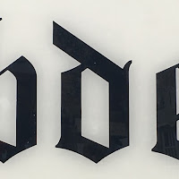
D ] This letter was found on the signage of Thou Art - A tattoo and piercing parlour on chapel walk in the city centre. 

It exudes quite a gothic look with its interesting points and serifs, making it appropriate for the venue it is representing. 


E ] Large 3D lettering from The Sheffield Institution of art. These red letters are mounted onto the white wall to attract visitors to the art institution and the gallery inside. 

With the contrasting colours and bold sans serif font the lettering is highly effective in its purpose. 


F ] The F on this signage is for Freshman's, an iconic vintage shop on Calver Street in Sheffield. 

The curves in the lettering give it a retro feel which communicates the vibe of the shop and it's purpose well. 


G ] This G was from the Graffiti on the wall of the beer garden for the Great Gatsby Pub on division street in Sheffield. The colouring and type along with the brick wall in which it is painted onto communicates the atmosphere of the vibrant pub well. The crumbling brick work adds to to the dynamic of the writing and the typeface itself is fun and easy to read. 


H ] This old cinematic style backlit type was found in the Common Room, a student Bar / Cafe also on division street in Sheffield. The overall aesthetic is really eye-catching and interesting and communicates the feel of the bar well. The sans serif typeface is clear and effective when used in a body copy alongside other letters. 


I ] From an A board for another independent coffee shop 'Moco'. Written in white chalky writing on a black board, it gives off an old school feel. On its own it could be mistaken for a J but used with other letters it is clearly legible as an I on its own. 


J ] JJ Josephs Emporium. Vinyl / Paint Printed on Glass looks aesthetically nice however is fairly illegible from a distance. The typeface itself however is very interesting with lots of different shapes on the edges of the lettering itself. The light colour against the glass is a low contrast but overall subtle and gives an interesting effect. 


K ] More Chalk writing found on an A Board advertising a special offer for the bar Bungalows and Bears, located in the old fire station for sheffield on division street. The lettering is eye-catching and a classic example of handwriting used on chalk boards. 


L ] Without seeing the context in which this writing is in the lettering for this L from Patisserie Valerie has an almost arabic / indian feel to it with it's interesting curves and shapes.  However once seen with the rest of the wording works effectively to exude a classic french feel. 


M ] This blocky M was from the independent art shop 'Moonko' on division street, specialising in selling hand made prints, plant pots and posters etc. The typeface gives an almost unfinished stencil effect which is relevant to the aesthetic of the shop. It is also replicated in wood on the inside of the store behind the till. It is eye catching as none of the surrounding shops use a similar typeface making the shop front stand out on the street. 


N ]  From the shop front of Cafe Nero. This iconic lettering is highly recognisable as belonging to Cafe Nero using the classic shades of blue, black and orange. The typeface is quite short and wide and making it highly legible to passers by. The colours are bold and eyecatching making the typeface effective as a whole. 


O ] This O is from a wall sticker / piece of graffiti found on West Street. It highlights the diversity of the residents in the city and shows the bustling nature of sheffield. The line through the O adds interest to the letter and draws attraction to the word being spelt as whole illustrating that just one subtle change can make a huge difference to the aesthetic of typography on the whole. 


R ] Found on the 'Open' sign for 'The New Shop' another vintage / second hand clothing store on division Street in Sheffield. The rounded serif typeface exudes a retro, old fashioned feel and communicates the personality of the store. 


Q ] This letter is found on the wooden sign outside the Antiques Centre in Sheffield. The type works in the area of which it belongs as it has quite an old fashioned, traditional feel to the writing as it isn't very stylised and is typical of traditional serif typefaces such as Times New Roman and Garamond. Such a type face wouldn't be suitable for a venue such as a contemporary bar or shop. 


R ] This piece of lettering was found in a piece of graffiti on the street written in spray paint. I really liked the interesting form of the hand lettering and could be used as a modern grungy typeface. It is fairly legible but is better used as a stand alone typeface rather than body copy. 


S ] Here is another example of hand lettering in an ornate stencil effect. The serifs are extremely exaggerated and draws attention to the signage. Despite the many embellishments of the letter it is still legible as an S an works effectively in the context for which it is being used. The shadowing used on the letter increases the legibility of the S as a whole. 


T ] Here is another example of Gothic hand lettering used for a different tattoo parlour in Sheffield, 'Five Magics Tattoo'. It is striking how all of the tattoo parlours in Sheffield that were studied used a similar style of grungy writing on the signage for their establishment. 


U ] Yet more chalk board writing used on another a board for Forum, a bar / restaurant on Division Street. This too uses a shadowing effect but is written in cursive / joined up writing rather than stand alone upper case lettering. It is hand painted in a style that is popular at the moment, flowing handwriting and is legible to read against the dark background on the sign. 


V ] This more traditional style of typography was found on the street sign for division street. It is a classic serif typeface which is highly legible from a distance and is very different to much of the other photography studied in the project. It's purpose is completely different to that of typography used in other circumstances such as cafe and shop signs as it needs to be legible from the point of view of drivers and pedestrians etc. Rather than attracting the attention to potential customers. 


W ] Found on the shop sign for COW, yet another vintage shop on West Street in Sheffield. The neon signage s very on trend at the moment which is effective in attracting potential customers to the shop. It is also highly legible in both high and low light and the double line adds an area of interest. 


X ] X shape from the popular Sheffield Graffiti artist Kid Acne. His artwork is extremely recognisable and iconic as many of his phrases are popularly used in Northern slang. 


Y ] From an optician in sheffield called 'Eye'. The joined cursive writing is much more refined than those found on the handwritten chalk A boards and the gold foil writing brings a much more upmarket feel. 


Z ] This block metal sans serif typeface is found on the outside of Green + Benz and jewellery shop on division Street. The materials used for the sign are reminiscent of the materials used on the products being sold in the shop.