- Size of publication
- Binding method used
- Stock
- Cover
- Image Placement
- Image Quality and editing / colour
- Text / the typefaces used / how much text compared to writing / where in the book / content
- Audience
I started my search at the Blenheim Walk Library by asking to look at the photography books section in the glass cabinets.
Book 1]
DUST // Michele Cera
'Dedicated to the face of Albania, it is in fact the binder book of all the faces of Albania, portrayed along that dusty strip of land overlooking the Mediterranean Sea. Michele Cera deconstructs the ideology of linear narrative in order to produce in a single frame the catalogue of the human universe of Albanian people. 37 photos but a large literature on the issue of marginality, geophysical and anthropic in total camouflage.'
http://www.landscapestories.net/bookreview/bookreview-01-michele-cera-dust?lang=en
Size - 20.2 x 1.2 x 24.6 cm
Binding Method - Case bound in perfect bound sections with headbands and footbands.
Stock - Thick gloss paper, white
Cover - Matt grey satin cardboard with embossed details and satin photograph
Image Placement - Polaroid style, white borders
Image - All of the images were high quality with a muted pastel colour scheme flowing throughout.
Text - Title page and acknowledgements, Interview in the back, no text around photos
Type - Caps Lock san-serif typeface for title page, lowercase serif font acknowledgements and sans serif interview page.
Audience - I believe the target audience for this book is an older age group of 30+ who are aware of the struggles and hardship of Albania following the war. The documentary style photographs further enhance this opinion, however it is also a book aimed at creatives. There is a strong pastel aesthetic running through the pictures in the book with it's matching colours and precise layout. The images contrast the harsh nitty gritty reality of life with the delicate and 'pretty' colour scheme.


Book 2]
Real Estate Opportunities - Eric Doeringer 2009
This self produced book is one of 1000 copies that follows Ed Ruscha’s 1970 book Real Estate Opportunities featuring photographs of vacant lots in and around Los Angeles. Doeringer's publication visits the same locations Ruscha had photographed and takes photographs from the same vantage point. In 2009, few of the lots remained vacant - they had been replaced by strip malls, Christian centres, restaurants, etc.Size - 17.8 x 14 cm , 48 pages
Binding Method - Perfect bound with glue
Stock - Matte, satin paper, white
Cover - Soft Cover, Glossy thick paperback, plain white with black serif typeface
Image Placement - Placed alongside text in polaroid form with white border throughout
Image - All black and white photography
Text - Title page and acknowledgements, location of pictures written underneath photo
Type - Serif font used alongside pictures
Audience - Residents of Los Angeles and from the local area, the way to book is produced and bound would keep the production costs and therefore the retail cost cheap which in turn would make the book more appealing to young creatives and photographers.


Book 3]
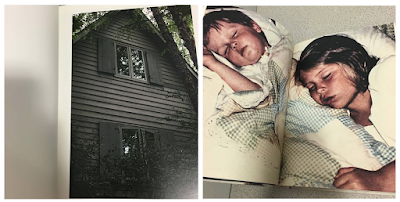
The Epilogue - Laia Abril
'This is the story of the Robinson family – and the aftermath suffered in losing their 26 year old daughter to bulimia. Working closely with the family Laia Abril reconstructs Cammy’s life telling her story through flashbacks – memories, testimonies, objects, letters, places and images. The Epilogue gives voice to the suffering of the family, the indirect victims of ‘eating disorders’, the unwilling eyewitnesses of a very painful degeneration. Laia Abril shows us the dilemmas and struggles confronted by many young girls; the problems families face in dealing with guilt and the grieving process; the frustration of close friends and the dark ghosts of this deadliest of illnesses; all blended together in the bittersweet act of remembering a loved one.'
http://www.laiaabril.com/project/the-epilogue/
Size - Hardback, 172 pages 24.8 cm x 19 cm
Binding Method - Hard back, case bound, perfect binding with headbands and footbands.
Stock - Thick glossy white paper
Cover - Grainy textured cover with embossed satin rectangle over photograph
Image Placement - Mixture of image placement, full page spreads of images, double page spreads, images with lots of white space, text alongside image etc.
Images - A mixture of found images and reconstructed imagery, all with a quite dark filter / edit applied, muted colours reflects the tone of the book.
Text - Stories next to relevant pictures, chronological, documenting
Type - Mixture of type writer and serif text used alongside images and for title
Audience - The target audience for this book would be the family and friends of people who suffer from bulimia and those suffering, as well as people grieving from the death of someone who had died from this disease, as well as creatives interesting in darker subjects. Ages 16+ target audience.


Book 4]
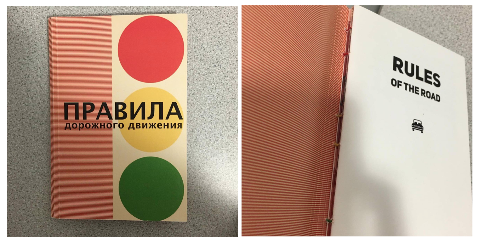
Rules of the Road // Vitaly Fomenko.
"In the fall of 2014 the world witnessed with confusion, how, headed by the ambitious adventurer Putin, fraternal Russia invaded the Ukrainian peninsula of Crimea. This project reinterprets the problems involved in political territory and movement through Soviet worn-out prints from the 80‘s Sevastopol State Traffic Inspectorate."
http://theindependentphotobook.blogspot.co.uk/2015/02/vitaly-fomenko-rules-of-road.html
Size - 44 pages, 12.5 x 19cm
Binding Method - Hand stitched, coptic binding using 3 different coloured threads into matt cardboard cover. Hand made limited edition run of 250 copies.
Stock - thick satin pages
Cover - Cardboard matte cover with black sans serif title and bold colours and shapes.
Image Placement - full page images / double spreads.
Images - Digital printing, all images monochrome colours with doodles printed / drawn over the top.
Text - Minimal text, title page, brief description.
Type - Sans serif
Audience - Those with an interest of international politics in the news as well as art and photography.


Book 5]
Speaking of Scars edition // Teresa Eng (1/500)
‘Speaking of scars’ deals with trauma and memory. During a 3-year period, photography was used to process an experience that couldn’t be processed. In the book memory takes the form of images, as it repeats and reconfigures itself around new and existing experiences.Despite the fragile nature of the images, the book expresses its brutal subject in a delicate way as it explores the complexity of trauma. The details of banal life offer up a world where things once seemingly benign become menacing; yet beauty holds resonance.
‘Speaking of scars” is an expression of the unspeakable, taking inconceivable events and transforming them into a visible language.' - Hot Shoe Magazine
Size - Hardback, 172 pages 24.8 cm x 19 cm
Binding Method - Hard back, case bound, perfect binding with headbands and footbands.
Stock - Thick glossy white paper
Cover - Grainy textured cover with embossed satin rectangle over photograph
Image Placement - Mixture of image placement, full page spreads of images, double page spreads, images with lots of white space, text alongside image etc.
Images - A mixture of found images and reconstructed imagery, all with a quite dark filter / edit applied, muted colours reflects the tone of the book.
Text - Stories next to relevant pictures, chronological, documenting
Type - Mixture of type writer and serif text used alongside images and for title
Audience - The target audience for this book would be the family and friends of people who suffer from bulimia and those suffering, as well as people grieving from the death of someone who had died from this disease, as well as creatives interesting in darker subjects. Ages 16+ target audience.


Book 4]
Rules of the Road // Vitaly Fomenko.
"In the fall of 2014 the world witnessed with confusion, how, headed by the ambitious adventurer Putin, fraternal Russia invaded the Ukrainian peninsula of Crimea. This project reinterprets the problems involved in political territory and movement through Soviet worn-out prints from the 80‘s Sevastopol State Traffic Inspectorate."
http://theindependentphotobook.blogspot.co.uk/2015/02/vitaly-fomenko-rules-of-road.html
Size - 44 pages, 12.5 x 19cm
Binding Method - Hand stitched, coptic binding using 3 different coloured threads into matt cardboard cover. Hand made limited edition run of 250 copies.
Stock - thick satin pages
Cover - Cardboard matte cover with black sans serif title and bold colours and shapes.
Image Placement - full page images / double spreads.
Images - Digital printing, all images monochrome colours with doodles printed / drawn over the top.
Text - Minimal text, title page, brief description.
Type - Sans serif
Audience - Those with an interest of international politics in the news as well as art and photography.


Book 5]
Speaking of Scars edition // Teresa Eng (1/500)
‘Speaking of scars’ deals with trauma and memory. During a 3-year period, photography was used to process an experience that couldn’t be processed. In the book memory takes the form of images, as it repeats and reconfigures itself around new and existing experiences.Despite the fragile nature of the images, the book expresses its brutal subject in a delicate way as it explores the complexity of trauma. The details of banal life offer up a world where things once seemingly benign become menacing; yet beauty holds resonance.
‘Speaking of scars” is an expression of the unspeakable, taking inconceivable events and transforming them into a visible language.' - Hot Shoe Magazine
http://teresa-eng.com/?page_id=494
Size - 68 pages including various folds and inserts, 17cm x 23cm
Binding Method - Cloth bound
Stock - Matte satin pages, 50 colour plates
Cover - Hard back cover with book cloth and de-bossed title in serif font, case bound with headbands and footbands.
Image Placement - Mixture of images: full page images / double spreads / smaller images however use of white space and border throughout and interactive pages.
Images - Muted, powerful imagery in complimentary colours that run throughout the book.
Text - Quote, Index, Description, acknowledgement
Type - Serif font
Audience - This book would interest people who have recently suffered from a trauma of some kind as well as creative professionals and people perhaps over 30 yrs.


I didn't see it coming // Emanuele Cardesi
Edition of 120 numbered copies
Size - 14 x 20 cm, 24 pages
Binding Method - Staple bound, zine style
Stock - Colour Laser Print on Munken Paper
Cover - Satin thick Softcover booklet
Image Placement - Full pages of images throughout, no text next to images, no white space
Images - Xerox Laser-Colour Printed images very colourful and thought provoking.
Text - Acknowledgements and publishing info at the back
Type - san serif font
Audience - This zine would appeal to a large target audience including design students, photographers and various other young creatives.


I then continued my research at the Village bookstore in town. This gave me a better idea of current publications on the market and also gave me an idea of what might appeal to design students and young creatives as that is the demographic that the book shop appeals towards and targets. I kept my eyes pealed for eye-catching and interesting effects that i could harness myself in my on publicaiton.
Book 7]
Badly Repaired Cars // Ronni Campana
'Badly Repaired Cars is a bright, bold and humorous documentation of some of the best (or worst) examples of DIY car repairs. Close up photographs of cars held together by tape, plastic and glue fill each frame and begin to take on the qualities of abstract art. A strip of duct tape across a broken headlight becomes powerfully graphic in form; green plastic hanging from a door divides the frame like a Rothko colour wash.
This is Book 2 in a series that celebrates the best in colourful, modern photography.'
https://www.hoxtonminipress.com/products/badly-repaired-cars
Size - 179 x 141 mm
Binding Method - case bound with fabric headbands and footbands, hard back.
Stock - satin thick pages, mixture of colours from yellow to white
Cover - 72pp hardcover with tip-in image and foiled tilting. Colourful matt cover with embossed writing and satin photograph.
Image Placement - Images either on one page or double spread with white space around edge
Images - Colourful bright and humerous
Text - Information in what the book is on and acknowledgment of publishers and photographers
Type - san serif font
Audience - Really broad target audience from anyone interested in funny photography to people interested in cars, or art. Ages between 16 - 60.


Book 8]
Cairo Diary // Peter Bialobrzeski
'Capturing Cairo between the overthrow of Morsi and Mubarak, Bialobrzeski’s images portray daily life in the Egyptian capital at a time of major urban, social and political upheaval and renewal. As silent and tranquil as they are anxious and tense, the images demonstrate Bialobrzeski’s ability to find beauty in chaos. The atmosphere is charged as we, the viewer, are left to contemplate what turn Cairo will take next.'
http://www.bialobrzeski.de/work/CairoDiary/Cairo_buch_51.html
Size - A5
Binding Method - Coptic Bound, stitched spine
Stock - matt satin pages
Cover - soft cover, Satin stock
Image Placement - Images cover entirety of pages within, no white space, no text
Image - All the imaes are very busy and jam packed full of interesting details.
Text - Cover page, title page and acknowledgements
Type - Serif font for titles and cover, sans serif small print
Audience - People who have been or are planning on travelling to Cairo, people who enjoy travelling in general, young creatives and general other clients of the village book store


No comments:
Post a Comment