DESIGN
The design of the cover features foiling to hint at the history of the Devonshire Quarter as cutlery and mark making manufacturers and Sheffield as the steel city. It also makes the cover of the book stand out and reflect the vibrant and interesting content on the inside.
Below are thumbnail sketches of different potential ideas for the design of the front cover:
The ideas focussed on a range of potential themes that were in keeping with the content of the book.
Postcode (S1) : The S1 postcode design ties in with how the inner content of the book is laid out, using the overriding first two letters of each postcode as the front cover, linking all the content inside together.
Coordinates: The coordinates for the Devonshire Quarter found on Google Earth is similar to the postcode idea as it locates where the devonshire quarter is in the world, for you to then locate the streets within. (2 variations below)
Arial View : This idea creates a link between the front cover and the chapters inside. Each chapter is a street name and the front cover is the street view. So opening the book is reminiscent of diving into the streets of the devonshire quarter. (3 Variations below) The most zoomed in version creates an abstract pattern at first glance which wraps around the spine of the book. The title is placed on the spine so the cover doesn't appear too cluttered.
DQ : The Devonshire Quarter is naturally shaped like a D and the letter Q is shaped like a magnifying glass, combining the two represents both the 'Devonshire Quarter' and also exploring the devonshire quarter which is what the purpose of the book is about.
Bold Type : A bold typography based cover looked effective in the book 'Read this if you want to take great photographs'. It draws attention to the book and looks good when foiled.
Tipped in Image : Similar to the books 'Bubblegum' and 'Badly Repaired Cars' The cover would feature a tipped in image of the Devonshire Quarter with surrounding bright stock with typography.
Simple Cover : Using Oriya Sangam SM and altering the Q into a magnifying glass, have a subtle yet simplistic cover that doesn't distract from the content of the book.


This arial view image is a geographical representation of the development of buildings in the area, therefore it tied in with the 'ephemeral' nature of the content in the book.


STOCK WEIGHT / COLOURS
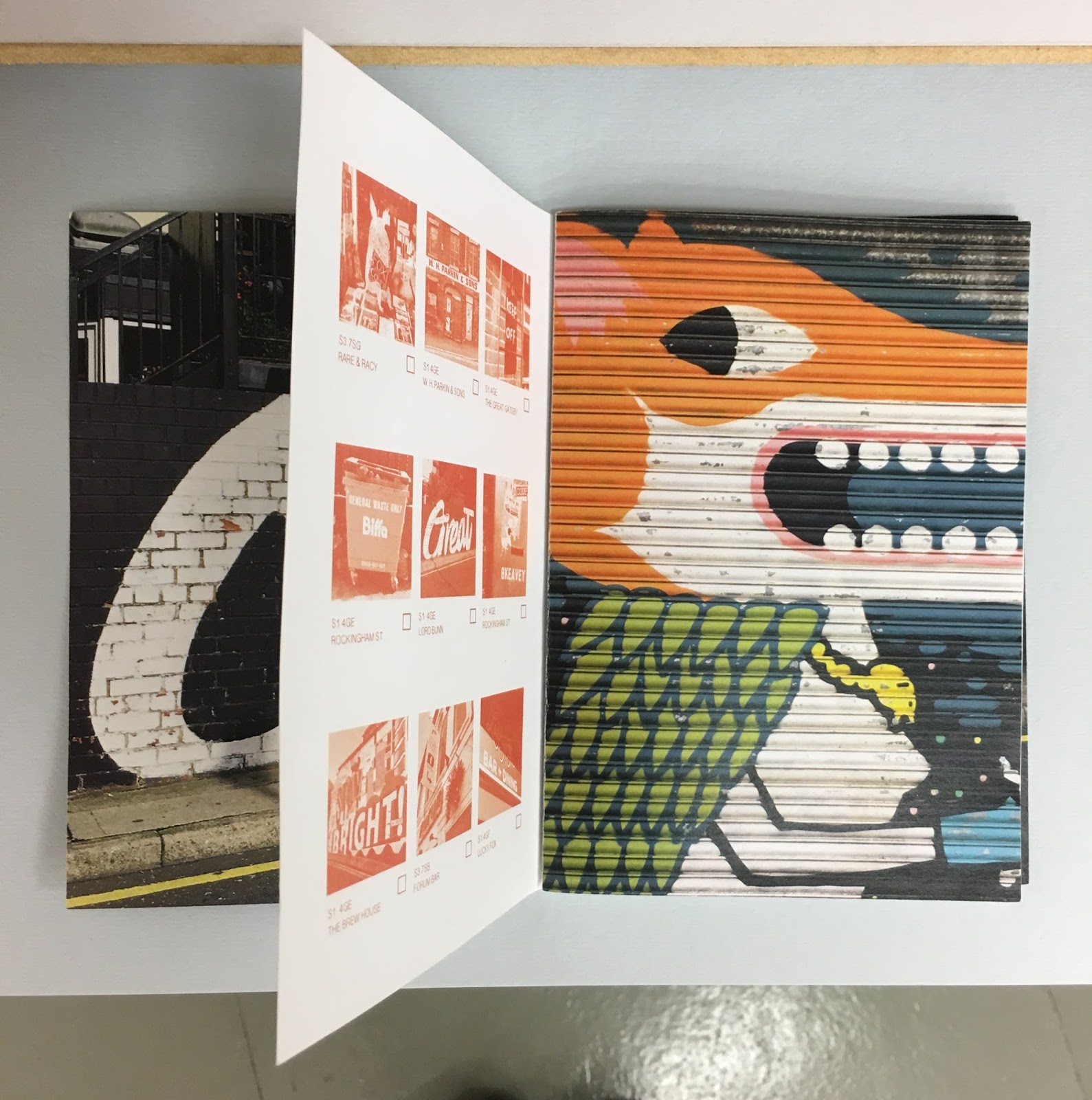
The stock used for the inner pages was 120gsm matte white paper. The cover needed to be considerably thicker for durability and to protect the inner pages, when in constant use.
Fred Aldous had a range of different coloured stocks that would be suitable for the front cover of the publication. To see what the book would look like in different variations I took with me some test pages of the publication to lay over these stocks and decide which worked best and were most suitable.


The ones that stood out to me most were the Dark Greys and the light grey/blues. However for practical reasons I eliminated the lighter coloured stocks as they easily show dirt when handled a lot and this publication was a field guide so it would not be a practical colour. Colours such as the vibrant red, orange and pinks may detract from the colours of the images on the inside of the book so a neutral colour seemed more appropriate. The use of foiling would also stand out well on a darker, neutral background.
The finished cover would be a zoomed in arial street view of the devonshire quarter in silver / holographic foil on a charcoal grey background. The metallic finish gives hints to the history of the Devonshire Quarter, while the colourful glints of the holographic foil represents the vibrant colours of the images within and the vibrancy of the Devonshire Quarter itself.
The colour of the stock does not clash with the images within, yet creates a striking finish when viewed closed.
The street view image represents all the content of the book within one place and wraps around the spine.
The title will be placed on the spine of the book as it will help readers find the publication when placed on a shelf and also not distract from the busy pattern on the front cover. It will be written in Oriya Sangam SM (the font used for the inner body copy) and has a hidden magnifying glass replacing the Q, to represent the search for the images within.
Having lettering on the spine also complies with one of Jan Tschishold's golden rules as it allows readers to easily find the book on a shelf.
No comments:
Post a Comment