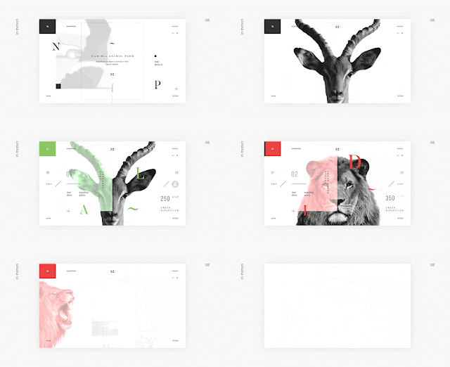
I also made a Pinterest board where I gathered a lot of visually inspirational screen graphics. Here are my favourites examples from each category on the list from the brief.
WEBSITES
Concept for Namibia Animal Park Website - Anton Skvortsov. This website concept has a lot of really eye catching examples of user experience and gave me an insight into how I could potentially approach the task of building my piece of design in a more unusual way, exploring the way a website can move. Everything from the colour palette to the imagery used has been carefully considered to make a more exciting user experience.
TITLE SEQUENCES
Title sequences are usually the first thing the audience sees when watching a movie or tv show so they are a vital indicator of what the rest of the film will be like and are crucial when it comes to engaging the audience from the start. One of the most memorable and clever title sequences I have watched recently was Deadpools. A lot of CGI, special effects and motion graphics went into the production of the scenario to make it look like a frozen fight scene that the camera was slowly panning through and set the humorous tone for the rest of the movie.
A more illustrated and simpler example of graphic design used in a title sequence is 'Man Seeking Woman' s. This uses simple vector illustrations and animates them into a flowing animation sequence using After Effects, Illustrator and Flash. 'The process was very open. The symbols are a medley of film genre and dating references. Simon Rich, the writer, told us that, as far as genres, all were on the table — from sci-fi, to horror, to fantasy — because the show itself would eventually draw from nearly every genre imaginable. We wanted to paint a picture of modern dating from Josh’s perspective as an underdog of sorts. Elliot did a great job of concepting and designing symbols that wove the two thematic threads together.' - http://www.artofthetitle.com/title/man-seeking-woman/
APP
Launched in 2014, Eight is the first technology based sleep-tracking company without a wearable device. Its device senses and analyzes data such as breathing rate, slept hours, and bed warming to maximize comfort while sleeping. Eight utilizes all the data it tracks to build a blueprint of individual sleeping patterns compiled into sleep metrics conveniently located within a personalized mobile application. Usage of the Eight app helps guide the advancement of your sleep experience.
Eight's app re-design was developed planning for it to be used within a sleep inducing environment. We employed a dark toned palette and included gradients representing the dawn and sunset. The app includes comfort features such as Smart Home integrations, White Noise Player, and Smart Alarm. All connectivity features can be activated with a simple swipe within the Eight app.
IDENTS
One of my favourite examples of a TV ident even though it was made back in 2012 is more 4's triangle flipping ident. The logo can work with any colour, making it malleable to suite a range of different themes, events and moods.
— ManvsMachine Case Study
At first glance the static logo looks too decorative and busy but once put into motion, the way it’s supposed to be, the effect is quite fantastic. Live-action idents see the brand break out into the real world in the form of mechanical ‘flippers’. The installations inhabit environments from a domestic staircase to an abandoned fishing boat in Dungeness. To achieve this ManvsMachine teamed up with installation design pioneers, Jason Bruges Studio, to help design and build a flexible system consisting of over 400 individual flipper units.


No comments:
Post a Comment