Sunday, January 15, 2017

OUGD503 - Responsive - YCN - Bear - Development

For the project, I am aiming to make between 3 - 5 cards depending on how long each one takes and the techniques I use. As I have decided on the human body/anatomy as a theme I need to choose 3 - 5 interesting and funny facts that would appeal to children aged 4 - 9 years old. The facts also need to have the scope to be made into a visually interesting image/trading card. 

FUN FACTS

1) A full head of human hair can support 12 tonnes. That's the same as 2 full grown African Elephants. 

2) Humans are bioluminescent and glow in the dark. 

3) A pair of feet can produce over a pint of sweat every day. 

4) A human baby has over 60 more bones than an adult.

5) Inside your bellybutton are thousands of bacteria that form an ecosystem the size of an entire rainforest. 

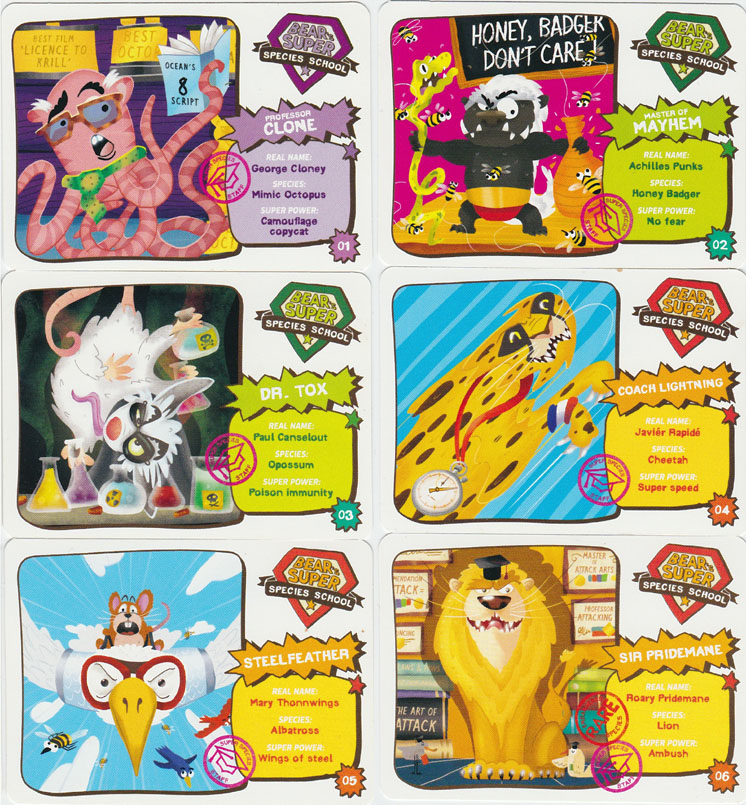
I bought a fruit yYoyo and looked at the card inside the current packs to see the kind of layout and content the Bear brand wanted to include. 


These are the current bear fact cards for fruit yoyos. As you can see the fact only makes up a small part of the card where the other part is very story oriented with lots of visuals and statistics. For my design, I need to think of other things I could include the fact to fill it out a bit more. 


This card includes

BACK

Fact File - in the style of a file  

Mission-o-meter: with statistics like a top trump

Spy Score: With the overall score of the card

Expert / Pro / Rookie level of card

Where in the world the mission is from

Secret message you need magnifying glass to read

Punny mission name: 'Mission: KNOX, KNOX! WHO'S THERE?'

FRONT

Colourful vector imagery, lots of detail and things to look at

The country where the story / mission is based.

My Concept


I wanted to think of a logo, name, and storyline to do with the body to be the foundation for my concept which the set of cards could follow consistently. That's where I came up with Bear's Bonkers Bodies and Bear's Anatomy Adventure. 

As the brief stated that BEAR wanted a design for a minimum of 3 cards, front and back and an accompanying 'collectible mechanic' I looked into storylines with an adventure style nature that could run alongside the collection of cards. The theme of being shrunken down and sucked into the body is a narrative common in multiple children’s television shows and films such as Arthur, Inner Space, Honey I shrunk the kids and the grown up cartoon series on Netflix, Rick and Morty. This idea also had the potential to be made into an interesting and fun series of facts and games. 


Top: Rick and Morty, ‘Anatomy Park’ Bottom: Arthur, ‘Giantess’ & Inner Space
For the logo I thought of different things I could do to put on the cards.  

Artist Jason Freeny is widely known for his surreal anatomical models of popular toys, such as sliced see-through barbie dolls and skeletal legos. His latest offbeat creations showcase the organs and bones of two more childhood joys: balloon dogs and rubber duckies.

I thought it would be cool to include this snapshot into the bear's body as part of the card.

This is a logo I mocked up:


It didn't really go to plan and I wanted the illustrations to be more wholesome and look hand drawn or screen printed etc. So I went back to the drawing board.

I also had a play around with some type that incorporated features of the body such as hair, teeth and muscle. Using Helvetica I experimented with this idea:


Again I wasn't overly happy with the results. This is where I went back to the drawing board, thinking about the concept I was actually looking into. I decided to do a doctor's waiting room style diagram of the bear logo, depicting different body parts of the Bear such as his hair follicles, teeth, paws and bones etc. I then combined it with a font with a very organic, hand drawn style. To finish the logo and make it look as hand rendered as possible I overlayed a printed texture to give it a grainy effect. 


OUGD503 - Responsive - YCN Bear - Artistic Styles


Bear's current style is very bright, bold and colourful as it is aimed at children. Their website heavily features a collage / 'paper cut out' style which I really like as it is not as flat as most vector imagery creating a 3D feel with a sense of childlike play. 

The brief specifies that the style of the fact cards does not have to replicate the style used on the website, giving me creative freedom to explore a range of different techniques however I do like the organic and playful nature of this cut out style so am keen to explore that further introducing some more elements of texture. 

Alongside this I would like to explore some mixed media examples such as screen print and lino cutting as well as painting, drawing and collage. 

Here are some examples of artists work that feature the interesting and unique styles I want to explore in this brief. 

Anna Kovecses

I'm really drawn to these choppy cut out collage-style prints by Anna Kovecses and think they would make a really clean, wholesome and engaging set of trading cards for a young target audience. The bold simplistic shapes and lines lend themselves to being incorporated with bright colours and grainy textures and would be an interesting style to experiment with and explore. 


Dawid Ryski

I'm a big fan of Dawid Ryski's work, particularly the book 'Alphabetics' due to the limited colour palette with every illustrative adhering to the same few colours. Each illustration looks very vectorised by their flatness but yet retain a wholesome quality to them which I would suit the aesthetic and personality of the bear brand. 


Natalya Balnova

The illustrations and prints by Natalya Balnova are another favourite of mine due to their experimental, bold inky style. Again they are very wholesome yet full of energy and life and would be another fun style of illustration to explore for the series, lending themselves to being incorporated with a range of bright and vivid colours. 


Natasha Durley 

Another illustrator I discovered through my research was Natasha Durley. I emailed her to find out the methods she used when creating her illustrations as they are packed with lots of bright and intricate organic looking patterns. She said she did a lot of the patterns by hand using paint, ink and paper - whatever she could get her hands on and then scanned them into the computer and combined them with her hand drawn illustrations digitally. She then used the settings in the side panel of photoshop such as 'overlay' to play around with different possibilities and create unusual outcomes. 


As well as illustrations I considered using a paper cutting approach for the design of my cards similar to these artists: 

Helen Mussle 

Really detailed paper cutting scenes with lots of character and charm.


John ed de Vera

More vectorised and simplistic style of paper cutting. 


Friday, January 13, 2017

OUGD503 - Responsive - YCN Bear - Trading Card Research


I began my research by exploring the designs of other trading cards on the market such as top trumps, pokemon cards and cards from Bear's previous years to see what styles and elements of the cards kids were drawn to and what potential layouts there could be. 


Bright colours are prevalent in all the designs I studied as they are bright, bold and eye catching for children to look at. I also noticed that it was essential to have a consistent layout running across the entire series of cards to create a congruous set that you could collect and display as part of a set. 

Facts, statistics and categories are a popular feature of many trading cards such as the 'occupation' label on the my little pony cards above and the 'Age / Grade' categories on the Arthur cards below. 


Again here you can see consistency in the design with subtle variations like patterns and colours. Below is an example from the 'Adventure Time' top trumps series.


Previous examples of bear cards have been done in many different ways. Including: 

Bear Super Species School 

Featuring a range of fun facts about different species of animals, insects and birds around the world, both endangered, current and extinct. The cards came with an online game that helped you decipher what super species house you belonged to. 


Bear's Time Travel Adventure

This pack enlightens kids with facts on both historic and futuristic events such as scientific research predictions. With different stops along the way and a barometer on where each event is set in time.  


Bear's around the world in 80 days

Teaching kids the famous and stereotypical quirks related to each different country through the use of illustration and flags. Each card stamped like a passport. 


Aswell as looking at different types of existing trading cards that are on the market for children I began looking at a range of artistic styles that looked effective when used ont he small scale of a trading card. 

A more minimal approach can be seen here on this Artist's version of a top trumps playing card. Lots of white space makes the design much more sophisticated and therefore it wouldn't be as appropriate or as engaging to a younger target audience. 


The target audience for this pack of cards is obviously younger due to the friendly child appropriate characters, however the use of reduced colour palette makes it look much more modern, and less cluttered / overwhelming. There is a mix between white space and colour between the front and back of the cards which I could consider including in my design. 


Without even considering the content, these cards automatically look as if they're for an older target audience than the cards I studied at the top of the page such as adventure time and my little pony. The muted greys, alongside bright primary and secondary colours, clean vector shapes and lots of white space create an engaging and clean but colourful series that exudes a more sophisticated feel.  


The cards below offer a more minimalistic approach to a set of children's trading / collection cards. The colour palette is toned down with greys and pastel shades and only a few brighter accent colours. The drawings are simplistic vector illustrations which work effectively alongside the typography and colours used. 


Again the use of white space, vector shapes and carefully chosen colours offers a more clean and simple solution to a series of cards. 


Here, the techniques used offer more texture and depth to vector / collage style drawings. I really like the use of angular lines and bold 'cut out' shapes mixed with the different styles of typography. I think it would be interesting to explore this technique further for my series of cards and get as far away from computer rendered and 'busy' imagery and layouts found in previous collections as possible to create a unique and different approach to this new set. 


OUGD503 - Responsive - YCN - Bear - Picking a theme

When starting this project I first had to put myself in the shoes of a 4 - 10 year old and think of a theme that would be both fun, interesting and full of great facts. It also had to have the scope to be visually engaging and have the potential be made into a much larger series. 

Here are a list of potential themes I came up with: 

Idea 1 - Art

The arts are widely viewed as less important than other educational subjects such as maths and science in today's society but there have been many studies into the benefits of encouraging creativity in children. Therefore one idea was to do a fun series on arts related themes such as crazy facts about artists and their work. 

Here are the most interesting facts I found to potentially include on the cards: 

1) Picasso has 23 words in his name! Picasso was baptized Pablo Diego José Francisco de Paula Juan Nepomuceno María de los Remedios Cipriano de la Santísima Trinidad Martyr Patricio Clito Ruíz y Picasso.

2) ‘Art’ used to be an Olympic sport. Artists were award gold, silver and bronze medals for architecture, painting, sculpture, music and literature across multiple Summer Olympics in the early 20th Century.

3) Picasso's first word was pencil and he could draw before he could walk

4) In the Mona Lisa painting by Leonardo da Vinci, Mona Lisa has no eyebrows. This was the fashion in Renaissance Florence to shave them off.

5)Salvador Dali sought to never explain his own work, however he has said that the idea for his iconic melting clocks came from chunks of Camembert cheese he observed melting in the sun—although he may have been joking.

6) The longest painting by an individual measured 3,444.91 m

After reviewing these facts and failing to find any large amount of interesting fun facts online I have decided against using art as a theme as younger children would have no idea, and no real interest in learning about who Picasso, Salvador Dali or LEonardo da Vinci is and there wasn't much scope for differentiation. It's more of a sophisticated theme for older age groups as it focusses more on art history.

Idea 2 - Anatomy / The Body

One interesting and unique theme that hadn't been looked into previously was the human body. I found loads of amazing facts that had lots of potential to be made into eye catching and visually engaging cards:


1) We have the same amount of hairs on our body as a chimpanzee. Most are useless and so fine that they are invisible.

2) With the 60,000 miles of blood vessels inside the average human body, you could circumnavigate Earth two and a half times.

3) The human eye is so sensitive that if the Earth were flat, you could spot a candle flickering at night from up to 30 miles away.

4) When you blush, the lining of your stomach blushes too.

5) Inside your belly button are thousands of bacteria that form an ecosystem the size of an entire rainforest.

6) We humans are the best long-distance runners on the planet. Better than any four-legged animal. In fact, thousands of years ago we used to run after our prey until they died of exhaustion.

7) A full head of human hair is strong enough to support 12 tonnes.

8) In 30 minutes, the human body gives off enough heat to bring a gallon of water to the boil

9) Humans share 50% of their DNA with bananas.

10) Humans are bioluminescent and glow in the dark. The light that we emit is 1,000 times weaker than our human eyes are able to pick up.

11) Humans shed 40 pounds of skin in their lifetime, completely replacing their outer skin every month.

12) Around 90% of the cells that make humans aren't “human" in origin. We're mostly fungi and bacteria.

13) A condition called synesthesia can cause senses to overlap. In other words, some people can taste words or hear colors.


14) Stomach acid can dissolve metal.

15) Humans shed about 600,000 particles of skin every hour.

16) A human baby has over 60 more bones than an adult.

17) An average person produces about 25,000 quarts of saliva in a lifetime, enough to fill two swimming pools.

18) We all have tiny mights living in our eyelashes.

19) Your ears and nose never stop growing.

20) Everyone has a unique tongue print

21) Your taste buds are replaced every 10 days.


Idea 3 - Weather

With climate change being a huge global issue for both our generation and the next I thought weather would be both a fun, interesting and informative theme to base the facts on. These are facts I found: 

1) You can tell the temperature by counting a cricket's chirps!

2) Sandstorms can swallow up entire cities.

3) A mudslide can carry rocks, trees, vehicles and entire buildings!

4) A heatwave can make train tracks bend!

5) About 2,000 thunderstorms rain down on Earth every minute.

6) In July 2001 the rainfall in Kerala, India, was blood red!

7) Wildfires sometimes create tornadoes made of fire called fire whirls.


8) Waterspouts, or rotating columns of air over water, can make sea creatures rain down from the sky.

9) The most damage ever caused by a thunderstorm was in 1995, when hailstones bigger than cricket balls fell in Texas, USA.

10) You can use pine cones to forecast the weather: The scales will close when rain is on the way.

After reviewing all the facts and asking a number of my peers which they found the most interesting I decided to go with human anatomy as the theme. There were lots
 of valid points made on which would be the best subject. One piece of advice was that children of this age aren't really self aware therefore human anatomy may not be appropriate, whereas things you can actually see like weather you find amazing as a child. However a lot of the facts on anatomy were very visual and about things you could actually see, making them fun, engaging and appropriate. 


OUGD503 - Responsive - YCN - Bear - The Brief

For the substantial brief I am doing the YCN competition brief for Bear.

The Brief

To create our next set of yoyo cards, whisking kids off on a magical adventure with BEAR.

Background


Yoyos, a tasty lunchbox snack made with just fruit and absolutely no added nonsense, with kids aged 4-9 in mind. They’ve become a playground favourite and have grown to the be no.1 kids’ fruit snacking brand in the UK. Ever since we first launched we’ve always had a free collectible card inside every pack of Yoyos- it’s actually a very functional piece of packaging that holds the rolls in place, but it gave us a lovely opportunity to talk to our consumers and driving engagement with the brand.

With our Yoyos we’re trying to sneak some fruit into children’s diets without them realising, and with our cards we’re trying to help them to learn about the world around them without ever feeling like they’re at school. 

Education and facts are at the heart of these cards- but it’s never allowed to be boring. BEAR is always the central character in the cards’ theme, and we create a world around him with the cards that we hope will really fuel children’s imagination and take them off on an adventure with BEAR.

The Creative Challenge

We would like you to create the next world of BEAR’s yoyo cards - it’s up to you to pick the theme! We would like to see at least three card designs, both back and front of the cards.

To get your brains whirring, previous card sets have included: ‘Around the world in 80 days’ with BEAR, with each of the individually illustrated cards being a miniature postcard sent from one of BEAR’s stops on his travels. Each taught children about amazing places and cultures around the world that they might never have heard of.

Our ‘Super Species School’ saw Head BEAR assemble the world’s most incredible species as students in his school- each had a super power that related to what made that creature incredible in real life, children could take a test online to see what ‘super squad’ (house) they would be in, and there was a specially designed yearbook that children could collect ‘bearcodes’ (barcodes) towards and be sent for free.

This year BEAR has gone off in his Time Cave back through history, with 80 stops in the grizzly past, and 20 in the furrific future showing some of the wildest inventions that scientists believe will roll out in the coming centuries.

Creative Considerations

·There has to be story behind the theme, and BEAR needs to be at the heart of it. BEAR is a real bear in the minds of children, and we want to take them off on an adventure. Every week we receive thousands of letters from children writing to BEAR asking what he likes doing, who his friends are, and asking whether he’ll come to their birthday party. Create something that will spark the imagination of a 4 year old you and you’re on to a good starting point…

· Make sure that your cards are packed full of facts- we want to squeeze as much learning as we can in. But this can’t be dry- think about how you felt when you were a child, and keep it as far away from a school text book as possible. To give you an example of what we mean- whilst at school we might learn about the planets and what order they’re in, but if BEAR was to talk about space he’d be telling kids that astronauts have to use liquid salt and pepper otherwise it flies up their nose with no gravity.

· Be bold, and not safe. Think wild and keep it really fun.

· Style: our cards are ‘guests’ in pack and therefore don’t always follow the style we use for everything else. That being said, keep it really wholesome, fresh and colourful, and trustworthy.

Target Audience

BEAR Yoyo’s are aimed 4-9 year olds, both boys and girls.

Mandatories

Please include the following:

· We would like to see at least three card designs, both back and front.
· A simple paragraph or so explaining the theme and story behind your cards.
· Please include the BEAR logo somewhere on the cards- to help people to understand who they’ve come from. In the past we’ve not always used the full logo (see the ‘clock dock’ on the front of our current cards), but just something that helps people.
· Please make sure that the cards are numbered- these are collectables.

Tuesday, January 10, 2017

OUGD504 - Design for Screen - Evaluation

This project gave me valuable insight into the processes and production considerations associated with designing a screen based user experience. After attending a talk at Glug by the Leeds based women in tech group ‘She does digital’, I was inspired to start my exploration of screen based design and this project provided me with the perfect opportunity to begin experimenting with the world of digital.

This brief was a sharp learning curve for me as I had never designed anything for screen before being given this project. I had to familiarize myself with new considerations such as pixels, wireframes, sitemaps and developers as well as getting to grips with completely new programmes such as After Effects. Despite this I believe I have fulfilled my learning potential during the module and that it has helped me to progress further in my practice. 

At times the project became frustrating when my limited knowledge of the unfamiliar software got the better of me, however overcoming these obstacles and producing the animated versions of my design became some of the most rewarding parts of the process.

I believe my final design was successful for the way in which it met all the criteria set in the original brief, making the process of finding student housing easier and more fun. The design of the site itself was kept straight forward, modern and uncluttered with images being kept at the centre point of the design. The new colour scheme and overall layout of the site also made the design much more user friendly than that of it’s competitors.  

From a practical aspect, the project taught me how designers work alongside developers in industry and showed me the list of different processes that are involved in making designs for screen so that they are industry ready.  

However, on a conceptual level, aspects such as the talk with Only helped me transform the way in which I go about brainstorming a project, first identifying a problem and then finding a solution so that my designs are more creative and innovative, pushing past limitations associated with printed design. I also learnt that when designing for screen it is important to consider the user experience as much as, if not more than the aesthetic elements. These include how the design feels, sounds, looks and interacts on every layer.

The project also alleviated any misconceptions I had previously such as the idea that coding was the job of the web designer or that web design is boring or unimaginative. Web design is limitless, constantly evolving and here to stay. It can elevate a brand to a much higher level than previous. Although web design may have some limitations designers embrace these challenges and push opportunities where possible. 

If I was to do the project again I would make sure to explore a range of different designs and fully document the experiments and considerations I explored along the way. I would also do more thorough testing of the finished design such as making it interactive and giving it users to evaluate.