
I began my research by exploring the designs of other trading cards on the market such as top trumps, pokemon cards and cards from Bear's previous years to see what styles and elements of the cards kids were drawn to and what potential layouts there could be.


Bright colours are prevalent in all the designs I studied as they are bright, bold and eye catching for children to look at. I also noticed that it was essential to have a consistent layout running across the entire series of cards to create a congruous set that you could collect and display as part of a set.
Facts, statistics and categories are a popular feature of many trading cards such as the 'occupation' label on the my little pony cards above and the 'Age / Grade' categories on the Arthur cards below.


Previous examples of bear cards have been done in many different ways. Including:
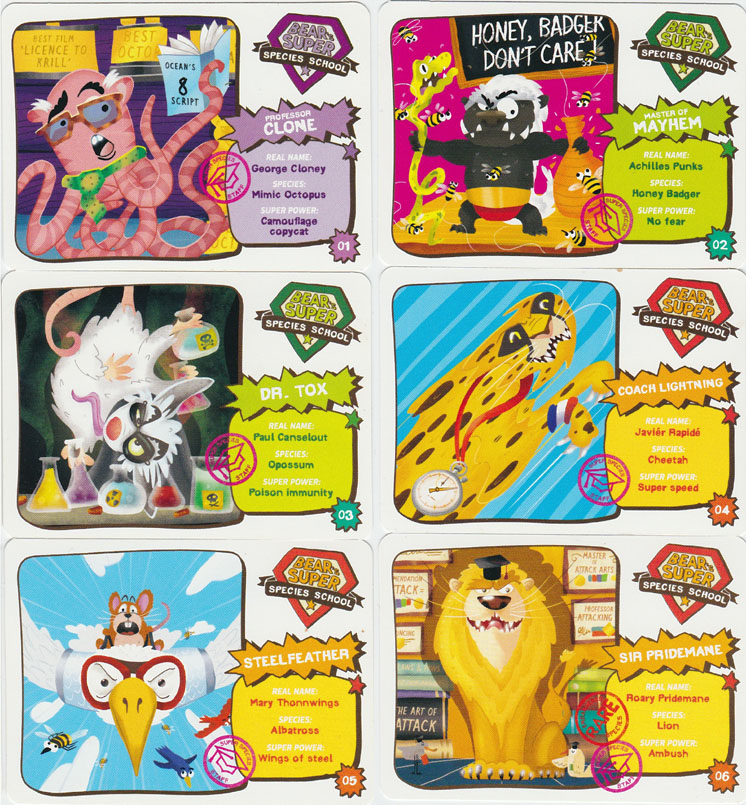
Bear Super Species School
Featuring a range of fun facts about different species of animals, insects and birds around the world, both endangered, current and extinct. The cards came with an online game that helped you decipher what super species house you belonged to.


Bear's Time Travel Adventure
This pack enlightens kids with facts on both historic and futuristic events such as scientific research predictions. With different stops along the way and a barometer on where each event is set in time.

Bear's around the world in 80 days
Teaching kids the famous and stereotypical quirks related to each different country through the use of illustration and flags. Each card stamped like a passport.

Aswell as looking at different types of existing trading cards that are on the market for children I began looking at a range of artistic styles that looked effective when used ont he small scale of a trading card.
A more minimal approach can be seen here on this Artist's version of a top trumps playing card. Lots of white space makes the design much more sophisticated and therefore it wouldn't be as appropriate or as engaging to a younger target audience.

The target audience for this pack of cards is obviously younger due to the friendly child appropriate characters, however the use of reduced colour palette makes it look much more modern, and less cluttered / overwhelming. There is a mix between white space and colour between the front and back of the cards which I could consider including in my design.

Without even considering the content, these cards automatically look as if they're for an older target audience than the cards I studied at the top of the page such as adventure time and my little pony. The muted greys, alongside bright primary and secondary colours, clean vector shapes and lots of white space create an engaging and clean but colourful series that exudes a more sophisticated feel.


Here, the techniques used offer more texture and depth to vector / collage style drawings. I really like the use of angular lines and bold 'cut out' shapes mixed with the different styles of typography. I think it would be interesting to explore this technique further for my series of cards and get as far away from computer rendered and 'busy' imagery and layouts found in previous collections as possible to create a unique and different approach to this new set.

No comments:
Post a Comment