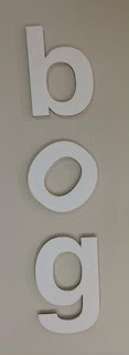
We had to make a word out of 5 random letters [o s b e & g] that could be used across 3 different companies of our choice.
We chose the word bog :
- b og : A toilet store. Separating the b from the 'og' created the illusion of a toilet from sideways on in the 'b'.
- b o g : An upmarket, organic fruit and veg store. Putting large spacing between the letters, made the logotype look more classy and expensive.
- bog : A garden centre. Having small spacing between the letters made it look, approachable, inexpensive, yet professional.
For the second task we then had to rearrange the letters in 30 seconds (still using the word bog) to create logotypes for 6 different types of companies.
Upmarket Car Company: Spaced out lettering creates upmarket feel.
Student Nightclub: Vertically positioned lettering and slanted 'o' creates funky, retro vibe.
Condom Manufacturers: (use your imagination...)
Quentin Tarantino Movie: Spaced vertically to use down the side of a poster.
Pest Control: randomly positioned lettering experimenting with the baseline creates a more organic, less structured word form.
Kids Animation Series: Jumbled lettering positioned at different angles creates a fun, playful logotype.


No comments:
Post a Comment