On the front cover of my design I wanted to have a healthy happy dog on one side and a rabid dog on the other.
Sourcing a couple of images from the internet and editing them using photoshop gave the images a stylish stencil effect. This creates a more unusual and eye-catching look than simply using a photograph for the publication and also reduces printing costs by using a limited colour palette.

These are the colour palettes I looked at and experimented with. the #ffffff will be replaced by the colour of the paper stock used. After a group crit everyone was in agreement that the most appropriate colour palette was the middle one as it was the most impacting. I made the rabid dog orange (#f93919) and the normal dog navy blue (#162231).

Once I was happy to use this as the front cover I began designing the infographics.
Layout I decided to lay the inside of leaflet out in this order:
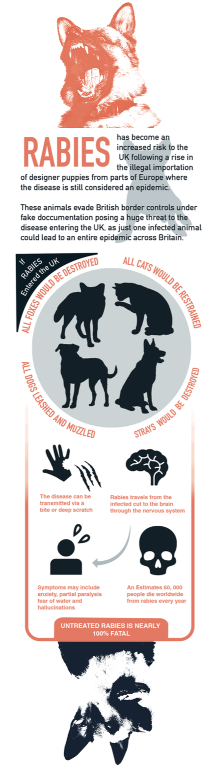
- Information on puppy smuggling at the top to outline the relevance of the leaflet in today's society.
- Brief summary of what britain would be like if rabies became an epidemic.
- Overview of the disease with symbols
Typeface I wanted to use a clean, clear sans-serif typeface for the design of my leaflet as although it is argued that serif typefaces aid legibility when it comes to body text and smaller writing, it can sometimes look appear dated and too academic. Seeing as the public information video for rabies was so behind the times, making it seem an old and outdated concern, I wanted to give my leaflet a current and fresh revival through the use of a san-serif typeface seeing as the threat of rabies entering the UK is becoming much more relevant once again in light of recent events.
I researched and experimented with a few sans-serif typefaces that I believed would be suitable for the design.
Helvetica - An obvious choice to beging with, Helvetica is a universally recognised typeface which can be found pretty much anywhere in your day-to-day life. However as it was developed by Swiss typeface designer Max Miedinger in 1957 I wouldn't consider it particularly modern and therefore it contradicts the reasoning behind going for a sans-serif typeface.
I looked at some more modern and unusual sans serif typefaces:


Avenir - Released in 1988, Avenir is a geometric sans-serif typeface designed by legendary type designer Adrian Frutiger. It is known for it's slightly humanist features with it's imperfectly shaped 'o' and slight tail on the t.

Brandon Grotesque - Released in 2010, Brandon Grotesque is a geometric sans-serif typeface designed by German type designer Hannes von Döhren. It is inspired by the geometric typefaces of the 1920's. The features I like of this typeface include the decender on the g. There is also a text version available called Brandon Text that features a larger x-height, making it more suitable for body copy.

Neutraface - A similar design to Brandon Grotesque, Neutraface is a geometric sans-serif typeface designed by Christian Schwartz and released through House Industries in 2002. It was inspired by the design principles of architect Richard Neutra. Fast food chain Wendy’s famously uses Neutraface in their advertising material. Neutraface has been an extremely popular typeface in the print world since its release.
As Brandon Grotesque and Neutraface we not free to download unfortunately I could not experiment with their typefaces in the design of my leaflet however I did experiment with Helvetica, Din and Avenir.
 |
| Helvetica, Avenir, Din Alternate (in that order) |
I decided to go with Din Alternate for the heading, subheadings and bodytext of the leaflet, to create coherence and simplicity.
This is how it looked after the first attempt:

I used silhouettes of animals to represent the facts in the circle next to them, allowing readers to fill in the blanks if it were for their own pets and also symbolise a shadow or place left behind where these animals used to be. For the general facts on rabies at the bottom I used symbols from thenounproject.com to break up the writing allowing the reader to digest the information slowly and create further interest whilst reading the leaflet.
On the computer it looked good however after printing it out I realised there were some changes that needed to be made including spelling mistakes, colours and layout. I also wasn't particularly happy with the size of the publication once it was folded so went back to the drawing board to make some adjustments.
The first thing I wanted to do was change the overall size of the leaflet so it looked bigger when printed.
At the moment when unopened the dimensions of the leaflet were: 11.3 cm high x 8.8 cm wide. The ratio of these dimensions I felt were suitable however I wanted the leaflet to be no smaller than A6 when completely folded which is 14.8 cm high x 10.5 cm wide. Therefore I increased the diameters of my publication which in turn allowed me to fit more information into the space.
Changing the orange colour from #f93919 to #ef5835 should hopefully improve the vibrance of the orange.
Adding an 'if rabies entered the UK' header improves communication on what the middle header is listing.
Fading the border also made the lines less abrupt around the outside.

The white background looked bit blank so I experimented by adding a subtle shape behind the text. I used the silhouette of a french bull dog puppy that I drew in illustrator as the background of the text, to engage the emotions of the reader, whilst perhaps making connections with pets they may own.

This also draws parallels with the images used in the dogs trust report. I then began designing the back of the information leaflet.
The content on the back would include:
- A quote from the Dog's trust regarding the issue.
- An image relating to rabies
- Helplines, numbers to call and contacts if anyone suspected an issue regarding rabies
- I world map of where rabies was commonly found
- statistics. "The last reported case of rabies was...lets keep it that way."
Advice: If you are concerned a puppy has been smuggled into the UK from abroad Contact your local authority or Trading Standards Office and make a report.

I added the french bulldog shapes to resonate with the look of the report on the dog's trust website as they too use bulldog's in the information on the puppy smuggling scandal.
Once I was happy with the design I printed it off and stuck the two sides together to ensure they matched up and to have a quick overview of the entire leaflet, making adjustments where I thougt aspects could be improved / enhanced.
The first thing that struck me once the leaflet was printed was that the orange/red colour was not as vibrant as I would have liked it to be. I went through the pantone colour charts to other inspiration for a more eycatching colour that I could use instead, that would brighten the aesthetic of the design and compliment the navy blue colour more.
Pantone 15-1-5-U was the colour that stood out to me the most so I edited the leaflet so the red/orange would take on this more vibrant shade instead.
Other Adjustments the leaflet needed:


Using the same 4 colours, grey, orange, navy and off white creates a balanced composition within the leaflet, giving the design a professional, ordered and engaging look that people will want to read.
The information is neatly split up into small, manageable chunks allowing the reader to digest the information quickly whilst simultaneously being fun and easy to read.
The mix of pictograms, photographs, symbols and stencils also creates a balanced mix of interest within the leaflet and using different coloured backgrounds also helps to split up the details provided.
After printing off a very rough copy of my leaflet I noticed that the pages did not stay together when folded. This would not be appropriate when being displayed in pet shops and veterinary surgeries as it could easily get damaged, crumpled and bent if it was flopping open. It would also take up more room on a stand and not as many leaflets would be able to be packed in. For this reason I decided to make a sticker to hold the front together before reading the leaflet.
These are a few potential designs I sketched out:

I then took all of my designs to be printed properly on the stock that I had previously picked out.
I added the french bulldog shapes to resonate with the look of the report on the dog's trust website as they too use bulldog's in the information on the puppy smuggling scandal.
Once I was happy with the design I printed it off and stuck the two sides together to ensure they matched up and to have a quick overview of the entire leaflet, making adjustments where I thougt aspects could be improved / enhanced.
The first thing that struck me once the leaflet was printed was that the orange/red colour was not as vibrant as I would have liked it to be. I went through the pantone colour charts to other inspiration for a more eycatching colour that I could use instead, that would brighten the aesthetic of the design and compliment the navy blue colour more.
Pantone 15-1-5-U was the colour that stood out to me the most so I edited the leaflet so the red/orange would take on this more vibrant shade instead.
Other Adjustments the leaflet needed:
- Make the french-bulldog behind the first set of text darker
- The symbols illustrating the basic information on rabies needed to be made the same navy blue as the rest of the leaflet as they were still black.
- Make the writing in the arrow for the 'you are here' on the map bigger. Barely legible.
- 'Dog's Trust 2014 report' - too slanted when italic - reduce slant.
- crop the image of the puppies so it doesn't spill over fold
- Move Adrian Burder reference to underneath the quote.
These were the final outcome of the two sides once these adjustments had been made:

The information is neatly split up into small, manageable chunks allowing the reader to digest the information quickly whilst simultaneously being fun and easy to read.
The mix of pictograms, photographs, symbols and stencils also creates a balanced mix of interest within the leaflet and using different coloured backgrounds also helps to split up the details provided.
After printing off a very rough copy of my leaflet I noticed that the pages did not stay together when folded. This would not be appropriate when being displayed in pet shops and veterinary surgeries as it could easily get damaged, crumpled and bent if it was flopping open. It would also take up more room on a stand and not as many leaflets would be able to be packed in. For this reason I decided to make a sticker to hold the front together before reading the leaflet.
These are a few potential designs I sketched out:

The stickers would follow the same colour scheme as the leaflet: orange, blue, grey and white. Some of the designs I decided were a bit excessive such as the toxic / radioactive symbols and the skull and crossbones and decided they would not be appropriate for the tone of my leaflet.
Therefore I decided to develop the '!' and 'Public information warning' stickers further using illustrator and the college's sticker printer.
I then took all of my designs to be printed properly on the stock that I had previously picked out.
No comments:
Post a Comment