Sunday, May 13, 2018

OUGD603 - Extended Practice - End of module evaluation

At the start of the year, I said that I wanted to get away from illustration and develop my style further as a graphic designer by focussing on a range of briefs that were orientated around branding and visual identity. I believe I have achieved this as my portfolio now shows a breadth of work which focusses on banding from the visual identity of an app to an urban mountain and ski resort in Copenhagen. 

I consider myself a problem solver and thrive when I am given a brief to overcome with a deadline to work towards. Therefore, this is one of the things I have found challenging this year as the lack of structure has made getting started on a project really slow. I feel this seriously hindered my progress this year as having no deadlines to work towards and no guidelines or problems to overcome made it really difficult for me to come up with briefs to get stuck into. In hindsight, I would have overcome this issue by entering a lot more competition briefs such as YCN and creative conscience, however by the time I realised I was struggling, it was nearing the competition deadlines.  Saying that, my portfolio is now full of work that is unique to me and showcases my interests and beliefs, rather than showcasing work that follows the same brief as thousands of other students. 

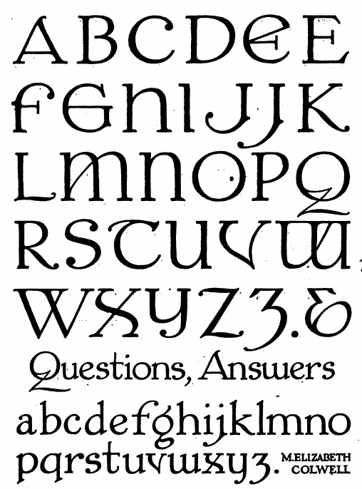
This year I'm also proud to say that I have successfully broadened my skill set by learning a lot more programmes that will benefit me when making my transition into the industry as a junior designer. I am now proficient at Adobe XD, After Effects, Lightroom and Glyphs mini.  As well as this I can also take my own product shots to a high standard following a photography induction that I organised with a photography student earlier in the year. 

I'm happy that I've managed to develop my style as a graphic designer rather than an illustrator, yet still feel I have a lot to learn and am excited to develop my practice further now going into the industry. One thing I have noticed myself doing a lot this year is comparing my work to other peoples, which is one thing I really regret as it's caused me to waste a lot of time rather than getting stuck in and developing my own work through experimentation and development. I've now learnt to stop using Pinterest as a source of inspiration and to instead get out into the world, going to exhibitions and do thorough, in-depth research in order to spark my creative process. 

This year I have really tried to consider the impact of Graphic design on society and the environment by aiming to be as ethically conscious as possible. Through researching issues thoroughly, engaging with the industry I feel a lot more informed about these issues and am ready to put them into practice when I start my internship. 

OUGD603 - Brief 07 - Gender Disparity - Final Outcome


Feedback

Question: Does the outcome I have produced effectively combat gender disparity within the industry? 

A: The research and reasoning that has gone into the type specimen booklet highlights the issues within the industry and is a sensitive way of approaching the topic, the design is really striking and looks cool so hopefully would grab the attention of employers. You've effectively achieved the aim of your brief as more people are aware of Carol Twombly than before. 


OUGD603 - Brief 07 - Designing the type specimen - Development


Saturday, May 12, 2018

OUGD603 - Brief 07 - Designing the type specimen - Research

To physically showcase the font I had designed I needed to create a type specimen of some kind. I looked into a range of different type specimens as well as campaigns promoting gender equality.


Idea 1

Period Equality designed by Paula Scher is a new organisation hoping to eliminate ‘tampon tax’ in the US. Scher renamed the non-profit from Menstrual Equality to Period Equity, creating a sans-serif black logotype using Margaret Calvert’s New Rail Alphabet typeface. She has spotted it with red dots to “pull no punches” about the “uncomfortable” subject of women’s periods, she says.


The design uses copywriting at the forefront of the campaign, therefore using an issue like this could be a good way to showcase my new font. The use of motion graphics and animation could also be one way to showcase the typeface.

Idea 2

A more straightforward and traditional version of a type specimen booklet would be to create a something in the style of the ones shown below, with a range of different pangrams and showcasing the alphabet. 


Idea 3

Another idea was to create a less traditional Zine to be the type specimen. This could then be used to outline issues of gender equality in the industry to display the letterforms, in a more gritty and honest format similar to how the Geurilla girls highlight inequality in the art world. 


Guerrilla Girls is an anonymous group of feminist, female artists devoted to fighting sexism and racism within the art world. The group formed in New York City in 1985 with the mission of bringing gender and racial inequality into focus within the greater arts community. The group employs culture jamming in the form of posters, books, billboards, and public appearances to expose discrimination and corruption. To remain anonymous, members don gorilla masks and use pseudonyms that refer to deceased female artists. According to GG1, identities are concealed because issues matter more than individual identities, "[M]ainly, we wanted the focus to be on the issues, not on our personalities or our own work."

A range of inspiring Zines include:


In many of the zines I found they had a limited colour scheme, which reduces production costs, therefore if I were to make one I would also try to limit the colour palette to one or two colours. 

For the content of the zine, I compiled a list of copywriting and facts that could be featured on the different pages:
  • 'It's not a confidence issue'
  • Outline statistics to do with women at events - underrepresentation
  • 'Why did I get the woman' syndrome - Paula Scher
  • Outline issues such as lack of support raising a family
  • List of describing words for men and women. eg. Women called 'Bossy', men called 'assertive'.
  • 'I just want to run with the boys and act like them too, but when I act exactly like them...I get called difficult.'
  • Statistics on the number of women CEOs
  • Quotes about typography being 'invisible'. 
  • Stats about 88% of female creatives saying that they lack role models. 
  • Quote about people using feminine as an adjective to describe curly, cute, delicate fonts. Something like 'Do I look like a feminine font to you?' 
Idea 4


Create a flip book of most notable women in typography history to showcase their work and pay homage to their contributions to design. In the essay 'Type persons who happen to be female' by Susanne Dechant, she states that 'the achievements of pioneering female typographers in history are in urgent need of consideration. They make excellent interview subjects, who not only look back on impressive careers but can also see them in overview - including all the zigzagging twists and turns in their personal biographies, welcoming the unwelcome divergences, which they can now explain and assess in compelling terms.'

Chosen Idea

Design a Guerilla Girls style zine showcasing the ugly truth of gender disparity within the type industry highlighting figures and facts about the statistics of women in design conferences to showcase the font. Make the zine cheap and easy to reproduce so it can be distributed around hunderds of studios and agencies in the industry to increase pressure on employers and eliminate gender disparity. 

Monday, May 7, 2018

OUGD603 - Brief 07 - Gender Disparity - Designing a typeface

As a starting point I wanted to choose a designer to base my own font on. Three women that stood out to me were Carol Twombly, who influenced the whole of Adobe’s typeface development; Susan Kare, the original designer for the Apple Macintosh’s display fonts and Margaret Calvert, designer of the British roadway network systems. I chose Carol Twombly as in her time at Adobe she proved herself to be one of the greatest female pioneers of type design, producing an impressive amount of typefaces.

The font I have chosen to base my typeface on is Carol Twombly's font Nueva Std regular. I will study the typeface and take features from it to create my own take on it, paying my dues to it's creator and increasing their recognition in the history books. 


The font I chose to base my own on was Neuva Std Extra bold, designed by Twombly in 1994. A font with a very high stroke contratst with round, bouncy counterforms and stroke shapes, particularly in the wider instances. The low connecting joins of the arches on h, m, n, r, b, d, p and q are characteristic of some calligraphic designs, and this combined with rounded bowls and tapering stems makes Nueva unique among roman typefaces.

The process began by sketching out Twombly’s font which allowed me to properly study it’s anatomy and pick up on any subtle details to apply to my own font. I wanted to keep it as similar as possible in order to honour Twombly’s work whilst transforming it at the same time. All of the fonts I had studied such as Troisemille were sans-serif fonts therefore I decided to make the new font also sans serif to give it a more modern appearance, moving out of the Roman typeface categor
y.


Keeping the x height, cap height and type size the same allowed it to stay true to the original font, Neuva. After creating a new version of the font both upper and lower case and punctuation I then transferred it onto the baseline grid shown above to ensure every letter form would work when positioned as a whole.


Once the initial design of the font was complete it was transferred into glyphs mini to adjust the kerning and kerning pairs for every letter to ensure it woud function as a whole. In the early twentieth century, ‘Office Girls’ in the Monotype workshop were given the task of transferring the ‘type directors’ designs into fully functioning typefaces, a process similar to this one. By creating my own single font it allowed me to witness first- hand the patience, skill and accuracy it takes to design a typeface.


Sunday, May 6, 2018

OUGD603 - Brief 07 - Gender Disparity Typeface - Initial Ideas

I had a few initial ideas for the design of the new typeface and what it could be inspired by. These are listed below: 

Idea 1 - Carol Twombly - Nueva 

Take a typeface designed by female typography pioneer Carol Twombly to bring her back into the forefront of the public eye as she was one of the first female typographers.

Re-imagine it to be bold, loud and in your face, perfect for the use on women's march posters or headlines in newspapers. In the book Women in Graphic design one of the points from the essay 'Type persons who happen to be female', Susanne Dechant stated that the work of these 'elderly pioneers of Typography' such as Margaret Calvert, Freda Sack, Veronika Elsner, Rosmarie Tissie, Gudrun Zapf-Hesse and Rosmary Sassoon was in 'urgent need of consideration.' Therfore this would be a perfect starting point to base the typeface on. 


Idea 2 - Susan Kare - Chicago

Honour the work of Susan Kare, a designer who worked on the typography for the Macintosh computer for Apple. It was the first computer with beautiful typography."This was largely due to the groundbreaking work of Susan Kare, who designed Chicago, the first Apple Macintosh typeface, in 1983. Intended for use on-screen in one size only, 12 pixels high, Chicago was robust but exceptionally user-friendly and it remained integral to both the Mac interface and to Apple's identity for over a decade.

Chicago is an object lesson in aesthetic and technological restraint. Working only in pixels on a limited grid, with no references other than the raw computer bitmaps of the time, Kare achieved a well-modulated typeface with subtly contrasting stroke widths and proportional letter spacing, making it easy to read even on the low-resolution Mac computer screen.


Kare pioneered the way for screen-based typography, with no inspiration to go from, she created a range of beautiful fonts which became the basis for many designers after her. 

Create digital typeface inspired by her work to bring Kare to the forefront of people's attention.


Idea 3 - Elizabeth Colwell -M Elizabeth Colwell Roman 

In my research, I tried to identify the first ever female typography and came across the work of Elizabeth Colwell and her typeface. This typeface has some really interesting letter forms and glyphs which could be used as inspiration for a new typeface. However, I want the typeface I make to be as relevant and justified as possible, in line with my aim to dispel gender disparity in the industry. Therefore as there is no way of finding out whether this typeface was one of the first ones designed by a woman I felt it wasn't as good a starting point as I would like. 


Idea 4 - Maragert Calvert - British Roadway stystems

Margaret Calvert is a graphic designer known for her design of road signs in the United Kingdom, as well as the typefaces Calvert and Transport. South African-born British typographer and graphic designer Margaret Calvert designed many of the road signs used throughout the United Kingdom with colleague Jock Kinneir. She also designed the Transport font used on road signs and the Rail Alphabet font used on the British railway system. Calvert's designs are still in use today but for much of her life, all her work was accredited to her partner. Design a type specimen based on the font calvert to recognise her achievements. 


Chosen Idea - The idea I have chosen to run forward with is developing a type inspired by Carol Twombly to bring her achievements and that of the other pioneering women in her field into the forefront of our minds. One reason gender disparity is still an issue within the industry is that many women's stories and achievements have not been shouted about or told. 'A historically rooted basis for the free and direct choice of female role models - and not the lateral pseudo-identification with male idols- or mentorships between kindred female biographies would boost the prospects of success (in today's young female typographers). The possibilities for such are still lacking, as design history in general and that of women, in particular, remains to be written' (Dechant, 2015). Hopefully by even getting just a few people to acknowledge the work of underrepresented women in graphic design this project would be worth the cause. To avoid adhering to stereotypes that women only work on frivolous fonts, the font will be bold, loud and in your face. 

'Do I look like a feminine typeface to you?'