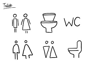
Inspiration:
All of these designs feature arrows and as there is really only one direction to go on Copenhill this is an element I wanted my wayfinding to feature.
Another aspect I needed to consider was the number of international visitors Copenhill would see every day. Therefore the design needed to include symbols as they are universal and can be understood in every language, transcending any language barriers.
Initial symbol sketches:
Chosen Symbols:
Adhering to Scandinavian design principles I wanted to keep the symbols very minimalist with form following function. As the architecture of the building is so abstract and unusual I also wanted to give the symbols a more unusual edge. From top left to bottom right, the symbols are: Lift, summit, restaurant/bar, vantage point, cafe and toilets.
Using sharp angles and a low line weight this achieves a more abstract minimalist look, avoiding more complicated designs.
For the restaurant, the cutlery symbols have a quality reminiscent of skis to them which add's to the quirkiness of the design.
Design experiment featuring arrows and symbols:
Final Design:
Design Mocked Up:
Considering the building materials was also a major factor in the design of the wayfinding as I didn't want it to distract from the natural beauty of the building's architecture which uses concrete, wood, metal and glass. Therefore the wayfinding had to be simple enough to compliment these materials.


No comments:
Post a Comment