Idea 1 - Carol Twombly - Nueva
Take a typeface designed by female typography pioneer Carol Twombly to bring her back into the forefront of the public eye as she was one of the first female typographers.
Re-imagine it to be bold, loud and in your face, perfect for the use on women's march posters or headlines in newspapers. In the book Women in Graphic design one of the points from the essay 'Type persons who happen to be female', Susanne Dechant stated that the work of these 'elderly pioneers of Typography' such as Margaret Calvert, Freda Sack, Veronika Elsner, Rosmarie Tissie, Gudrun Zapf-Hesse and Rosmary Sassoon was in 'urgent need of consideration.' Therfore this would be a perfect starting point to base the typeface on.


Honour the work of Susan Kare, a designer who worked on the typography for the Macintosh computer for Apple. It was the first computer with beautiful typography."This was largely due to the groundbreaking work of Susan Kare, who designed Chicago, the first Apple Macintosh typeface, in 1983. Intended for use on-screen in one size only, 12 pixels high, Chicago was robust but exceptionally user-friendly and it remained integral to both the Mac interface and to Apple's identity for over a decade.
Chicago is an object lesson in aesthetic and technological restraint. Working only in pixels on a limited grid, with no references other than the raw computer bitmaps of the time, Kare achieved a well-modulated typeface with subtly contrasting stroke widths and proportional letter spacing, making it easy to read even on the low-resolution Mac computer screen.
Kare pioneered the way for screen-based typography, with no inspiration to go from, she created a range of beautiful fonts which became the basis for many designers after her.
Create digital typeface inspired by her work to bring Kare to the forefront of people's attention.


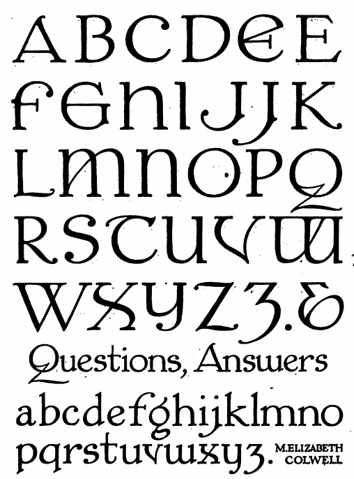
Idea 3 - Elizabeth Colwell -M Elizabeth Colwell Roman
In my research, I tried to identify the first ever female typography and came across the work of Elizabeth Colwell and her typeface. This typeface has some really interesting letter forms and glyphs which could be used as inspiration for a new typeface. However, I want the typeface I make to be as relevant and justified as possible, in line with my aim to dispel gender disparity in the industry. Therefore as there is no way of finding out whether this typeface was one of the first ones designed by a woman I felt it wasn't as good a starting point as I would like.
Idea 4 - Maragert Calvert - British Roadway stystems
Margaret Calvert is a graphic designer known for her design of road signs in the United Kingdom, as well as the typefaces Calvert and Transport. South African-born British typographer and graphic designer Margaret Calvert designed many of the road signs used throughout the United Kingdom with colleague Jock Kinneir. She also designed the Transport font used on road signs and the Rail Alphabet font used on the British railway system. Calvert's designs are still in use today but for much of her life, all her work was accredited to her partner. Design a type specimen based on the font calvert to recognise her achievements.
Chosen Idea - The idea I have chosen to run forward with is developing a type inspired by Carol Twombly to bring her achievements and that of the other pioneering women in her field into the forefront of our minds. One reason gender disparity is still an issue within the industry is that many women's stories and achievements have not been shouted about or told. 'A historically rooted basis for the free and direct choice of female role models - and not the lateral pseudo-identification with male idols- or mentorships between kindred female biographies would boost the prospects of success (in today's young female typographers). The possibilities for such are still lacking, as design history in general and that of women, in particular, remains to be written' (Dechant, 2015). Hopefully by even getting just a few people to acknowledge the work of underrepresented women in graphic design this project would be worth the cause. To avoid adhering to stereotypes that women only work on frivolous fonts, the font will be bold, loud and in your face.
'Do I look like a feminine typeface to you?'
No comments:
Post a Comment