After opening the app the user is automatically taken to the location/map page similar to the Uber app. A pin signifies your location and the direction in which you are facing to help with orientation. The app then locates all art galleries, artist workshops and design conferences/gatherings within a 5 mile radius and signifies their location on the map.
Clicking on a location pin opens the event (far right) showcasing all of the information about the event including location, price and how to get there.
Users can click the burger icon (far left) to open filter options where factors such as distance, price and event type can be adjusted.
The app allows the user to completely tailor search results to their personal interests meaning only relevant events show up on the map reducing clutter and therefore increasing usability.
Selecting a point on the map opens up a window containing information and images of the event be it an exhibition, workshop or design conference to give the user a sense of what it is.
Users can then tap the heart icon to save it to their favourites for later or tap the directions icon to open up google maps, helping users get there quickly and safely in an unfamiliar city.
The bottom of the page displays similar events nearby to make navigation quicker and allows users to find more events they may have otherwise missed.
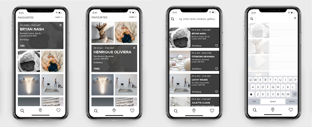
Items that have been favourited appear in the favourites section, allowing users to go back to them either later that day or another day altogether.
Under (Sort V) the list can be rearranged based on current distance away from you (closest > furthest) price (lowest > highest)or based on your preferred disciplines.
Clicking the cross removes the event from favourites.
Clicking on the image causes it to expand, and a grey box of information to overlay as pictured in the first and second images, causing the layout to shuffle. As well as searching via location on the landing page users can click on the magnifying glass icon to search via artist name, event or gallery etc. to see for example, if one of their favourite artists has an exhibition on nearby.
A list of popular events pop up automatically to give the user inspiration but once you click in the search bar these fade out and allow the user to type what they’re looking for. An animation showcasing the navigation and UX / UI of the app is on a memory stick inside the submission folder.
The paired back visuals perfectly target millennials and those on the move because they don’t like reading too much information and only want to see what’s necessary. When you’re out and about you don’t want to use too much data so limiting the amount of content on the app increases usability as well as adding to the minimalist design.


No comments:
Post a Comment