Before designing the advertising campaign I started to consider the style I should go down for both layouts and what kind of images (if any) to use. This had to be in keeping with the branding of Copenhill and be recognisable, memorable and eye-catching building excitement and suspense before the opening day.

One of the first styles I experimented with was a blue, green and red colour scheme to represent ski runs combined with a repeat typography pattern and old school retro skiing photographs. My reasoning behind this was I wanted to replicate the nostalgic excitement of when skiing holidays abroad started to appear in the 60s, which was a futuristic and exciting concept back then. The video below is an idea of the vibe. This is because the idea of having a ski slope on a waste energy plant is an exciting and futuristic concept to us now.
Combining the elements created a trendy modern design, however, I felt it had lost touch with the underlying values of Copenhill and didn't accurately reflect the personality of the area. Therefore I tried some alternative routes to develop it differently.


Playing further with the idea of using vintage and retro skiing photographs I developed an alternative style using the same typeface designed in Copenhagen (FP Head) this time making the colour scheme match the photograph.

After getting feedback on these posters I decided that there wasn't enough consistency amongst the designs and it all felt a bit messy and all over the place, therefore developing the styles further I developed then into a more muted style in muted greys, blues and greens.

I preferred this style, however, thought I could develop it further to make it look more modern and timeless as I feel this style may soon become dated due to its stylized colours and typography, whereas classic Scandinavian and Swiss design is more timeless due to its form following function.
Going back to the drawing board I scanned through more vintage and retro photographs of old skiing holidays bearing in mind what sorts of things would work equally across both print and digital media. This is when I came across this one photo:

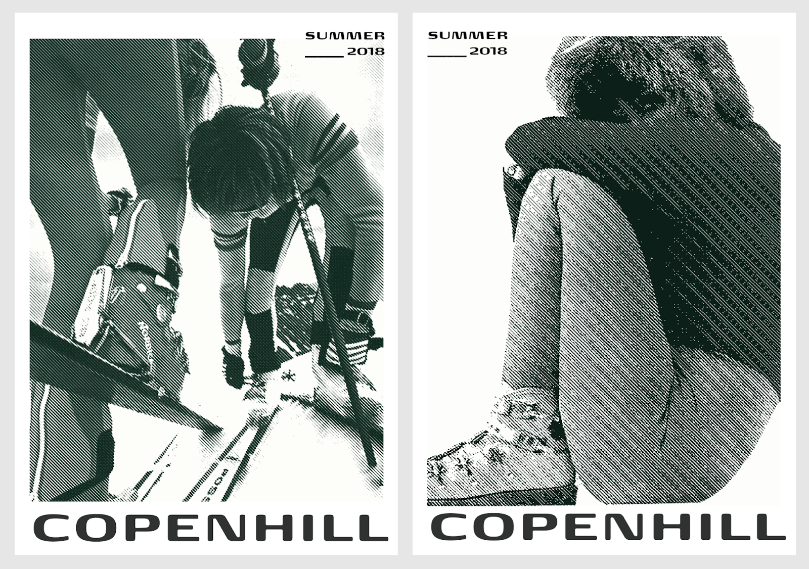
Something about it really stood out to me and then I realised it wasn't in black and white but instead dark green and cream tones. This subtle difference in the colour palette I felt would work perfectly both on the printed and digital collateral as it was slightly more unusual than straight black and white and added an old-fashioned yet interesting look to the image. It also helped me tie all the different vintage photographs together into one coherent series. I then went back over all my old designs and enhanced them with this new colour palette.
This is how my designs progressed for the advertising campaign:

I then also started playing around with halftone and duotone to add another element of interest to the design. Anoother good think about using these effcects was that because many of the images were old and therefore low resolution, it didn't really matter and wasn't noticable after the halftone was applied as that is how it was meant to look.


Finished poster series:

Billboard Development:

Feeback that I received on the first billboard was that it was good and they liked the style but it needed more work and would also be nice if it featured some of the other activities which Copenhill offers.

The posters which simply have the name Copenhill, a vintage repurposed photograph and the season ‘Summer 18’ on them aim to be ambiguous whilst simultaneously building excitement for the opening of the site. Originally the posters were all snow sports orientated but the feedback I received was that it would be nice to show the full range of activities Copenhill has to offer.
Advertisments will be placed on billbords around Copenhagen’s public transport services to target a local audience, whilst adverts in airports will target tourists and those visitng Denmark. Transforming people’s perceptions of what a public utility should be like.
No comments:
Post a Comment