Monday, February 29, 2016

OUGD406 - Studio Brief 02 - Individual Practice - Licence to Print Money

Now I've got a rough idea of the route I want to go down for my bank note I have started looking at screen prints I like from other artists that have the potential to be incorporated into the design of future currency, focussing particularly on typography. 

I created a pinterest board to gather inspiration for the project that you can find here:
https://uk.pinterest.com/bethewens/money/ 

These a are a few examples of artist work that I have found to inspire my project. 


OUGD406 - Studio Brief 02 - Individual Practice - Licence to Print Money

Money is something we handle and exchange every day, so much so people never really pay attention to the artwork on the face of currency and concentrate more on it's value. I believe there is still future for physical money rather than card payments, contactless and the new 'apple-pay'. Nothing will ever fully replace the action/ sensation of physically handing over your hard earned cash.

After visiting the exhibition at the people's history museum I decided to further my research by looking into alternative designs by other artists for different countries currency online. I particularly wanted to focus on designs that increase the value of cash in way that makes the holder think about the message it holds / has printed onto it, rather than it's value in payment.
On designer I found who follows this criteria is American designer Travis Purrington. For his master’s thesis at the Basel School of Design in Switzerland he designed a bank note that could be used to double up as an “educational tool” “And not to reinforce such a patriotic bond with the country, but more of a global bond with mankind.”

In his design Purrington wanted to introduce imagery that had to do with systems, rather than dated iconography, because that’s really what money is about. It’s the connecting synapse between a huge number of systems that keep the country churning day by day. His bank notes depict images of scientific discoveries, inspiring architecture and picturesque landscapes, celebrating incredible achievements made collectively over time by the human race rather than a select few iconographic figures. 


I like this idea as it makes money seem less corrupt and more universally accepted and celebrated for the better reasons. It reminds us of what we as a species are capable of achieving rather than the wars and greed that has been caused in the past by wealth and power. 

The notes also appear much more modern with their mix of bright and muted colour scheme, interesting geometric shapes, pattern and unusual layout. However at the same time they seem to have a timeless quality to them. 


I then looked further into the history of money and the banknote. I found the website: https://www.smashingmagazine.com/2016/01/learn-from-the-history-of-banknote-design-most-desirable-product/ which extensively covers a lot of interesting information about the history of the banknote. 

'The notion of using paper as money is probably as old as paper itself. The practice of using paper to transfer letters of credit over large distances appeared in China about 618 AD. The ancient Chinese, responsible not only for ingenious concepts but also for ingeniously describing them, named this practice fei-chien or “flying money.”

The oldest surviving paper notes were issued during the rule of the Ming Dynasty, between 1368 and 1399. The Ming dynasty’s 200 Kwan note is nearly the size of a legal document. The note was manufactured from recycled gray mulberry bark paper.


During the American Civil War, the back of the dollar bill was printed in green because the color was associated with stability and growth. These “greenbacks” started a tradition of printing US banknotes in green. This traditional color scheme of US banknotes, dominated by green and black, combined with the uniformity of banknote sizes, has been heavily criticized for not being accessible, especially for the visually impaired.

One important thing to consider in my design is the orientation I would want my proposed bank note to face. Portrait looks a lot more modern and is used in many countries currency including the Swiss franc banknote with revived the fashion for a vertical format 20 years ago. Because a vertical format is more ergonomic for feeding notes into payment terminals and other research shows that people tend to handle notes vertically rather than horizontally, this orientation will likely take hold of currency design in the coming years.

Banknote designers care about being responsive and one concept being mulled over in the currency world is to make one face of the note horizontal, optimized for the wallet, and the other vertical, for quick use with a banknote terminal.


One amazing idea I found was the Brixton Pound. The Brixton Pound (B£) is money that sticks to Brixton. It’s designed to support Brixton businesses and encourage local trade and production. It’s a complementary currency, working alongside (not replacing) pounds sterling, for use by independent local shops and traders. The B£ gives local traders and customers the chance to get together to support each other and maintain the diversity of the high street and strengthen pride in Brixton.

The B£ makes money work for Brixton by supporting smaller shops and traders who are under threat from the recession and larger chains. It stays in Brixton and circulates, increasing local trade and community connections. Money spent with independent businesses circulates within the local economy up to three times longer than when it’s spent with national chains, research by the New Economics Foundation has shown.

The B£ encourages people to think about where their money is going and commit to spending a proportion of it locally. On the environmental front, the B£ supports local businesses in sourcing more goods and services locally, reducing their carbon footprint.

Source: https://brixtonpound.org/what


One route I thought would be interesting to go down is typography. I found an interesting example of the use of typography as the main artwork for currency in the form f Notgeld. Notgeld, is a term for 'emergency money' issued by a body rather than a central bank. 

'The most obvious example of notgeld is the paper money that was printed in Germany during the period of hyperinflation following World War I. During this period, over 36,000 types of notes were issued by over 3,500 companies, towns and cities. Notgeld went beyond being just bills, evolving into a powerful force for raising the spirits of a desperate society.


While the majority of notgeld had very little intrinsic monetary value (paper notes were printed almost nightly in every area), the quasi-currency played a huge role in the visual culture and history of Germany.'

The design of most notgeld was based on the historical subjects and heraldic images, offering a way for a defeated country to seek comfort in a glorious past. Some notgeld series, such as the one created by Herbert Bayer, incorporated a minimal, modernist aesthetic, calling people to think of a better future, instead of recalling the past.

At that unstable period, notgeld became a means of expression for contemporary artists and designers; therefore, they quickly became more of a target for collectors than actual currency. Another reason for some of the intricate designs relates to finance: If a bill was left as a collectible, the debt would not have to be paid.

Notgeld is a goldmine for typography enthusiasts. Many of the designs, such as the one above, created by Wenzel Hablik, were purely typographic. They came from various artistic movements that either began or moved forward during that time, including Expressionism, Dadaism, New Objectivity and Modernism.'


One thing I noticed about the currency I had researched so far is how muted and dull most of the colour schemes are. For my project i wanted to focus on bright colours and engaging shapes to transform currency into something that will be payed more attention to rather than handed over and exchanged without a second thought. In doing this it may also reinforce the value of money and make us realise how lucky we in the western world are to have a disposable income. 
Some colourful designs I found are the re-works of pre-existing American tender from presidents into members of the justice league by artist Aslan Malik. 


Regardless of content, I really like the mis of colours used in these notes as even if you squint your eyes and don't look at the drawings the colours are still modern, fresh and engaging. 

At burning man festival they do not use money, but acquire things through trading their own gifts for other peoples. I wanted to think about things that people would want to exchange rather than money, hypothetically speaking about non-physical entities. 

Values I thought of were things such as: 

- Manners
- Morals
- Respect
- Character
- Common Sense 
- Trust
- Patience 
- Class
- Integrity
- love
- acceptance 
- Happiness
- Wisdom
- Faith
- Peace of mind
- Humility 
- Luck
- A second chance at a missed opportunity 
- Appreciation of simple things
- Natural Beauty 
- Talent
- An open mind 
- Having Fun
- A kind gesture
- A nice memory etc. 
- Youth 
- Good Karma  
- Positive Attitude 
- Motivation 
- A great Idea 
- True Love
- A good reputation 

As the project is on 'The FUTURE of the banknote' it doesn't specify how far in the future to base it on. In centuries time, the corrupt and physical things associated with money may be a thing of the past, and people will be able to trade things with more intrinsic value. 

For my project I want to design a bank note with the value of an entity that money can't buy. 


Sunday, February 28, 2016

OUGD406 - Studio Brief 02 - Individual Practice - Licence to Print Money

The Brief: In an age of Apple Pay, Bitcoin, contactless, Paypal and other options for the transferring of funds, is there a future for "real" money?

In this brief we have been set the task to research into the development of coinage and banknotes while also exploring the cultural understandings of legal tender. Following this and the research visit to the People's History Museum's Show Me The Money exhibition), we must begin a more developed interrogation of financial transactions in order to complete your own proposal for the future of the banknote.

We have to design a bank note that will be presented as a print that making use of any of the varied analogue print processes available within the college's workshops such as screen print mono print and lino. The finished product must consist of a minimum of two colour finishes and the paper size for completed work has to be 21cm x 26cm with banknote designs displayed landscape. The size of the actual banknotes and whether or not they are two sided is completely up to us based on our reasoning behind the final outcome.

In this project we should aim to think visually, exploring both literal and lateral responses. We should experiment with text and image, both separately and together, and explore a range of suitable production methods.

Aims: I plan on exploring a number of directions with this brief including a range of historical figures worthy of being on a bank note to things considered more important that money such as health, strength of character and what makes being a good person. 

To kick start this project I'm going to revisit my notes on the peoples history museum and look into some existing designs of alternative banknotes. 

Wednesday, February 24, 2016

OUGD406 - Studio Brief 01 - Professional Practice - Secret 7 - Final Resolution

These are the final resolutions I submitted to Secret 7. The first two are for Jack Garratt's 'Worry', the second is for Tame Impala's 'The less I know the better'.


140 Character Description: ' This album cover is inspired by the passionate and aggressive way the artist performs live with meticulous timing and raw emotion. '


140 Character Description: 'This album cover was inspired by the lyrics of the song 'pieces you left' and resonates with imagery from a domestic fall out.' 


140 Character Description: 'This Cheeky album cover is riddled with innuendo to portray the excitement and innocence of teenage youth, pushing the boundaries of life.' 

I was delighted when my first design for Jack Garratt's album got picked to be in the exhibition!


The exhibition was really inspiring to look round and it was great to get a piece of my work into such a well established exhibition.


The cherry on top of the amazing cake was the fact I saw it 3RDDD (!!!!) on the website a few days later so it was one of the first people looked at when they view the gallery online. I couldn't believe me eyes! 


I will definitely be taking part again next year. 

OUGD406 - Studio Brief 01 - Personal Practice - Secret 7 Responces

Following on from my initial research I started to kickstart the design process by making rough sketches of any ideas that came into my head. 

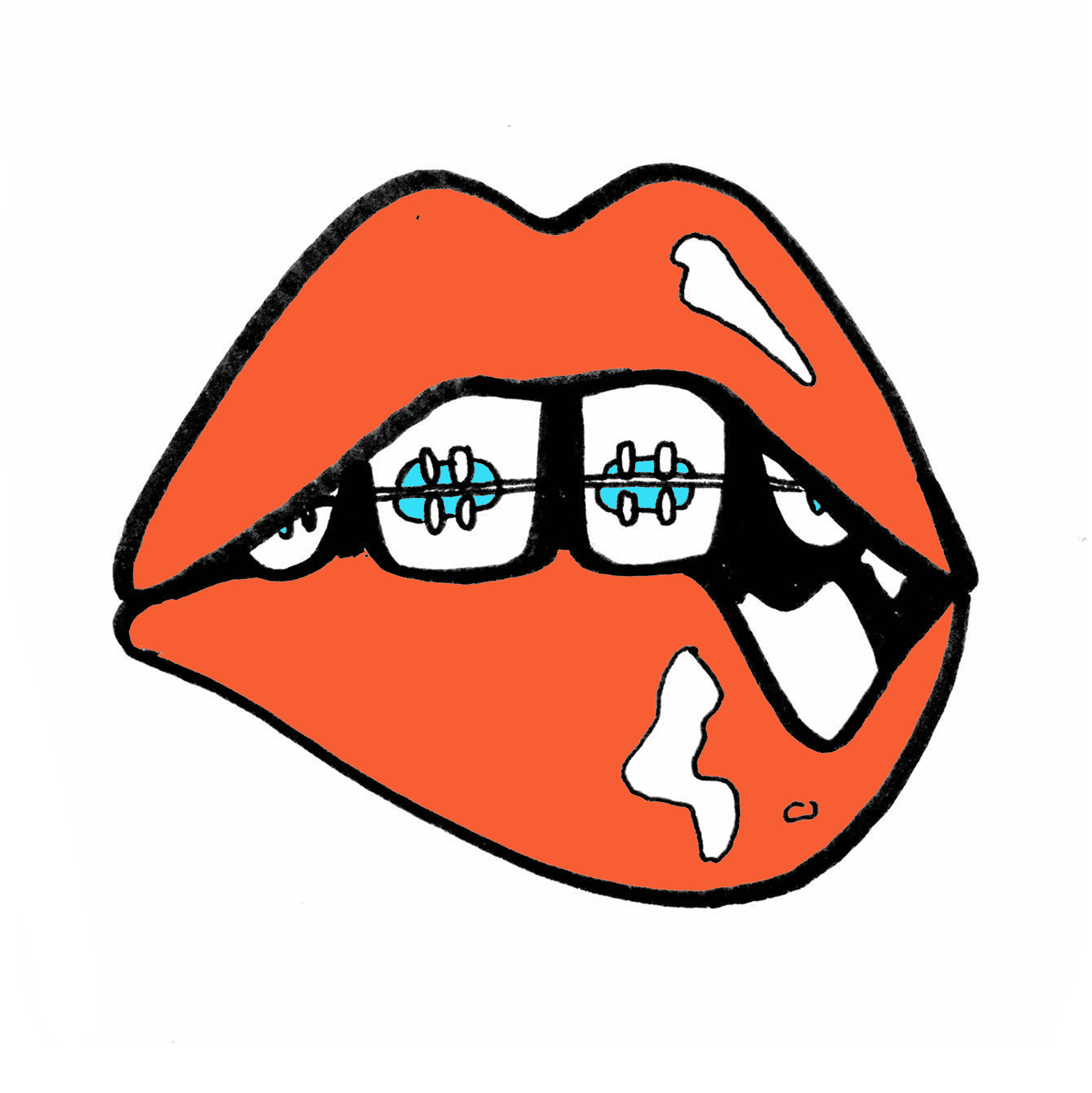
I started off with Jack Garratt's track, Worry, focussing first on the key lyrics within the song. I drew inspiration from 'Pick apart the pieces' thinking about imagery that could relate to these words such as broken pottery, jigsaw puzzles, flower petals and the game 'operation'. Some of the other lyrics I felt could be visually interesting were 'when my eyes are closed I start to feel you staring at me' 'sounds of women I'll never meet', hence the lips and eyes, as well as 'this moon of ours only shines a half to make me feel whole' and 'I felt your breath in every step I take when the wind blows'. 

Then I looked at general imagery related to the word worry such as thunder clouds, the worry emoji, and biting nails.

Finally I was inspired by the way Jack Garratt performs his songs in such an impeccably timed and passionate way, playing a number of instruments all at the same time, hence the drawings with the mr Tickle arms, imitating a sense of urgency and confusion.   

Gif compiled of my initial sketches and ideas: 


My  favourite ideas for the Secret 7" sleeve:


Top Left: Broken Pieces of pottery inspired by the lyric 'pieces you left' 
Top Right: Tweezers picking out the broken heart in the game operation, inspired by the lyrics 'Pick apart the pieces you left'. Symbolises how his ex is playing with the singer's broken heart. 
Bottom Left: Also inspired by the same lyrics, this image shows a pair of hands picking apart a tiny model of the singer's body. She is picking apart what she left (him) in the most literal sense of the meaning. 
Bottom Right: This is inspired by the passionate and talented way Jack Garratt performs live. 
Bra: Inspired by the lyrics 'pieces you left' I thought of possesions left behind like bras and hair clips. 
Thunder Cloud: Imagery resonating with the word worry

Experimenting with my favourite idea in colour, I'm not 100% happy with this resolution for some reason, perhaps the colours or composition but my crit group thought it was extremely effective and that I should just submit it how it is right there and then: 


This is the same idea created in a different composition with different illustrations and a new colour scheme. I'm not sure how effective I think it is:


 Mocked up as album covers.


While I was still contemplating the possibilities I could look at with Jack Garratt's sleeve I moved on to look at some ideas for Tame Impala's track 'The less I know the better'. This song is a personal favourite of mine and reminds me of teenage romance, naivety and heartbreak. I wanted to create an album cover that resonates the cheeky tone of voice Tame Impala captures within the song using various illustrations riddled with innuendos.
The music video features a giant gorilla named trevor and a lot of raunchy imagery however I didn't want to focus too much on what the music video as that is the vision of another artist and I wanted my album cover to be original. I tried to focus more on the lyrics of the song and the way it made me feel than what I'd seen in the video or the psychedelic artwork that had already been produced for tame impala. When drawing my ideas I thought of stereotypical teenage parties, sneeking out, young love, innuendos and innocence as well as lyrics in the song such as 'go on superman, say your stupid line' and the title of the song itself, 'the less I know the better', which also ties in with the theme I was going for of 'leaving things to the imagination'. You could imagine the worse yet still be blissfully unaware of what's really going on. 

Sketches of initial ideas: 

4 favourite ideas: 


Ideas with colour:


Mocked up as album covers:


I presented these ideas in a group crit and got a lot of positive feedback. 

One of the comments was that I could use the set of thumbnail drawings I did as a design in their own right as it looks like a comic strip of events relating to the lyrics of the song. 

These are 4 ideas that I had for album sleeves which I didn’t submit into the competition s I didn’t think they were as visually eye catching or ‘obvious’ as the others. 

I also discovered that an almost identical version of the lips design had already been entered a few years earlier.