Wednesday, May 17, 2017

OUGD505 - Evaluation

This module has been the first opportunity where I have explicitly had to focus on the ethics behind design and production and how to make work which is 'designed for good.' Ethics is something that I had never really associated with graphic design however it has been beneficial to my practice learning about how design can influence our community in a positive way. 

Studio brief 01 allowed me to research into the history of Leeds as a city and discover an array of multicultural and exciting events that has shaped Leeds into the city it is today. As traditional print isn't one of my strongpoints I wanted to use this project as an opportunity to create a piece of design that was really fun, bold and humorous, something that I would enjoy working on and look forward to printing. 

I really tried to push myself in the idea generation process by coming up with at least 10 individual designs and ideas for the poster that could each work in their own right as a stand out and vibrant poster. I'm really glad I did this as my final idea of merging a pigeon with a flamingo inflatable only came at the very end of the idea generation process after combining a range of my initial sketches into one humorous and clever concept. This has taught me a valuable lesson in the importance of brainstorming and not just going with the first idea that pops into your mind. All my peers thought it was really clever but light hearted design which is what I was aiming for. 

Although I went for screen printing again in my traditional print this year rather than lino or mono printing I tried to push myself and learnt how to make an image half tone to create depth and shadows, which was a new skill for me. 

I definitely struggled with my time management for this module as it initially overlapped with COP and Responsive during its early stages, therefore I ended up putting a lot of my time and effort into those briefs, which resulted in me neglecting this one. Unfortunately my preferred way of completing work is to focus on one project at a time however I know this will not be a realistic approach when it comes to 3rd year and after I graduate so this is something I will have to try and improve on in the coming months. That being said, as the year has progressed I have found myself being able to undertake and ultimately produce work a lot faster than I could in 1st year without the quality being affected, which is something that I'd initially hoped to improve on at the start of the year. 

Once I got into it I particularly enjoyed studio brief 02 and the idea that you can find an issue whether that be political, social or ethical and resolve it through the use of design. If I had applied myself sooner I feel I could have come out with some more unusual and refined ideas and designs however I'm happy with what I produced and think the entire range of products looked really smart and cohesive when gathered together. If I had not been so pushed for time I would have liked to make an animated video showing the benefits of a lending library as part of an advertising campaign and would have animated my screen based designs to showcase the user experience.

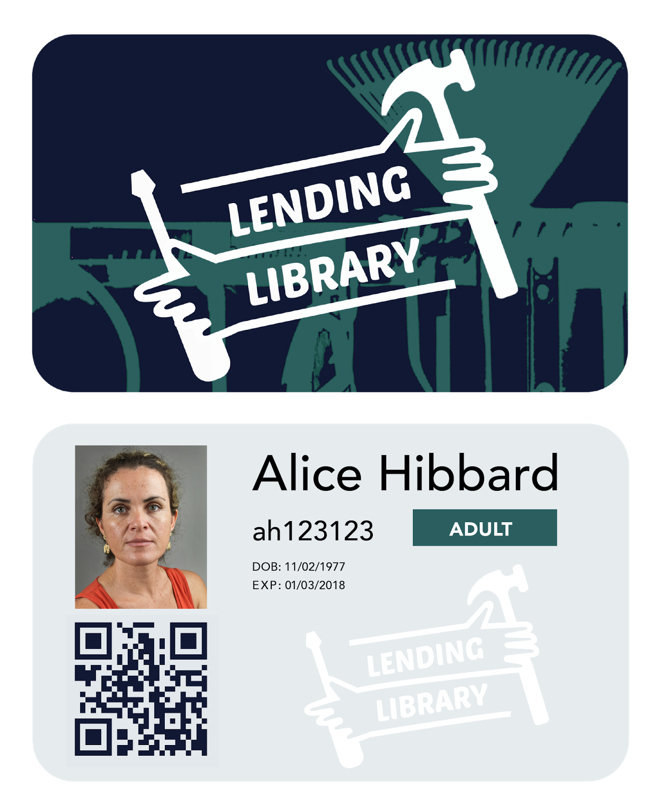
 The lending library idea has a lot of potential to be made into a reality, therefore it's exciting that I had the chance to explore this concept while it was still relatively new. 

OUGd505 - Studio Brief 02 - Final outcome


The Problem

Communities are starting to become more and more detached from one another, losing the sense of knowing your neighbours and becoming less active within the community. With a rise in house pricing, more people and families are finding themselves with less space, and less funding for expensive objects such as DIY tools, camping gear, and other large miscellaneous objects, that are only used once or twice a year. In our wasteful society, the idea of sharing commodities would not only benefit people's wallets but the environment too and reinforce the benefits of belonging to a community, sharing and borrowing commodities.

The Brief

Encourage people to 'lend not spend'. Design the end to end branding for the Leeds branch of a Lending Library, a place where Leed's inhabitants can go to borrow objects for designated periods of time as and when they need them. The design needs to be accessible and engaging to all ages from students to OAPs.

Outcome


The outcomes I have created answer the brief as I have produced a range of collateral from library cards to leaflets to an advertising campaign. The designs are bold and vibrant without losing touch with the practical service behind them. The lending library provides a service where anyone with a membership card (only £7.50 a year for OAPs and students) can access commodities such as tools, camera equipment and cleaning products all year round as and when they need them. 

I also created a website and a mobile web page as I wanted the online catalogue to be accessible to anyone, anywhere, whether you're retired and sat on your computer at home or a busy student sat on the bus or running errands.  

Feedback

18 - 60 year-olds

The feedback has all been really positive with everyone asking why this wasn't already a thing. As the target audience was so broad it was important to create perfect balance between a young, modern and engaging design as well as informative and straightforward. The colour scheme I used kept the branding engaging as well as highly legible at all sizes, whether it was on a sticker or A3 poster. The flyers and leaflets quickly and succinctly explain what the lending library does and is for and the tone of voice is kept friendly and welcoming. 

Evaluation

I am happy with he final outcomes and think the finished designs all tie in really well together. Throughout the project I kept referring back to the module's title 'product, range and distribution to ensure that I wasn't going off track and had covered every appropriate solution to these 3 criteria. The methods of distribution I specified have maximised the amount of people the campaign would reach and I think it has really good potential to be made into an actual service and product. I know I would use it! 

OUGD505 - Studio Brief 02 - Photography of Collateral


Tuesday, May 16, 2017

OUGD505 - Studio Brief 01 - Finished Poster


OUGD505 - Studio Brief 01 - Poster Development

The idea I decided to take forward was the flamingo pool inflatable (representing the beach) mixed with a pigeon to represent the city. The idea contrasts beach with city = city beach and creates a humorous outcome that appeals to the large demographic of both children and adults. 

As the city beach appeals to both children and adults alike I wanted to make it a bright and vibrant poster that could be stylish as a poster for adults in an office space the same as it would be in a children's bedroom etc. 

Therefore I wanted cartoon imagery, with bold lines and bight colours. These were the initial sketches through to the final design: 


Artist inspiration: 

Brosmind

Mary-lou Fayre

Minkyung


Sketches


After asking for feedback from my peers, one of the critical design decisions I made was making the ring of the pigeon pink as originally it was going to be the colours and markings a pigeon would have. Making it pink linked the idea more to flamingos and the inflatable idea. 

Making the design half tone allowed the design to use a range of different colours with a minimum amount of ink.


Typeface

For the typography on the poster I wanted to keep the image the main focus as that would be the most appealing part to children and the concept of the design spoke for itself through the use of illustration. 


I experimented with a range of typefaces and styles but decided to use ‘Krungthep’ as the typeface as it gave an old seaside town feel mixed with the brutalist architecture of a city. It was also subtle enough to not detract attention from the illustration itself, meaning the pigeon remained the main event. 


The positioning and shape of the text also represents a ripple in the water on which the inflatable is floating, subtly creating depth and movement in the composition without obviously suggesting the idea of it’s placement in a pool. 

OUGD505 - Refining Collateral - Creating consistent range

Product: Leeds Lending Library

Range

Library Cards: Student/OAP, Adult
Website

Mobile Supported Website


Facebook, Twitter and Instagram pages


Distribution


Posters


Leaflet 


Stickers

Tote Bags


To keep the range cohesive I used a consistent colour scheme that was easily recognisable as belonging to the same organisation.