Library Cards, Posters/Flyers, Stickers, Badges, Tote Bags
The imagery that I used across the range came from a photograph of neatly organised set of tools from this website. I changed the colour mode to duo tone and made it into an abstract pattern to use as the background pattern for the collateral.
Posters and Flyers
Typeface: Gotham Bold
Feedback
Stickers
The imagery that I used across the range came from a photograph of neatly organised set of tools from this website. I changed the colour mode to duo tone and made it into an abstract pattern to use as the background pattern for the collateral.
Library Cards
For the library card I wanted the design of the front to be bold, simple and colourful - something that you would like to keep in your purse at all times and for your friends to ask 'what's that?' striking up a conversation and spreading awareness of the service.
The design features an abstract silhouette of part of a tools rack (you can see the rake) making an abstract but eye-catching pattern. This will tie in with the stickers and the posters creating consistency between the branding and the advertising of the service. The logo is then overlaid in contrasting white.
Posters and Flyers
Typeface: Gotham Bold
Feedback
- Very industrial
- Quite Shouty
- Looks like a poster you'd find in the war
- Gives off quite a propaganda feel
- Try it in more friendly colours
I wasn't really happy with any of the above compositions, so simplifying it by combining the logo with the additional slogans on the posters gave the same message with less writing. The most important pieces of information are where to find the lending libraries (in Hyde Park and on The Headrow) and the website address to find out more information.
I asked for feedback on whether or not people thought more information was needed on the posters to make it clear what the service provided:
Feedback
- 'I like how it's the kind of thing that would appeal to anyone from students to people who have retired and I think the design reflects that. I wouldn't really put any more information on it as it's pretty self explanatory. I also like how the shapes in the background are a subtle hint to what you can borrow from the library. The pink colour scheme is my favourite.'
- I like the jazziness of the poster. The navy is quite corporate for what the service provides however with the mint green/turquoise accent colours used alongside them it brightens up the design.
- I like the jazzy and colourful colour schemes however at first glance they look like they could be promoting an event for donuts at the Faversham so they may not be appropriate.
After the feedback I altered the navy poster so it was a bit more vibrant and light hearted by adding a minty green accent colour.
I decided promotional stickers would be a good way to raise awareness of the Lending library in leeds as personally flyers that get posted through the door just get instantly thrown in the bin. However as a student who walks around leeds more than any other mode of transport, I notice a lot of promotional stickers plastered to pedestrian crossings, lamp posts and the back of seats on busses etc. Seeing more than one subconsciously plants the event/service in my mind and I start to notice it more and more until eventually I look up what it means or ask someone about it.
These stickers could be posted in bus stops where people are waiting, lamp posts, gig poster pillars, busses etc.
I sketched them out initially with the intention of making them all different fonts, colours and designs however I realised that as it was a brand new service that no one will have seen or heard of before repetition was a more appropriate response as it creates consistency and will start becoming more a more memorable each time it's seen. Initial designs:
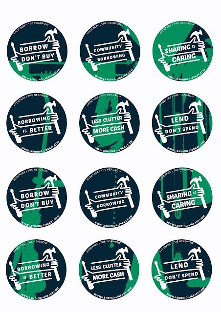
Final designs - matches lending cards and posters with consistent typeface, logo and layout. Colour scheme has the potential to be played around with to create a touch of diversity. Different catchy slogans create subtle differences with the same underlying message, that borrowing rather than buying is the way forward.
Stickers contain important information such as where the lending libraries can be found (one in Hyde Park and one on The Headrow), the website to go to for more information and the recognisable logo.


No comments:
Post a Comment