Friday, October 16, 2015

Studio Brief 2: Symbol


The second study task we have been given was to create a symbol that would work simultaneously with the pre existing logo for Yorkshire Sculpture Park. 


I had a range of initial ideas focussing on both the sculptures I found in the park and the grounds they were set in. The image above shows a range of photos and sketches inspired by the park that could be used as a potential logo. The top row of images were inspired by Dennis Oppenheim's Alternative Landscape Components, or as I like to call them, Toilet Trees. I thought they made some really visually interesting shapes that could have a lot of potential to be used in a logo.
The bottom images were inspired by the map of the park and the outlines themselves. I focussed on the shape of the outline then added in dots where the permanent exhibitions were, to add a bit of interest and make it more relevant. I also tried making the shape more abstract (inspired by the sculptures found in the park by Henry Moore and Barbara Hepworth) and use looser lines to mimic this effect.

However the main things that interested me from the park, and that I thought had the most potential to turn into different outcomes were the Barbara Hepworth Sculptures 'The Family of Man'. 
These sculptures are a permanent feature of the park, donated by Hepworth and created in 1970. 
I did a range of sketches of these sculptures but decided again to take it down a more abstract minimalist route, reminiscent of the simplistic shapes Hepworth builds upon. 


These were a range of sketches of the sculptures I did looking at the different forms Hepworth creates.


These were my favourite 4.


I narrowed it down to 3 shapes and started playing around with the layout, overlapping them and experimenting with different compositions.


 I then played around with a variety of strokes, altering the thickness of the line to see if it would be more legible, or less legible on different scales when the logo was reproduced. 


I tried to take it as far as I could but I think I went a bit over the top towards the end creating extremely abstract shapes. However I still think they make interesting forms. 

This was the thickness I decided to run with as it would be good when used in colour and as negative space. I'm not very happy with the quality of this as the image started going a bit grainy however when I get more confident in illustrator I will experiment with making the shapes into vectors.


This is the image placed against darker logo backgrounds and changed to white, exploring it's potential when used as negative space. I experimented with dragging the logo outside the boarder of the shapes (top right) and looked at different compositions it could work in such as against a square rather than a circle. I kept with the circle as that is what the preexisting logo already is so it would remain complimentary and I also feel the shapes within the lines I drew of the sculpture were already quite 'blocky' and square, so the round edges of the circle frame the design nicely.


I then stopped to assess the progress I had made and asked my peers their opinions. The logo I had so far was effective however it was starting to look a bit cluttered and busy, which could effect the impact it made on different scales. I addressed this issue by re drawing the 3 shapes I had chosen, making them even more simple and and uncluttered. Then i regrouped them in the same order. One of the comments I got in the crit Session was that the 3 shapes looked better when 'stood alone' before being overlapped, which I could look into further if I revisited this project. However I feel the overlapping lines create a more visually interesting composition and encourage a sense of interaction from the audience to interpret their meaning in different ways.   


And this is the final logo I chose. I'm really happy with the shapes created and I think it is really successful both as a stand-alone symbol and with the pre-existing logo for YSP. 

My logo used on the YSP website

My logo used on signage from YSP grounds

My logo used on a mock up postcard for YSP

Logo used on mock up merchandise 

Logo used with the typeface from the YSP website


CRIT FEEDBACK FROM MY GROUP:


The majority of the feedback I received from my group was positive however there were a few helpful points made about things I could have looked into further to give my work more depth and understanding. 

'I personally preferred the logo in a square, however the circle links in with the current logo'
-I did experiment with a lot of different backgrounds but went for the circle for this reason. I believe this comment shows that my logo works in many formats and is diverse enough to use in a wide range of contexts. 

There were a lot of positive comments on how I had applied the logo in various contexts including on signage and the website. 

'I preferred the version where the shapes were not overlapping' 

'looks better with non-overlapping shapes'

These are 2 valuable comments because I took a lot of time deliberating on whether to overlap the sculptures or not. I too thought they worked well on their own but may have been a bit lost/unsubstantial when used in a logo,  however I think if this was used as a logo for the park, the individual shapes (not overlapped) could be used in different contexts perhaps as mascots or various markers for park signs etc.

'fill in the holes with a block grey colour to make it clear they are holes' 

'Fill in some of the sculptures with block colour'

More interesting points that I hadn't previously thought of. 

Favourite comment:

'I could see this as a real logo for the park'


Tuesday, October 13, 2015

Introduction to Design Principles

Watch Me!

'Graphic design is a process of visually communicating concepts, messages and content through the effective use of visual language.'

All that is necessary for any language to exist is an agreement amongst a group of people that one thing will stand for another. If only one person understands then it isn't a language. 

Semiotics - is the study of meaning-making, the study of sign processes and meaningful communication.


Road signs designed by Margaret Calvert


Introducing Gestalt Principles: Theories that explains how we see things.

Gestalt Phsycology:


Meaning "shape, form" and defining an area of psychology that aims to understand our ability to perceive and organise the world.

"The whole is other than the sum of the parts." - Kurt Koffka

That is, that our perceptions can be more than merely what is presented to us; we can conceive ideas informed by our already complex understanding of the world. 

We look to make sense of the ambiguous, meaning we look at the outline of shapes to understand their meaning. 


Continuation:


Our instinct is to follow what we perceive to be a line or a path.

Law of Pragnanz:


Phil Cleaver - What they didn't teach you in design school
We are conditioned to follow simple paths and shapes. We prefer things that are simple, clear and ordered. We like things in their purest forms. Safer, less time to process, less dangerous surprises.

We break down complex shapes by thinking of how it's made rather than of how it's presented to us.

Our brains are conditioned to see figures and faces, we fill in a lot of the blanks. 

Closure: 


Noma Bar
Closure is the glue that holds elements together. It is about the human tendency to make links and try to understand. Reading images to comprehend their meaning.

Danny believes that something is sophisticated when it's a bit more ambiguous and requires something extra from the viewer. Noma Bar is a good example of this. The reader is rewarded by understanding the image and 'solving' the riddle.  It creates a sense of pleasure when they get to the conclusion by themselves. 

The key to closure is providing enough information so the eye can fill in the rest. If there are too many gaps then the image will start to break up rather than being seen as a whole. 
If too much information is provided there is no need for closure to occur and the image becomes boring. 

Symmetry and Order:


Grapheme Shigeo Fukuda 

Symmetry created order and solidity: It is our nature to impose order on chaos. 

We want balance in the image and text, yet compositions don't need to be symmetrical to create balance.

Lorem Ipsum: Style Rather Than Content

Explore the work and begin to understand your preferences in Graphic Design. Look at the relationship between image and text in addition to what you're reflecting on in your blog. 

Colour, Palettes, Formats, Shape, Grids, Layout, Image.

Monday, October 12, 2015

Kern-down

To practice our Kerning skills our tutor devised a game to help us get a grasp of the ways spacing between letters can change the overall nature of a word.

We had to make a word out of 5 random letters [o s b e & g] that could be used across 3 different companies of our choice.

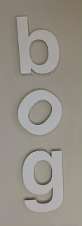
We chose the word bog :

  • b og : A toilet store. Separating the b from the 'og' created the illusion of a toilet from sideways on in the 'b'.

  • b o g : An upmarket, organic fruit and veg store. Putting large spacing between the letters, made the logotype look more classy and expensive.

  • bog :  A garden centre. Having small spacing between the letters made it look, approachable, inexpensive, yet professional. 

For the second task we then had to rearrange the letters in 30 seconds (still using the word bog) to create logotypes for 6 different types of companies.

Upmarket Car Company: Spaced out lettering creates upmarket feel.


Student Nightclub: Vertically positioned lettering and slanted 'o' creates funky, retro vibe.


Condom Manufacturers: (use your imagination...)


Quentin Tarantino Movie: Spaced vertically to use down the side of a poster.


Pest Control: randomly positioned lettering experimenting with the baseline creates a more organic, less structured word form.


Kids Animation Series: Jumbled lettering positioned at different angles creates a fun, playful logotype.


Kerning

Before the kerning lecture I wasn't aware of the different types of spacing you could have between letter forms or their 'technical' terms. Now I will be able to apply new spacing techniques to my work and have a better understanding of the methods I prefer using. From listening to the lecture I feel like I naturally have a good eye for deciphering the correct spacing between letter forms so I'm looking forward to developing my practice in this area further. 

I also didn't realise before the lecture that there wasn't a specific set of rules for kerning. Most designers rely on their eyes to visually work out the correct composition of their letter forms whereas previously I thought it was something that had to be exactly measured using a mathematical formula of some description. 


Saturday, October 10, 2015

Study Task 1: Written Feedback


Study Task 1: Crit

On Friday we had our first critical evaluation, assessing the work we had produced for the design of a new logotype in the week.

The tutors liked the work and our presentation but gave us some points on areas we could improve.

The first was that the colour we used (blue) was too cold for a boiler company. It didn't really sell the idea of warmth and heating.

The second was that the slogan 'the boiler people' was a bit old fashioned and could have been updated to 'our boiler people' or 'the boiler people'. It was also ineligible and hard to read from a distance or if used on a smaller scale.

Apart from that everything we did including research, experimenting and creating was all up to scratch and we could clearly explain why each design decision was made.

These are a list of other useful points to consider when doing similar projects to this:


  • When critiquing something e.g. saying 'the typeface wasn't very friendly', you have to say why! Can't just make bold statements without backing the up.
  • Never put writing or big bodies of text in presentations. Use pictures on the slides and verbally communicate the rest of the information.
  • Explain why each design decision was reached at every step. WHY? WHY? WHY?
  • Keep it simple.
  • Look at the way the company communicates through social media like twitter and Instagram to get a feel for the brands identity and the language it uses.
  • Be confident in the work you've produced. You have to make convincing pitches and bold claims like 'We believe this is the best representation of the company because...' You want to try and get across the brands identity in the clearest way possible.
  • Consider and document the most challenging aspects.

Thursday, October 8, 2015

Anatomy of Typography


TYPEFACE: Collection of different fonts. The 'Family'. The Primary Design. 

FONTS: Refers to physical embodiment of letters/numbers. 

LETTERING: A drawing/ Illustration of letters in a certain order, composition or word form. 
(only mean tot be in that order-can't rearrange to use in a different order)

'A font is what you use; a typeface is what you see.' 

Cap-Height: The height from the baseline to the top of the uppercase letters.

X-height: The height of the lowercase letters.

Baseline: Imaginary line in which the letters appear to rest.

Serif: With Stroke. [Bracket] Curved Connection.

Sans-Serif: Without Stroke [Terminal] end of a stroke, straight edge.

Descender: Dips down e.g. p+q

Ascender: Capital letters and letters like b, d + f

Italic: slanted - usually narrower that 'roman' original - used commonly for emphasis - primarily used in serif design - completely new design from original 'roman'. 

Oblique: mostly slanted - distorted - original letter form pushed over and skewed - reflects original design - primarily used in sans serif. 

Superscript: Letter, figure of symbol placed or printed above normal line of type. 

Subscript: Below the normal line of type. 

Counter: negative space within the letters 'O'.

Eye: negative space within the letter 'e'. 

Bowl: letters like b,p,d. 

Apeture: space in arches like in letters a, n & c.

Crossbar: A

Ear: g

Tail: Q

Colophon: Information about typefaces designers, founders found at end of printed publications e.g. magazine. Specifications: Typographic + production.

Kerning: Process of adding or subtracting space between letters of characters. Experiment with space between letterforms when designing type. (American Airlines // Helvetica ) 

Tracking: Refers to loosening or tightening a BLOCK of text > not just the spaces between.

(Putting this on here to refer back to as I hadn't previously been aware of many of the different terminologies used in Typography).