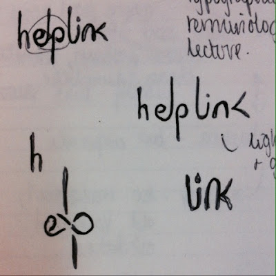
It also drew parallels with imagery relating to boilers and pipes which we wanted to incorporate into our designs.
Here I experimented with joining the letters 'el' and 'li' and tried to look for other shapes within the word that could form a link such as the 'e + p'.
Other sketches following the same idea:
We decided to pick one of the sans serif fonts (between Futura and Helvetica) because they are clean, modern, simplistic and approachable; however we decided Helvetica was too corporate and overused.
The serif fonts we felt didn't fit with the company's practical message as they appreared too traditional and outdated.
We are aiming to keep the logotype clean and contemporary as the company is for boiler repairs- not a fancy subject. However it needs to remain approachable. This is why we are favouring using a lower case font in the logo.


No comments:
Post a Comment