
As a group, we believed the Whitney Museum's visual identity is contextually informed as it reflects the structural architecture of the new museum exterior. This enhances its identity through a bespoke concept and considered visual language. Also the interchangeability of the design allows for use in terms of reproduction and adaption. Contrary to this view, we feel that on a practical level the identity is restrictive, dominating and rigid in it's communication visually. Although the designers produced the identity with a 'need to be signed or filled', the visuals functionality is limited when presented as a stand-alone image.
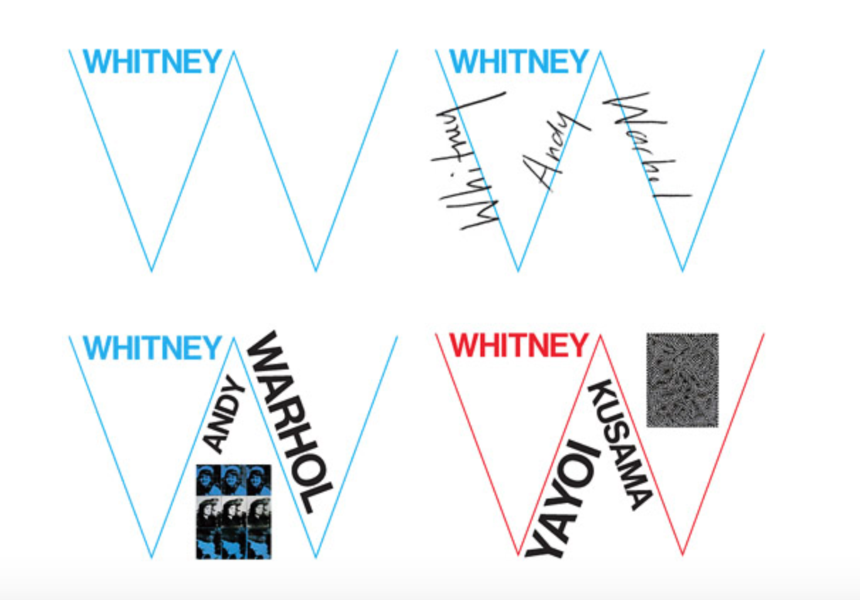 |
| W - A space that wants to be filled/signed/drawn on |
 |
| W on advertisement and in different forms |
 |
| Variations of W used as information |
[ See more information about the ideas behind the design here ]
No comments:
Post a Comment