CURRENT GREGGS LOGO

Nationally recognised and easy to spot. Very Well Known. Colours say more Insurance company to me than 'food' and although they're very friendly, they don't seem very appetising to me. The sans serif font is clearly legible and easy to read which is a key factor as a lot of the target market are elderly customers so a clear font is crucial.
The orange squares act as a confusing logo. I did research into them but couldn't find any reason why they were a part of the logo or what they represented. I think they look like when you batch bake bread buns, but that's just my opinion.
MARKET RESEARCH
-Who is the company?
Greggs.
-What do they do?
Sell cheap, fast, 'on the go' breakfast and lunchtime food such as sandwiches, sausage rolls, salads, pasta, soup and a variety of cakes and buns.
Their 'daily promise' is that, "every sandwich is freshly prepared here (on site) today".
Everything is "freshly made by hand with quality ingredients".
-Who are their main competitors?
McDonals, Pret A Manger, KFC, Subway, Pasty Co. , Meal Deals & Burger King.

Similarities I found between Gregg's competitor's logotypes were that they too mainly used san serif fonts on their shop fronts and stuck to a maximum of 3 complimentary colours.
- Who is the target audience?
Anyone looking for a quick, easy, cheap snack, sandwich or lunch. From children on their way home from school to old age pensioners.
- Where will the logo appear?
Takeaway Cups, Sandwich Wrappers, paper bags and pasty wrappers, the signage outside, on product packaging they sell such as coffee beans, takeaway soup containers & posters.
- On site findings?
Exterior: big glass doors, metal gilding, blue and orange Greggs sign.
Interior Decor: colour scheme is mainly dark grey and brown. Exposed brick walls, rustic wooden floorboards, black & white floor tiles, big glass doors. Stylish black and white photographs of Leeds (showing it's community based perhaps?) Brown, stripy comfy seating against brick wall and stylish metal and wooden chairs. Red retro lights that hang down from the ceiling.


Smells like coffee and baked food items.
The radio is playing in the background (music for all ages, both old and new).
On the coffee cup: Grey Lid with off white body of coffee cup. Writing on cup is hand rendered but the logo in the middle remains the same with a slightly muted colour palette creating a slightly more upmarket feel. The texture of the cup has a recycled quality but feels slightly 'grainy' and less shiny and smooth than poorer quality cups would.

Option to eat in or takeaway.
People:
I observed the customers in Gregg's between 2:00pm and 2:30pm (half an hour) and out of the 31 people who visited only 3 sat in to eat.
Younger than 17 years old: 1
Students (18 - 25): 7
25-30 years old: 3
30-50 years old: 13
50+ years old: 7
The range of age groups who visited varied, however their were a fairly even number amount of each with 30-50 year olds visiting the most frequently.
I asked a number of people their opinion of Greggs and what they associated the company with. These are some of the answers I got:
- "Cheap, quick, easy, unhealthy, average."
-"More healthy than McDonalds."
-"Working Class"
-"Hardly any Greggs in Brighton" (a more middle-class town)
-"Sandwiches & sausage rolls"
-"Old People"
-"Anyone visits there but mainly students"
-"Reminds me of builders"
-"I've grown up with it so I like it" (brand loyalty) (sees the brand as trustworthy)
-"Shit quality food"
-"Cheap and Cheerful"
A very mixed bag of opinions!
3 of the customers who visited the Greggs I observed were very corporate, middle class individuals which surprised me as Gregg's has a certain stigma for being a working class institution.
I feel the more upmarket feel of this particular Greggs attracted a whole variety of people, and that a new logo needs to be designed to reflect that and spread the message that Greggs prides itself on freshly prepared food and is a nationally recognised and trusted institution. Even though the current branding is easy to spot and recognise I feel it's current logotype is getting a bit dated and needs a fresh re-work, mainly focusing on changing the colour scheme.
PREVIOUS REBRANDS
Gregg's Moments branding was designed by Katie Peake and was a trial of entering the coffee market. However it was decided to be discontinued and instead it will incorporate its coffee business within the existing shops. Peaks rebrand incorporates coffee cups to replace the squares in the logo, a black, white and orange colour scheme and a complete re design of the interior of Greggs. Check out her rebrand here.
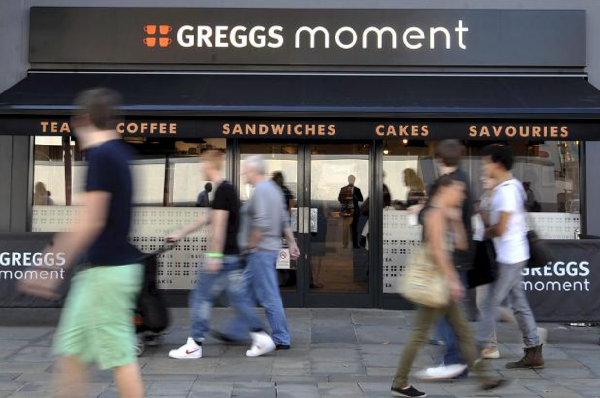


More info on Gregg's moment
I started by looking at changing the colours of the Greggs logo as this is the main area I had an issue with. I wanted to get a feel of how any new logo I created would fit in with the company and its goals.
I created my own logotype for Greggs in illustrator, keeping the squares and edited the colours to 3 of the main colours used inside the Greggs that I visited. A pale taupey grey, a charcoal grey and a russet red colour.

However I felt that if I was going to redesign the logo for Greggs it needed a complete rework, so went back to the drawing board and sketched a load of potential ideas that I thought could work as a new logotype. The difficulty I faced was that Greggs is a well established and well loved family known brand and changing the appearance of it could cause controversy and confusion, however with this project I decided it was all or nothing.
I tried a variety of different approaches including hand rendered [reminiscent I thought, of someone scrawling their name over their sandwich wrapper to show it was theirs] Abstract lines [that could work well if used on a neon sign like other takeaway fast food joints] Serif [to bring a more traditional feel back to the company, paying respect to it's strong heritage] and sans serif letter press style fonts [to create a sense of hand made quality feel while drawing "industrial" parallels with its popularity between working class individuals]


I looked around for various fonts I could use that would be appropriate and interesting for the rebrand but the favourite one I came across was called Dreamwalker, from dafont.com. I love the letterpress quality it has with it's imperfect, grainy smudges within the letters. I thought this font had both an indutrial yet 'organic' quality to it which I thought was perfect as it captured the 'working class, builder after a sausage roll' feel as well as the 'middle class, freshly made food by hand' quality.
I also thought when being reproduced on cups and posters it could be cheaply and easily manufactured using this process and stamps.

After playing around with the kerning and layout of the letters, this was my first outcome. I thought it was different to anything else on the highstreet, giving Greggs the edge, and could be displayed stood up in the window, rather than on a sign above the door. It could also be made from wood/metal and be made into a physical sign from the block letters.
I asked my peers opinions and they liked it initially but then decided your eyes were drawn more to the word 'EGG' than Greggs, which I felt was hugely problematic.
Another comment was they read the sign to literally as 'GRRR' 'EG' 'GSS', which is very confusing.

To try and fix this issue I spaced the name over 2 lines rather that 3, however this caused further legibility problems. All the attention was drawn towards the cluster of G's in the bottom left hand corner, creating unbalance within the lettering. It created too much of curved corner in this seemingly boxy layout and didn't work at all. I needed to keep it simple.

This concept creates an engaging and abstract element to the design and thus loses the need for a confusing and distracting square logo.

I tried the 3 lines in different lengths and positions however stuck with the original design as it drew the most parallels with the imagery I was trying to convey.
I then kerned the logo by spacing out the letters as I thought it looked less harsh and industrial than I had previously made it.

Once I was happy with the design I started playing around with potential colour palettes to use. I decided to stick with the colour scheme I had found at the Greggs in town as it is very versatile and would look effective in a range of different environments and on various items such as the coffee cups, sandwich boxes and posters.

I decided I liked white against a charcoal grey background the most as, the burgundy I felt was too similar to Pret A Mangers. The writing was also the most legible against a charcoal grey background.

This is the finished Logotype.
I then edited it onto the photos I had taken as park of my research for the company and see how it looked.


SUMMATIVE FEEDBACK
This was the feedback I received from my class before I had explained my aims for the company's new logotype an the message I was trying to convey.
It was a unanimous vote that the final logotype I chose was the best out of the typefaces and layouts that I had experimented with.
[Q]
Do you think the typeface I used [Dreamwalker] was appropriate and appeals to a wide target audience?
[A]
Makes it classy, looks like a quality cafe / bakers.
It looks more like a hipster cafe than a bakery - not sure it would appeal to a broad audience.
I feel it would mislead the customers in what the brand is.
I don't like the texture on the typeface. I think a solid colour would work better.
The typeface is appropriate however, I would prefer it to be a solid colour rather than the texture effect.
I like the texture of it but it makes it look very classy with the mix of font and colour. It looks more like a pub or restaurant.
The typeface works well and stands out. The texture creates a more modern feel however it may have worked on more colours so more experimentation could be done.
There were a lot of mixed opinions about the 'texture' used in the typeface. After I explained the aims I was trying to convey for the company the feedback was a lot more positive in response to this 'texture':
I love the handmade stamp quality of the type as it reflects fresh food and makes it look friendly.
I like the texture as it reminds me of the texture of pastry.
I decided to run with this grainy stamp effect because it did make it look more handmade like letter press, expressing time and effort put into the goods sold by Greggs.
[Q]
Is the colour palette I used appropriate for a wide target audience or does it look uninviting/ unfriendly ?
[A]
I think that a more friendly and fresh colour could have been more effective. I relate Greggs to a fresh bakery/ cafe and I feel the burgundy colour would have communicated this better/ more effectively.
It may make the brand seem more high end and formal than it is.
Might swerve the audience away - looks high class and expensive.
I think it is quite aggressive and uninviting - looks more hip, expensive and avant grade.
I understand that it is meant to have a more rustic feel, but i also see it as more of a grungy bar than a pastry shop. I like the designs on slide 8 as they look more friendly and approachable.

slide 8
I think more colour could have been used as i don't think it stands out that well.
I think it looks quite harsh. Maybe a lighter colour would be more suitable.
The colour palette seems to have helped to modernise the rebrand and works well with the typeface.
One of my reservations about this design was the colour perhaps being too harsh and industrial for a bakery / cafe however I liked it because it was modern and easily legible hen used with white from a distance. I do agree with all of the different points made here. Perhaps working with a slightly lighter grey or a warmer colour like the burgundy could have solved this problem without reducing the legibility of the design.
[Q]
Do you think the new logotype is more or less successful than the original and why?
[A]
Less. If the target audience is the same, the original is more successful.
More. Doesn't look cheap like the original.
More. The original uses too many colours and the type doesn't represent the brand well. However, I think it would confuse a lot of new customers to what the brand is.
More. Looks very sophisticated and will appeal to a wider target audience.
More. Gregg's really needed a rebrand to help them keep up with the current market.
More. It appeals to a wider audience.
More. Portrays Gregg's as a more modern and up to date food outlet.
This was also a mostly positive response that reflects the aims I had when starting the brief. After highlighting my reasons for rebranding Greggs the feedback was a lot more in favour of my final design:
Deffinitley achieved a modern design. Looks a bit more like a grill restaurant than bakers but still works.
It is a more upmarket logo which has a rustic and more organic feel, it would attract a wider audience.
Looks grilled, tasty, transfers really well.
the 'E' is really successful as the type looks similar to the original but the E is very different.
[Q]
Is the shop front sign legible from a distance?
[A]
Yes.
It is strong and bold.
It grabs the eye.
Good contest of colours, increases legibility.
Bold, but could be more eye-catching with colour.
Very eye catching but would be better if you chose a different lighter colour.
Bold and easy to read from a distance.
The bold type is clear and stands out against the dark background.
OTHER COMMENTS
I like the way the shape of the logo and the shape of the E resembles a sausage roll (s).
No comments:
Post a Comment