These are the Questions I asked and feedback I received from the crit:
Which of the different colour schemes work best?


- The 1st and third are the cleanest I think
- I really like the poppy visual use of colour and would recommend taking advantage of spot colours when screen printing, for example fluorescent inks.
- Pink / Green / Yellow works the best as a colour combo.
- Pink, green and yellow as it is vibrant and bright works well to motivate and pops off the page.
- Red / Blue / Orange - the bold colours help the design stand out.
- I prefer the last one, pink and green as it goes with the funky retro feel.
- Second and third - would be amazing screen printed due to the well balanced tones.
- Green and orange for me
- I like the last colour scheme however would consider adding yellow for more contrast.
I feel like there is something missing from the design like a pattern in the white spaces. Any suggestions on how I could make it look less bare / tie the whole design together?
- Look into the composition of current banknotes. Maybe reducing the size slightly of the individual components would allow for more white space to experiment with introducing other aspects such as patterns etc.
- Maybe include NYC - Casey's love for it and where he works? - He loves 2 dollar bill, maybe use as a denominator?
- Look into guiloche patterns?
- Something as simple as textured paper to print on could help? you could even experiment with different boarder colours (this could help to contain the design and give it more structure)
- Incorporate a jazzy collage perhaps? Maybe some cool leaves poking out or even the number of the note repeated in different sizes?
- maybe framing the design with a pattern?
- Bright stock would make the design pop! and be more eye-catching. Adding a boarder would also add definition to the design and break up the white space.
ONCE I had got this feedback there were some new aims I wanted my design to incorporate:
- Add boarder to design
- Look at features of existing banknotes
- Look at different coloured stock
- Use flourescent inks
- Play around with existing layout to incorporate more elements.
I also wasn't happy with the typefaces I had chosen as they were still the same ones as from my initial quick sketches.
I looked on pinterest to see if there were any different forms of typography I was more interested in that I could apply to my design. These were a few that jumped out at me.
I loved the bold, eye-catching letters as well as the colour schemes of these screen printed posters. Casey had also mentioned in his vlogs how he loves the colour scheme green and pink so I thought it fitted in perfectly!

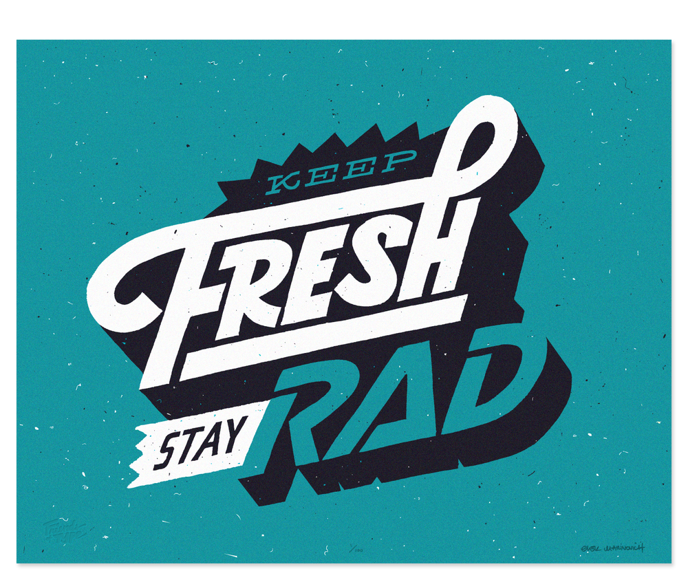

The typography in this poster instantly stood out to me and I thought it would be really interesting to replicate through screen printing.
I replicated the type in illustrator using 'HalloEuroboy' a font I downloaded from online and then copied and pasted it over each other multiple times to make this simple yet effective typeface.

I also discovered an old coupon I found from Fred Aldous with the same colour scheme that I had been looking at. This gave off the kind of retro vibe I had been after and incorporated many of the features I wanted to include such as a boarder and bright colours. I thought to keep the design futuristic and to tie in with my theme of 'money as something money can't buy' I decided to go down the route of making my design more like a coupon than a bank note.


Inspired by the collaborative branding brief that was running at the same time as this project I incorporated patterns commonly found on receipts to break up the design and make it more interesting. I felt my note was finally beginning to take shape.
I added the star sign ' 24 hrs' to make it look like a 'sale' sticker however decided to replace it as it made the design look a bit clumsy.

I still felt like there was something missing to the design. I then realised a lot of people might not recognise the figure as Casey Neistat as he is a relatively new celebrity after only becoming youtube famous in the last couple of years. I felt the design needed his name to be included so people could at least read who the design was of if they didn't recognise him. I also added two flexing emojis to represent motivation, making the design more universally understood, which was one of my initial aims in the brief.
I then began considering how I was going to produce the design. I had never done screen printing before or used the college's screen printing facilities so was nervous about the next stage having only had an induction up to now.
For this reason I decided to simplify my design from a 3 colour separation to 2. I felt this would help me get the prints right first time as it was less lining up to worry about and I could easily try and redo them if they went wrong. I also felt using just two contrasting colours instead of 3 would create a more eye-catching and vivid effect.

This was the outcome I got from altering the design to two colour separations. I then wanted to add a border and a patterned background behind casey's head just to fill the space more.

This was the final design of the bank note. The border was made from more patterns inspired by receipts and the dotted background was inspired by multiple screen prints I had seen.


I then made it into two colour separations which I thought looked pretty cool on their own!
I chose a range of GFSmith stocks to print my design onto including the following:
- Colourplan / Cool Grey / 135 gsm
- Gmund Action / Clear Blue Sky / 310 gsm
- Gmund Action / Alpine Sparkling Water / 310 gsm
- Colourplan / White Frost / 135 gsm
Gmund Action / Alpine sparkling water / 310 gms was my favourite stock as it was white, which allowed the colours to stand out against it but also had a subtle irridescnet shimmer when help in the light. Unfortunately all the prints I did on this stock had imperfections so I couldn't use them as my final piece for submission however for the exhibition I may print a few more to put display.
These are my final prints being made:

Final Outcomes:


Final result:

I'm really happy with how it turned out! The colours were really vibrant and everyone seemed to love the finished piece.
Screen printing and aligning the different colour separations was a lot easier than I anticipated which made me regret not being more adventurous, however for a first attempt at screen printing I think it went really well.
This brief was great at introducing me to the college's facilities and I've discovered that I absolutely love screen printing, although it takes 10 times longer than digital printing, the finish is much more interesting and you can acheive effects a digital printer wouldn't be able to like using fluorescent or metallic inks and printing onto more unusual stock. I can't wait to do it again!
No comments:
Post a Comment